Search Results: transparent images (7)

Data Visualization
Sanjay Matange 1
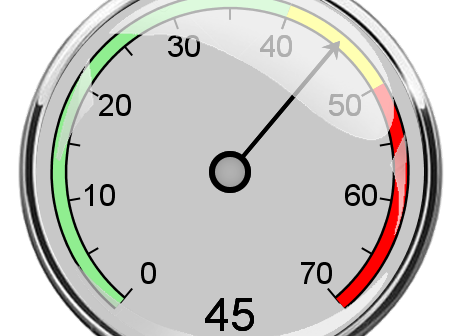
Dial KPI using SGPLOT

Last week I was at PharmaSUG 2016, where I presented a 1/2 day seminar on creating Clinical Graphs using SAS.  I was gratified to have a enthusiastic audience of about 28 attendees and we had a great interactive session.  I also presented a paper on Clinical Graphs Using SAS.  More

Data Visualization
Sanjay Matange 4
Marker Symbols

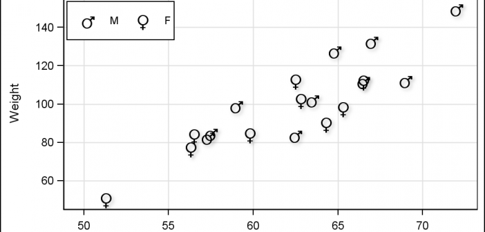
There has been much discussion on the SAS Communities page on usage of different symbols in a graph.  The solutioin can vary based on the SAS release.  New features have been added at SAS 9.4 releases to SG Procedures and GTL that make this very easy.  With SAS 9.4M1, almost any combination is

Data Visualization
Sanjay Matange 0
More symbols, you say?

Users have often expressed the need for more marker symbols.  ODS Graphics supports over  30 scalable marker symbols, both filled and empty.  As mentioned in an earlier article, with SAS 9.4, filled markers can now have outlines and fills, and can also have special effects. Also with SAS 9.4, now you

Data Visualization
Sanjay Matange 8
Comparative Histograms

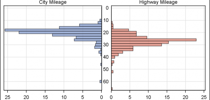
In reference to a previous article on Violin Plots, a reader asked about creating comparative mirrored histograms to compare propensity scores.  While I had my own understanding of "Mirrored Histograms", I also looked this up on the web.  Google showed many cases of two histograms back to back, either horizontally or vertically.