Sanjay has wowed me with some of the graphs that he has created lately in Graphically Speaking. In this blog, I will revisit several of his graphs (and a few of mine) while concentrating on only the axes, grid lines, and reference lines. They might not be the most exciting parts of a graph, but there are multiple options that when properly used can turn a good graph into a great graph. The axis options include all of the options that you can set in the XAXIS, X2AXIS, YAXIS and Y2AXIS statements (which include axes lines, ticks, tick labels, axis labels, and grid lines).
Let's begin with a basic, default set of axes. I'll use one of my graphs from Vector Plots and Adjusting Point Labels. By default, PROC SGPLOT creates horizontal axes on the bottom (X) and top (X2) and vertical axes on the left (Y) and right (Y2). The X and Y axes have a label for each axis and marks and labels for each tick. By default, there are no grid lines or reference lines.
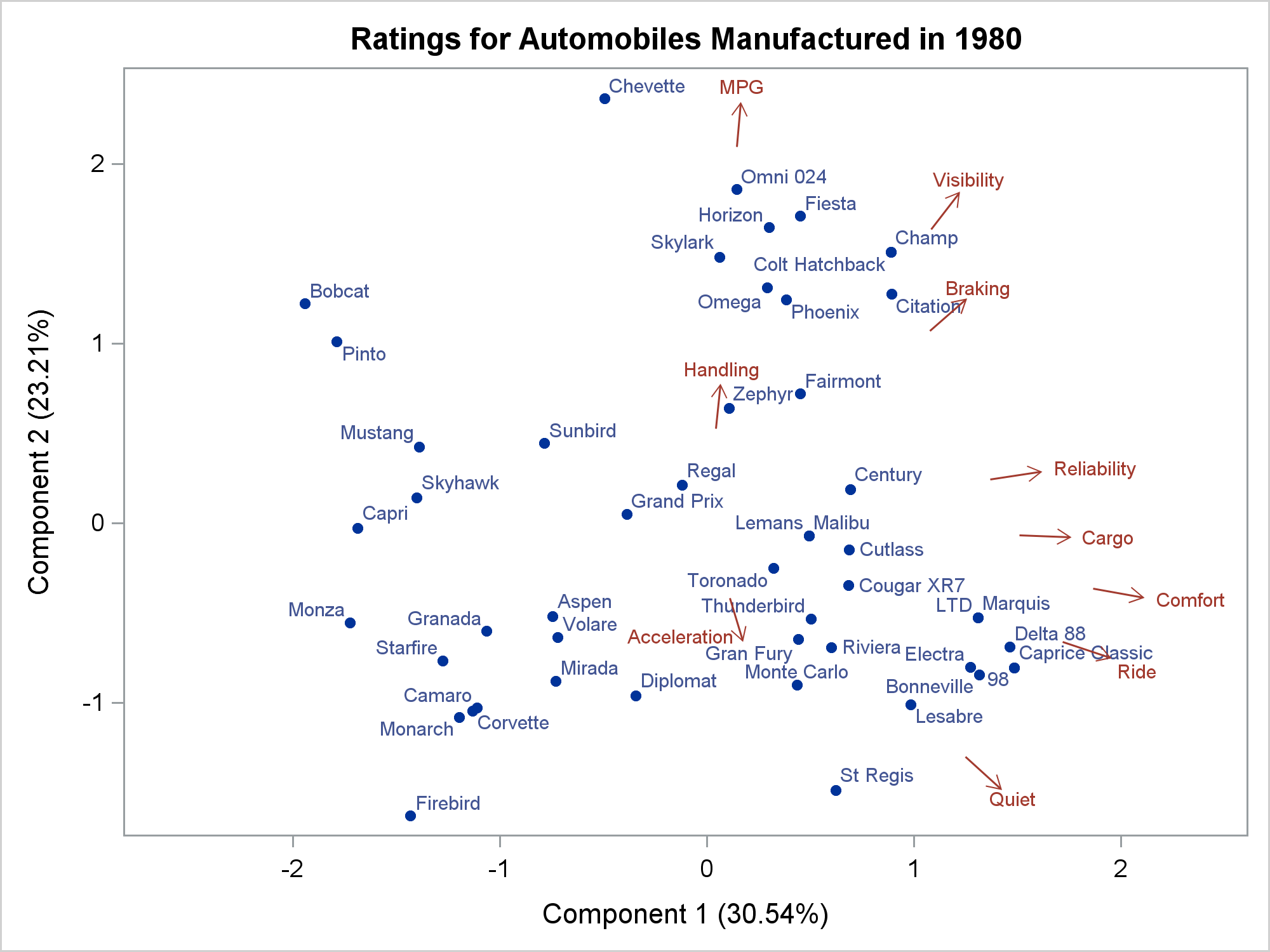
One of my goals in making this graph was to shorten the vectors, which by default emanate from the origin (0,0). A short vector coupled with knowledge of the origin is sufficient to show the direction of the vector. Eliminating "redundant ink" makes a graph that is cleaner than the default. I will say more about Tufte's concept of "data ink" after the next graph.
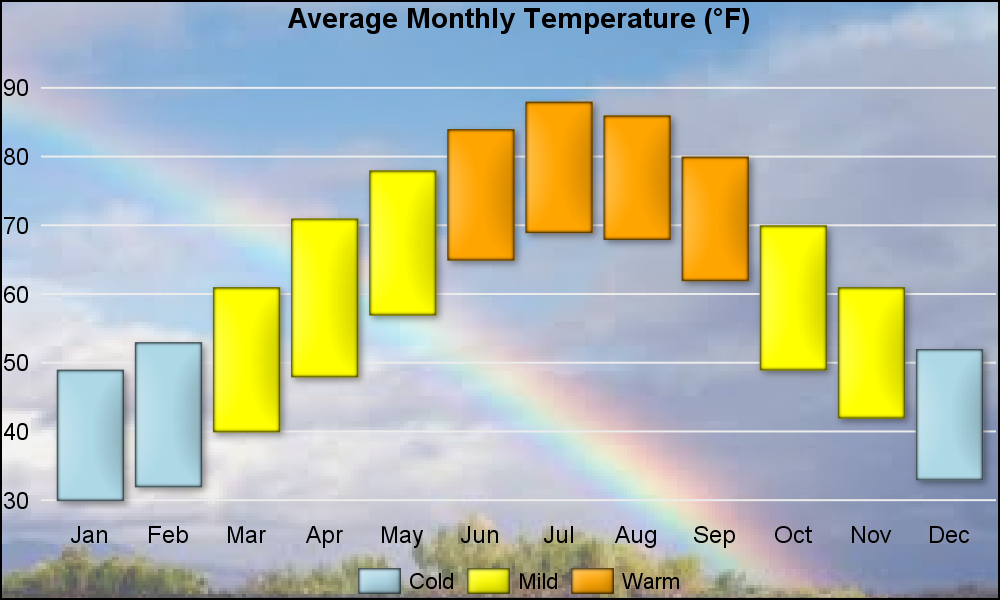
I first thought of writing a post on axes when I was looking at Sanjay's Image Backgrounds blog. This graph is striking because of the background, so you might not even think about the axes. However, the choice of specifying options that suppress many of the default components of the axes is critical for the appearance of this graph.
Sanjay uses these statements:
xaxis display=(nolabel noline noticks); yaxis display=(nolabel noline noticks) grid offsetmax=0.1; |
The X axis has no label, no axis line, and no ticks; it has only tick labels. The Y axis has no label, no axis line, and no ticks; it has tick labels and grid lines. The only lines are the horizontal grid lines. Neither axis needs a label. This is true for date axes and other axes where the tick labels need no further explanation. Tick labels might not need explanation because they are fully descriptive as is (e.g. dates) or because they are explained elsewhere in the graph such as in a title or footnote. Axis labels, axis lines, and tick marks would have cluttered this graph.
Edward Tufte popularized the idea of data ink--the essential part of the graph. Tufte makes a case for maximizing data ink while minimizing everything else including redundant ink and "chartjunk". No one would describe a graph with a background image of a sky and a rainbow as minimizing nondata ink. However, removing the axis lines and labels do eliminate some nondata ink. My goal is not to argue for or against maximizing data ink or minimizing chartjunk---personally, I think Sanjay's use of images, outlines, and data skins make those graphs more striking and engaging---I just want to show you that you can make some stunning graphs in part by not displaying all of the axis components.
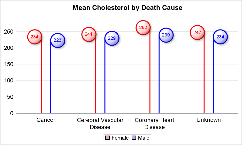
You can see similar axis options in Lollipop Charts. This time there is a horizontal axis line in the graph that displays vertical lollipops but no axis lines in the graph that displays horizontal lollipops. Both look good. You can also see similar axis options in Scatter with Mean Value.

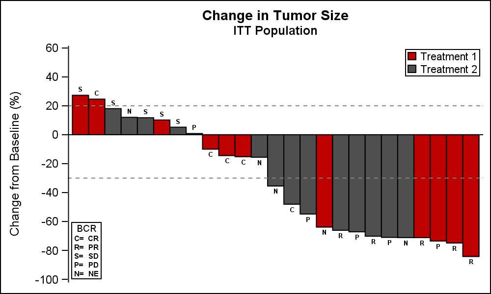
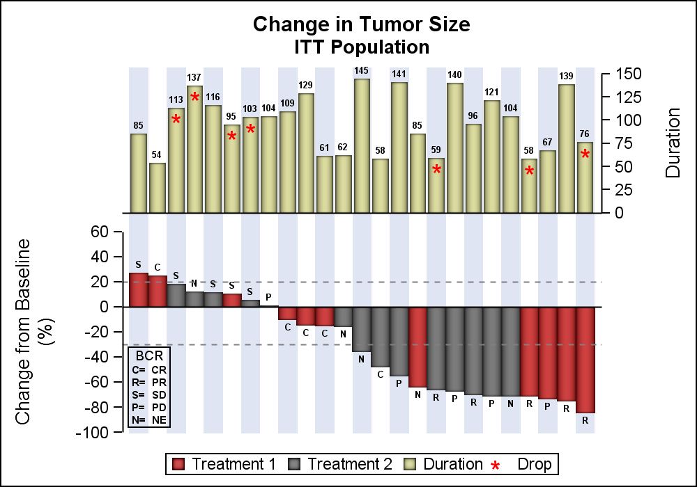
Next, let's look at Clinical Graphs: Waterfall Plot ++. The first graph has no horizontal axis, but it has a full vertical axis that has a line, label, ticks, and tick labels. The next graph is similar, but it contains two charts and a Y and Y2 axis.
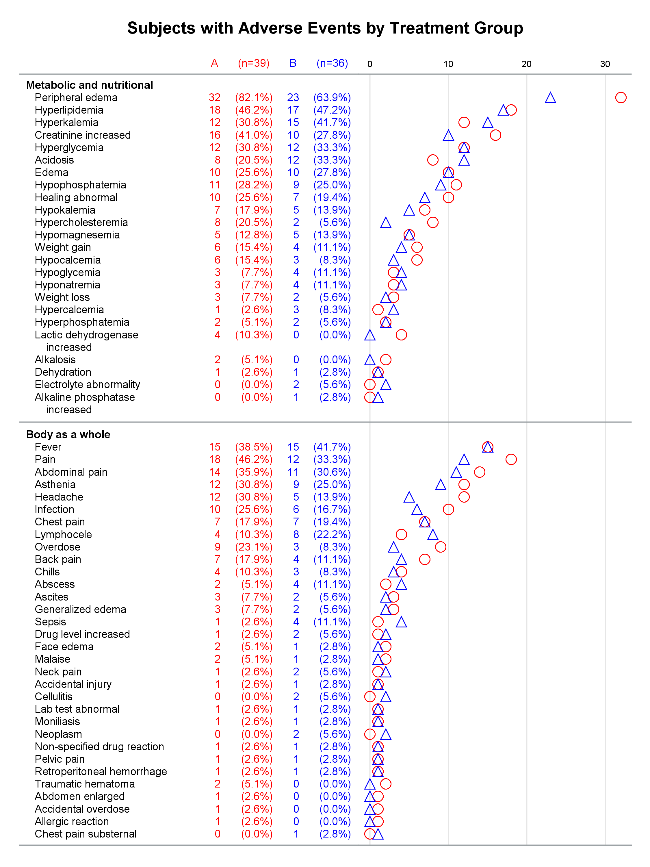
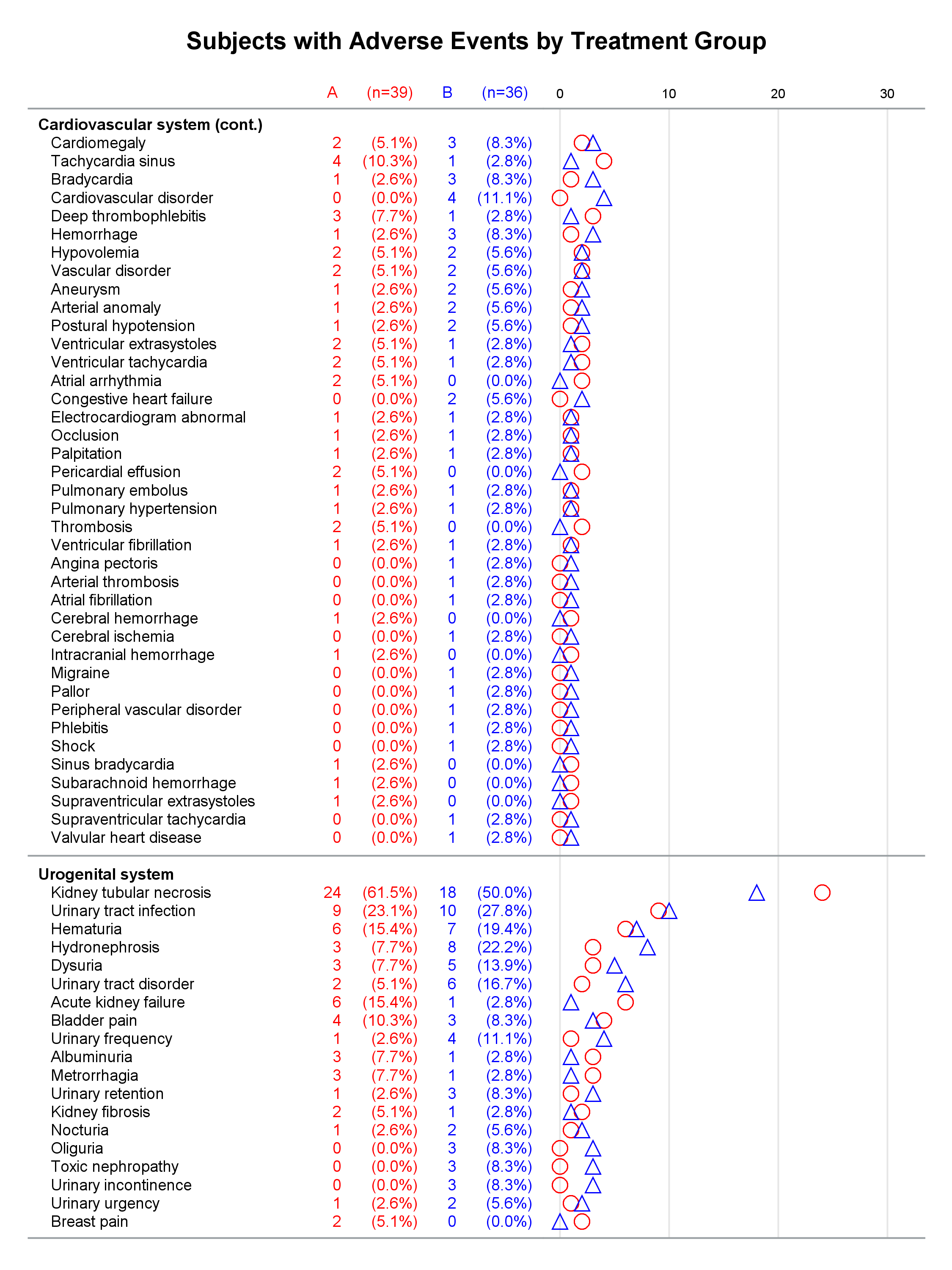
Multipage Adverse Event Reports displays an X2 axis with a line and tick labels. The X axis consists of only a line, and nothing is displayed on the Y axes. The additional horizontal lines are reference lines. Here the goal is to make a multipage report that combines tabular and graphical information.

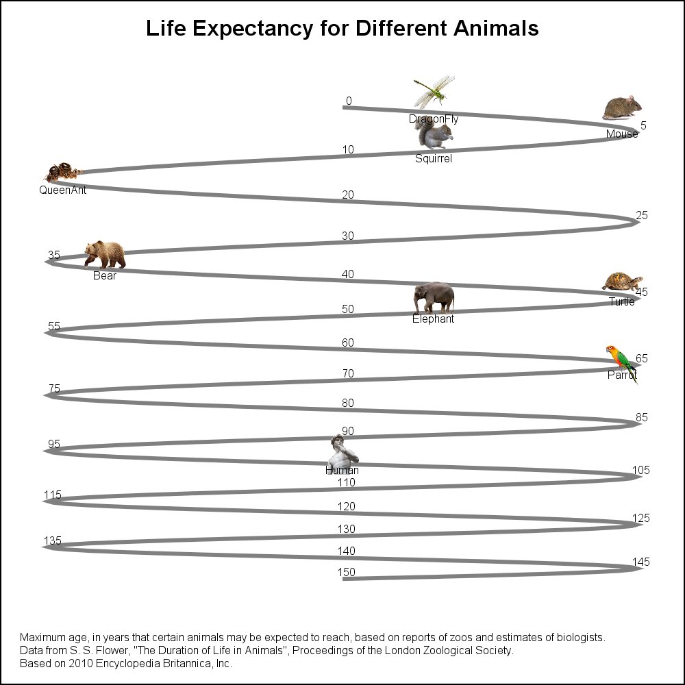
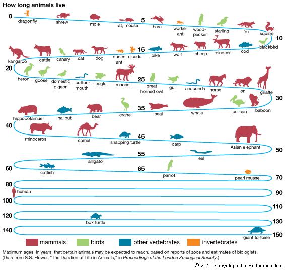
See Animal Life Expectancy Graph for an example of a graph that has no axes. A TEXT statement provides tick label information but not in the traditional tick label locations. Also see A Graph with Visual Categories for other examples of minimal axis options along with the use of images.
Look at other Graphically Speaking posts for other examples of axes. The Stem and Leaf Plot post creates a graph that has no horizontal axis. The Y axis has an axis line and tick labels but no ticks and no axis label. Diagonal Tick Values shows how to deal with long tick labels on the horizontal axis. The SAS/STAT documentation chapter ODS Graphics Template Modification has additional examples. In particular, Example 22.4 Customizing Axes and Reference Lines shows how to put reference lines through the middle of a graph, suppress the top and right axis lines, and display only reference lines and no axes. That section focuses on GTL and not PROC SGPLOT, but you can easily use PROC SGPLOT to do the same things.
proc means data=sashelp.heart;
   var height weight;
   output out=means(where=(_stat_ eq 'MEAN'));
run;

data _null_;
   set means;
   call symputx('hmean', height);
   call symputx('wmean', weight);
run;

proc sgplot data=sashelp.heart noborder noautolegend;
   refline &hmean / axis=x;
   refline &wmean / axis=y;
   pbspline y=weight x=height / degree=3 markerattrs=(size=3) lineattrs=graphfit2;
   xaxis display=(noline noticks novalues);
   yaxis display=(noline noticks novalues);
run; |
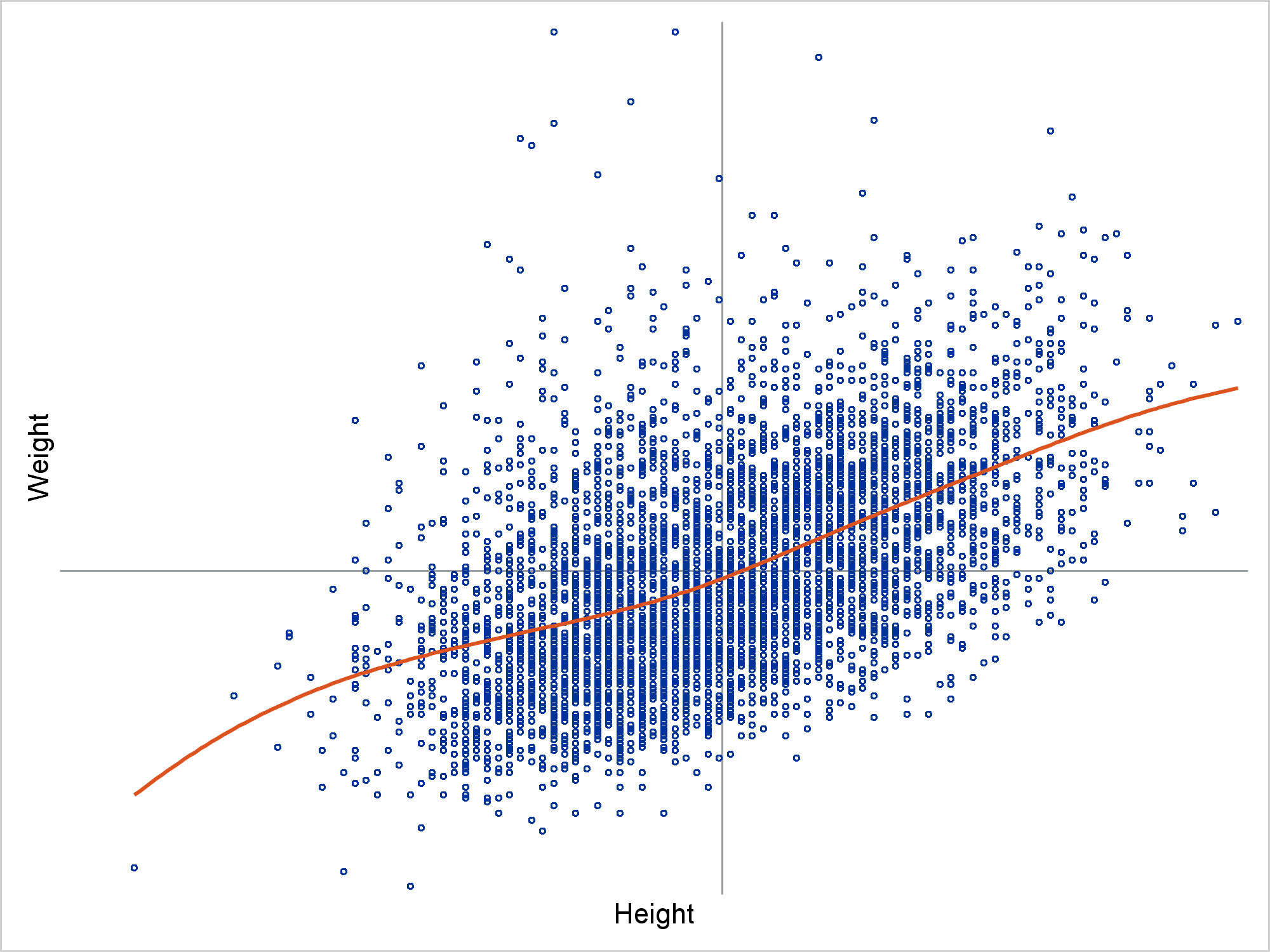
Notice that even with NOLINE specified in the two axis statements, you still need to specify NOBORDER in the PROC statement to fully suppress the axis lines.
In summary, there are four statements that control axes: XAXIS, X2AXIS, YAXIS, and Y2AXIS. Each has a DISPLAY= option that enables you to specify DISPLAY=ALL (the default), DISPLAY=NONE, or DISPLAY=(NOLINE NOTICKS NOLABEL NOVALUES) and choose which part of each axis to suppress. There are many other options including the GRID option, which displays grid lines at each tick. You can also display reference lines. See the XAXIS Statement and REFLINE Statement for more information. Controlling these statements and options enables you to make clean, elegant graphs.


3 Comments
Thanks for the kind words, Warren. Means a lot coming from a highly respected SAS expert.
When delving into "Chart Junk" as defined by Tufte, I sometimes take a less rigorous approach for graphs that are meant for general consumption. On the page of a newspaper or magazine, graphs often have to compete with other information on the page. A visual first has to attract the attention of the reader, and then make sure the information is delivered effectively. So, a little bit of "glitz" may be added just for that purpose. InfoGraphs also fall in this category. Also, many of my articles describe "how" to do something the user asked. Whether one should actually do that or not is a different question. The article with the "Temperature Graph" was intended to describe "how to add image background". The recent article on "Waterfall Pot ++" was addressing the usage of a 3D visual for data that is really 2D.
http://blogs.sas.com/content/graphicallyspeaking/2017/07/30/clinical-graphs-waterfall-plot/
Thank you too for the kind words, Sanjay. I totally agree. A graph constructed for the New England Journal of Medicine has different rules than a graph constructed for a newspaper or magazine. The great thing is that ODS Graphics does a great job of making both types of graphs! I have worked on graphs both with and without glitz. Adding a bit of glitz is more fun!
I am firmly in the bare-bones no-frills camp, but like Warren I find it fun to occasionally create animated greeting cards, fractals, and three-dimensional tori.What consistently surprises me is the number of times that I learn some skill or trick while "playing" that I can later apply to more serious endeavors. Warren's post reinforces that idea. Although I am not likely to use a rainbow as a background image or put an elephant on an axis, I can still learn tricks from these examples about how to customize the appearance of an axis.