In this post, I show how to make a bar chart and an X-axis table; ensure consistency in the order of the legend, bar subgroups, and axis table rows; coordinate the colors for each of those components; and drive all the color choices from an attribute map. I also show how to control the order of the X axis when some combinations are missing and when alphabetical or numeric order is not desired. This level of consistency and attention to detail can mean the difference between a good graph and a great graph.
The data contain account payment statuses for different accounts. There are 2 categorical variables. The variable Site is the site ID, and the variable Paid is the payment status. The values of the Site variable are Roman numerals. The Paid variable is an ordered categorical variable with values "> 90 days", "> 30 days", and "Current"; and they need to be displayed in that order throughout the graph. This variable naturally lends itself to a traffic-light color coding: green for the best value ("Current), red for the worst value ("> 90 days"), and yellow for the intermediate value ("> 30 days). You cannot properly sort the data by using PROC SORT and either of the raw variables.
(Click on graphs to enlarge.)
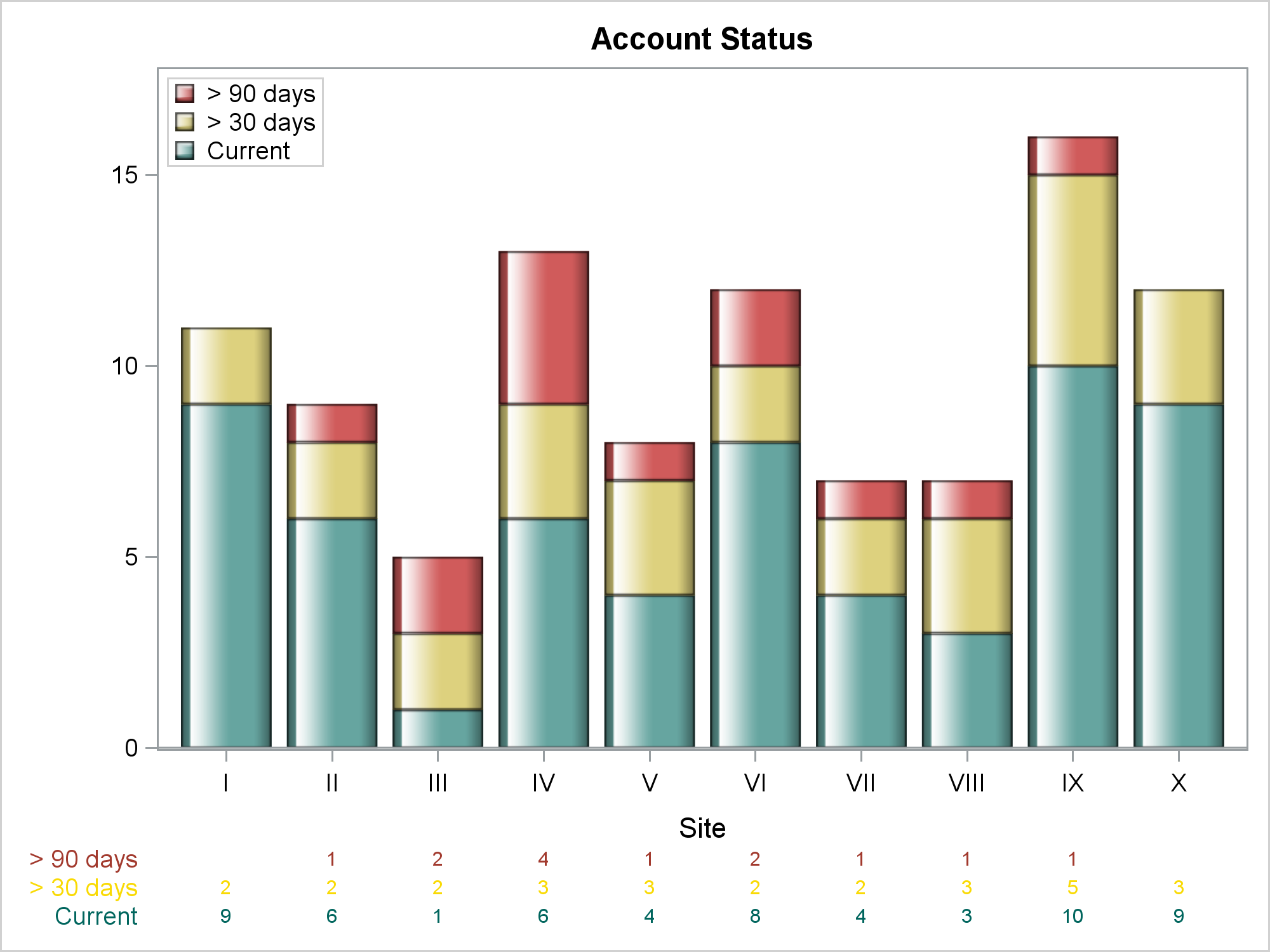
Notice that the legend, bars, and axis table rows all are ordered red, yellow, green. Both the axis table rows and the row labels also follow this color scheme. The colors are not pure red/yellow/green; rather, they are come from the style elements GraphData2, GraphData12, and GraphData3 of the HTMLBlue style. Also notice that the sites are displayed in numerical order.
The following step makes the random data, which has the two character variables:
data x(drop=j i);
   length Site Paid $ 10;
   do i = 1 to 100;
      site = put(ceil(uniform(7) * 10), roman10.);
      j = uniform(7) * 5;
      paid = ifc(j lt 3, 'Current', ifc(j lt 4.5, "> 30 days", "> 90 days"));
      output;
   end;
run; |
The Paid variable is constructed so that most accounts are current, some are greater than 30 days, and a few are greater than 90 days. Not all sites have accounts with a greater than 90 day status. You can use PROC FREQ and the SPARSE option to create a data set that has all of the combinations of Site and Paid (including those that do not actually appear in the data set) and the variable Count (the number of times each combination occurs).
proc freq data=x; tables site * paid / sparse noprint out=c(drop=percent); run; |
The following step creates the attribute map:
data attr(drop=n);
   retain ID 'a' Show 'AttrMap' ;
   input Value $ 1-9 n;
   LineStyle        = cats('GraphData', n);
   MarkerStyle      = linestyle;
   FillStyle        = linestyle;
   TextStyleElement = linestyle;
   datalines;
> 90 days 2
> 30 days 12
Current   3
; |
It reads the instream data set that contains the values of the account status, and the number of the GraphDatan style element that is used for each. Assignment statements create all of the style variables that are available in an attribute map (even those that do not get used in this particular example). The variable Show='AttrMap' makes the legend appear in the order of the values in the attribute map data set. The following step shows a first pass at making the graph.
proc sgplot data=c nocycleattrs dattrmap=attr; title 'Account Status'; vbar site / response=count group=paid attrid=a; xaxistable count / textgroup=paid attrid=a; yaxis label=' ' offsetmax=0.1; keylegend / location=inside position=topleft across=1 title='00'x; run; |
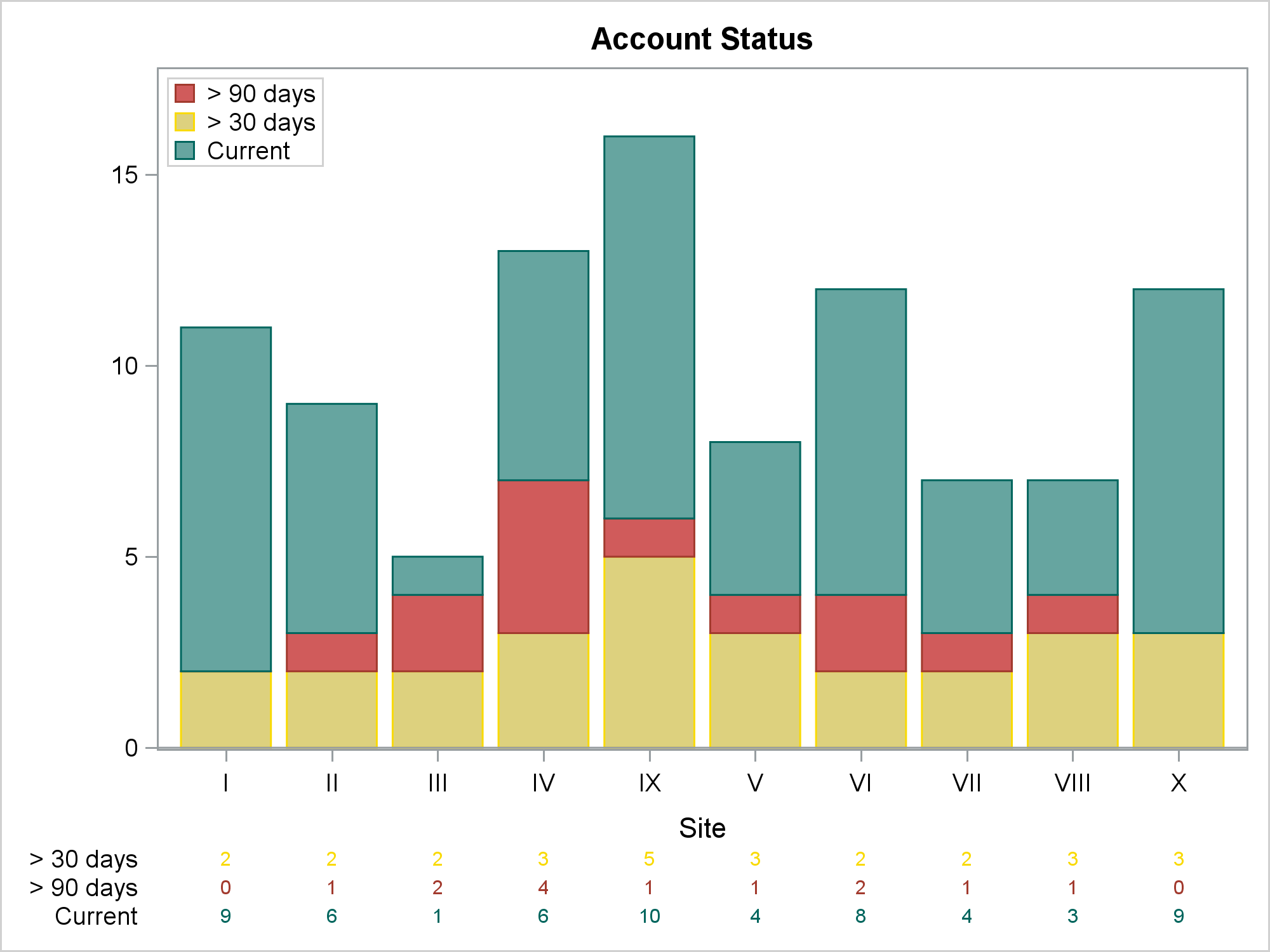
All the right information is there, but neither the bars (green, red, yellow) nor the axis table (yellow, red, green) match the legend (red, yellow, green). Also, the axis table row labels are all black. Furthermore, the X axis values are not sorted in the desired order. The rest of the example shows one way to make everything match.
We need to create two variables that we can use to sort the data set into the desired order. One way to do that is by using PROC FORMAT, INFORMAT statements, a DATA step, and the INPUT function:
proc format; invalue sitef 'I'=1 'II'=2 'III'=3 'IV'=4 'V'=5 'VI'=6 'VII'=7 'VIII'=8 'IX'=9 'X'=10; invalue paidf '> 90 days'=1 '> 30 days'=2 'Current'=3; run; data x2; set c; array _cc[3]; s = input(site, sitef.); p = input(paid, paidf.); if count eq 0 then count = .; _cc[p] = count; run; |
The variables S and P contain integers. When the data set X2 is sorted by S and P, the data are in the right order. This step does two other things. Zero counts are replaced by missing values so that zero counts are not displayed. Also, three additional count variables are created--one for each of the payment statuses. They are needed in order to control the colors of the axis table row labels. Each variable has one block of nonmissing values and two blocks of missing values.
The following step sorts the data:
proc sort data=x2 out=sorted(drop=p s); by s p; run; |
The PROC SORT step will not succeed in putting all of the observations in the desired order if it were used on the raw data set, which has missing combinations. It succeeds here because the SPARSE option in PROC FREQ provides the missing categories, so all categories of both variables can be sorted into the proper order.
The only way to control the colors of the axis table row labels is by using options. They are not directly controllable by the attribute map through some minor variation of the PROC SGPLOT syntax shown previously. Instead, three XAXISTABLE statements are written to a macro variable by the following step:
data _null_;
   set attr;
   length s $ 2000;
   retain s;
   s = catx(' ', s, 'xaxistable', cats('_cc', _n_), '/ x=site valueattrs=',
            linestyle, 'labelattrs=', linestyle, cats('label="', value, '"'), ';');
   call symputx('axistable', s);
run; |
The values of the options come from the attribute map. The preceding step stores the following statements in the macro variable AxisTable:
xaxistable _cc1 / x=site valueattrs= GraphData2 labelattrs= GraphData2 label="> 90 days" ; xaxistable _cc2 / x=site valueattrs= GraphData12 labelattrs= GraphData12 label="> 30 days" ; xaxistable _cc3 / x=site valueattrs= GraphData3 labelattrs= GraphData3 label="Current" ; |
Each statement has options that use the right style element for both the values and the labels.
The following step creates the final graph that is displayed near the top of the blog:
options missing=' ';
proc sgplot data=sorted dattrmap=attr nocycleattrs;
   title 'Account Status';
   vbarparm category=site response=count / group=paid attrid=a
            grouporder=reversedata dataskin=gloss;
   &axistable
   yaxis label=' ' offsetmax=0.1;
   keylegend / location=inside position=topleft across=1 title='00'x;
run;
options missing='.'; |
The data are sorted by the S variable, so the Roman-numeral site numbers are in the proper order. The values of the GROUP=Paid variable are sorted into GROUPORDER=REVERSEDATA order, which matches the order of the legend. (The default ordering displays the first group at the X axis, and subsequent groups are displayed above it.) The AxisTable macro variable inserts the three XAXISTABLE statements in the right order. The legend placement in the top left is ad hoc and might need to change for other data. The statement OPTIONS MISSING=' ' displays missing values as blanks.
If you decide to use other colors, you only need to change the attribute map and rerun the code. All color specifications (even those in the generated XAXISTABLE statements) come from the attribute map. If you are a regular reader of Graphically Speaking, you know that attribute maps provide control over groups. However, you might not think to use them to drive writing statement options. By using an attribute map and a few extra steps, you can provide complete control over color and order and make a gorgeous graph.


2 Comments
Pingback: Advanced ODS Graphics: Range Attribute Maps - Graphically Speaking
Pingback: Advanced ODS Graphics: Range Attribute Maps - Graphically Speaking