This is the 4th installment of the Getting Started series. The audience is the user who is new to the SG Procedures. Experienced users may also find some useful nuggets of information here.
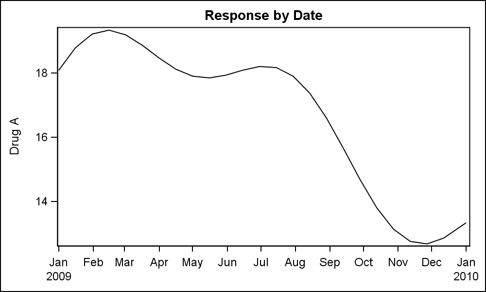 Series plots are frequently used to visualize a numeric response on the y-axis by another numeric variable on the x-axis. Often the variable on the x-axis is a time variable, in which case these are known as TimeSeries plots. In such cases, the slope of the line provides significant information on the rate of change of the response. A basic Series plot of a response over time along with the data set is shown on the right.
This graph shows the plot of "Drug_A" variable by Date. The data set has multiple columns, one each for the response for each drug. We are plotting only the response for Drug_A. Since the x-axis uses a numeric variable with a SAS date format, the x-axis only displays the "year" when necessary. The SGPLOT code for this graph is shown below.
 title 'Response by Date';
proc sgplot data=seriesMultiVar subpixel;
series x=date y=Drug_A;
xaxis display=(nolabel);
run;
I have set an x-axis option to suppress the display of the x-axis label as it is redundant in this graph. You can click on the graph to get a higher resolution image. There you will see that the curve is not smooth as there is a 15 day interval between the observations. Each (x, y) point is connected with a straight line in data order, creating a faceted appearance.
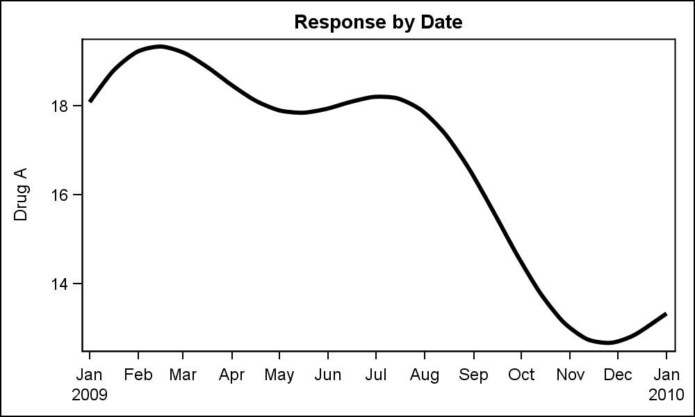 The curve will be smoother if more data points are provided. Or, in this case we can add the SMOOTHCONNECT option to get a smoother display of the data. The curve still passes through each data point that is provided. The graph on the right also increases the thickness of the connect line using the LINEATTRS=(THICKNES=3) option.
title 'Response by Date';
proc sgplot data=seriesMultiVar subpixel;
series x=date y=Drug_A / smoothconnect
lineattrs=(thickness=3);
xaxis display=(nolabel);
run;
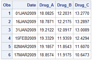
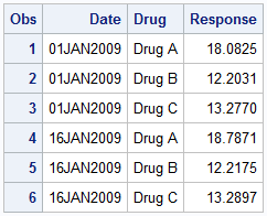
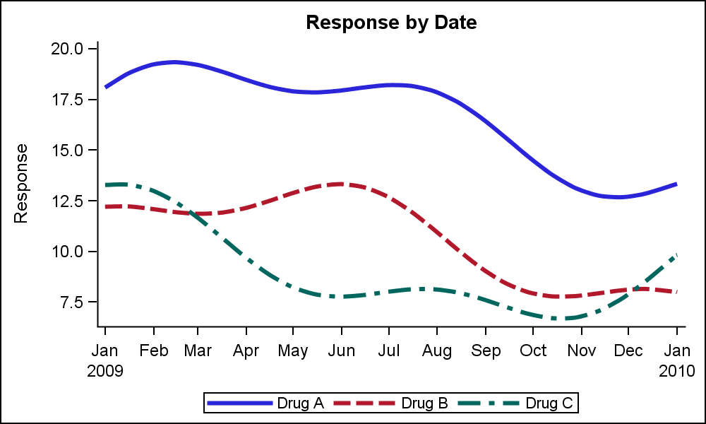 As you can see in the view of the data set above, we have three different columns for drug response, "Drug_A", "Drug_B" and "Drug_C". To get a plot of all three columns, we simply add as many SERIES plot statements as we need. For each plot we have the option to set the plot attributes as we want such as the line color or pattern, or the thickness or other attributes. Note the NOBORDER option to drop the inner frame around the data.
title 'Response by Date';
proc sgplot data=seriesMultiVar subpixel noborder;
series x=date y=Drug_A / smoothconnect lineattrs=(thickness=3);
series x=date y=Drug_B / smoothconnect lineattrs=(thickness=3);
series x=date y=Drug_C / smoothconnect lineattrs=(thickness=3);
xaxis display=(nolabel);
yaxis label='Response';
run;
Note, in the code above, we have not specified the line color or pattern. However, the SGPLOT procedure has detected the overlay of three series, and has automatically assigned different attributes for each series from the GraphData1-12 style elements of the active style, in this case LISTING. The CYCLEATTRS option does this assignment. You can turn off CYCLEATTRS if you do not want such automatic attribute assignment. Note a legend is automatically generated to display the response labels for each curve.
 Often users have questions on what is the best way to arrange their data to create SERIES plots. in the case above, separate SERIES statements are used, one for each variable. However, sometimes the number of curves in a data set may vary from day to day. In such cases it is better to use the GROUP feature of the SERIES plot.
In the data shown on the right, we have transposed the multi-variable "wide" data into a "long" grouped format. Here, the variable to be plotted is provided as a group, with the value provided as a single Response column. Now, we can use the GROUP option of the series plot to display this data using one SERIES statement. The curves are plotted using the group id to connect the points for the curve. All the curves now get same attributes except the group color and pattern, which are changed automatically based on group.
 ods graphics / reset attrpriority=color;
title 'Response by Date';
proc sgplot data=seriesGroup noborder;
series x=date y=response / group=drug
lineattrs=(thickness=3) curvelabel
arrowheadpos=end arrowheadshape=barbed;
xaxis display=(nolabel);
yaxis display=(noline noticks) grid;
run;
In the graph above, I have made the following changes:
- I added curve labels, which often make it easier to decode the information in the graph as the variable name is placed close to the curve, and one does not have to refer to the legend to decode the data.
- I added arrowheads. Note, for arrowheads to work well with thick lines, one has to provide enough distance between the last two observations on the curve. If you look at the code linked below, you will see I have done just that.
- I used the YAXIS statement to turn off the y-axis line and ticks and added grid lines. This provides an alternate clean appearance for the graph.
- I used ATTRPRIORITY=COLOR in the ODS GRAPHICS statement to avoid usage of line patterns in this graph. See article on attribute priority.
Finally, the SERIES plot statement has support for multiple grouping for color and patterns. This is very useful to create Spaghetti Plots, where the curves are grouped by multiple classifiers, such as Year and Region. This can be done using the grouplc and grouplp options.
SGPLOT code: Getting_Started_4_Series

1 Comment
Pingback: Getting started with SGPLOT - Index - Graphically Speaking