Funnel graphs are useful to track the number of visitors passing through various pages of a website or the number of patients in a study. The graph shows visually the retention of users or subjects in a study across levels of a marketing cycle or the study.
One common representation of the Funnel Chart or Funnel Graph found on the web is shown below. This graph depicts the number of customers across different stages on a web site selling some product. In this example, 268,514 customers enter the web site home page. Then, 142,091 go to the "Store" page, and so on.
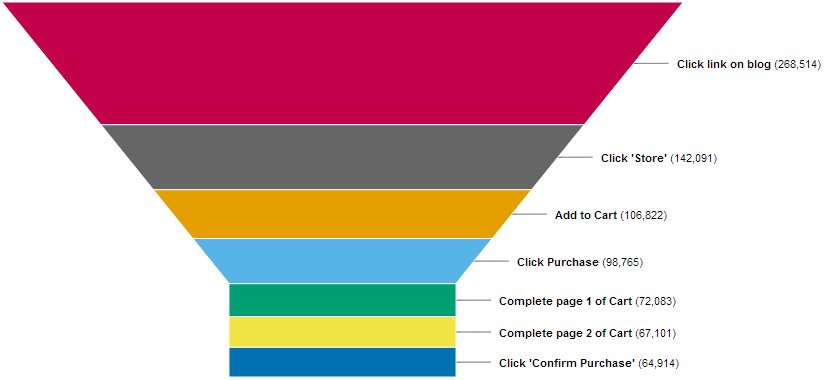
In this example, the slopes of the sides of the funnel is constant (maybe some predetermined angle, say 30 degrees), and the number of customers appears to be represented by the volume of each segment. The number of customers reaching "Store" are only 52.9% of the ones that visited the web page, but this is not "visually" clear. The thickness of the segment varies, a closer examination of the visual is needed to see where the loss of customers is happening.
It has been empirically shown in published studies that the most effective way to make visual comparison of magnitude is by using linear distances from a common baseline. Linear distance from non common baselines is also very effective. Comparisons of areas is much less effective. Following this idea, I decided to take a different approach, where the thickness of each segment is held constant, and the width is varied by the number (or percent) of people in a stage. For this case, I made up some data shown below.
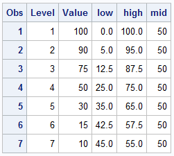
The data contains the percent of subjects in a study level, starting with 100% down to 10%. Level numbers are shown. A simple bar chart can be easily created, but we want a "Funnel" shape. So, Mid, Low and High values are computed to place each bar aligned in the center as shown below. The value for each bar is displayed in the middle. A HIGHLOW plot is used to create the graph.
SGPLOT code:
proc sgplot data=funnel nowall noborder noautolegend;
highlow y=level low=low high=high / type=bar dataskin=matte;
text y=level x=mid text=value / textattrs=(size=12) strip;
yaxis reverse display=none;
xaxis display=none;
run;
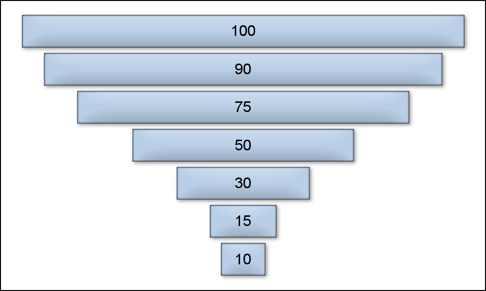
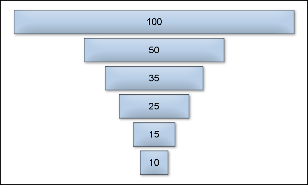
This simple graphs works quite well visually showing the data and providing a feel for the severe or gentle drop off of customers by stage. A similar graph is shown below for a different data with more severe loss of customers after stage 1. Only the data is different, the program code is the same as above.
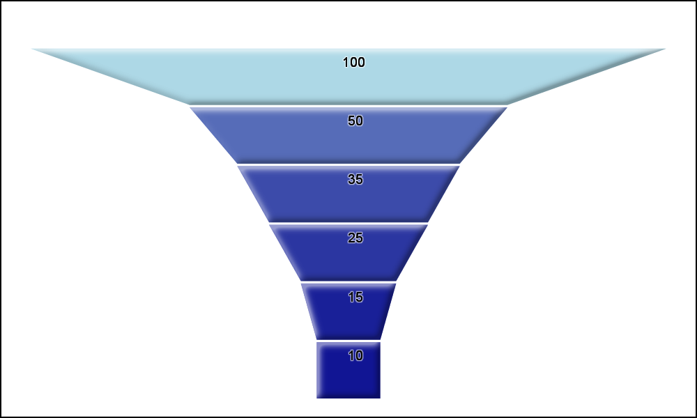
Now, let us take the next step to create a graph that looks more like a "Funnel". We will do this by generating trapezoidal polygons for each level from the data. The the upper width of the trapezoid represents the value of the upper segment and the lower width of the trapezoid represents the value of the next lower segment. The bottom segment is rectangular.
The step for creating the funnel shape can be made into a macro. But, I admit I was a bit lazy, and I just included the code in the link below. The generated data snippet is shown below. Note, four observations are generated for each original observation in the data, with common "ID" to define the trapezoid. X and Y values are generated for each vertex of the trapezoid
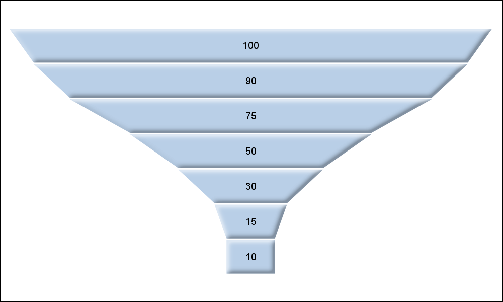
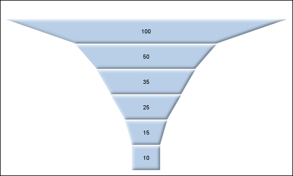
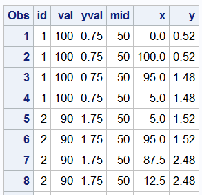 Here are the Funnel Graphs for the two data sets used above. Note how the shape of the Funnel gives a good feel for the progress of customers through the site. It could be concluded that the top level web page in the second case is less inviting to the customers to click on subsequent links.
SGPLOT Code:
proc sgplot data=funnel3 nowall noborder noautolegend;
polygon x=x y=y id=id / label=val fill dataskin=sheen;
yaxis reverse display=none;
xaxis display=none;
run;
Note the use of the POLYGON plot to display each segment. DATASKIN=SHEEN produces the bevelled edges for each polygon automatically. The polygon LABEL option itself is used to display the value.
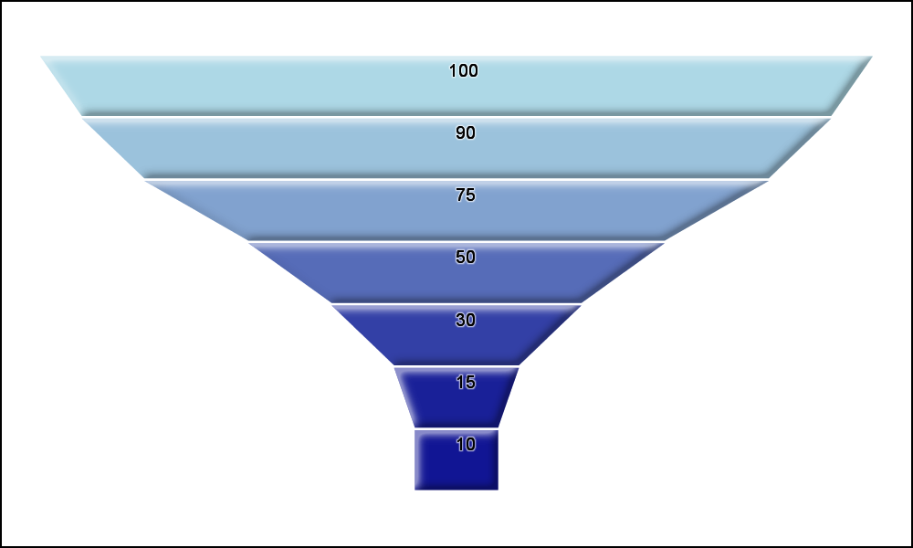
A further enhancement can be added to color each level by a response (or traffic) for the level. A simple Range Attribute Map can be used as defined below. Here the color range varies between DarkBlue for response value of 0 and LightBlue for response value of 100.
A TEXT plot is used to display the segment value, and is shifted to the upper edge of the segment. Also, BACKLIGHT option is used to ensure display of the values regardless of the segment color. Click on the graph for a higher resolution image.
data rangeMap;
id='a';
min=0; colormodel1='DarkBlue';
max=100; colormodel2='LightBlue';
output;
run;
proc sgplot data=funnel3 nowall noborder noautolegend rattrmap=rangeMap;
polygon x=x y=y id=id / fill dataskin=sheen colorresponse=val rattrid=a;
text x=mid y=yval text=val / backlight=0.25;
yaxis reverse display=none;
xaxis display=none;
run;

9 Comments
There is also a statistcal plot called the "funnel plot," which enables you to compare doctors, hospitals, schools, etc in terms of some performance metric. In case a SAS user is looking for that kind of a funnel plot, see "Funnel Plots" and "Funnel Plots for Proportions"
Very cool example. Note that a 10% conversion rate (from blog page clicking all of way through to purchase) would be a dream campaign -- the rate is much more likely to be a fraction of a percent. You might need to come up with a way to represent that scale as you progress to the bottom of the funnel.
Since you say "the most effective way to make visual comparison of magnitude is by using linear distances from a common baseline," wouldn't a more effective chart be a simple bar chart with percent on the vertical axis and "level" (or time) on the horizontal? Looking at a funnel chart tricks the mind into thinking that the throughput rate is twice as high as it actually is because you are centering the bars instead of left-aligning them.
I agree. However, the topic here is "Funnel" graph. So, I had to work under those constraints. Still a better representation of magnitude than use of areas.
What Chris mentions is true, most often it will get so thin that it would hardly be visible. I played with the Windows and Mac Zoom keys to get in close. Eventually they will show up. Some sort of zoom control down by the funnel bottom might be useful. I am not sure something could be created that would work with html, rtf, pdf etc.
This would be a useful graph for pharmaceutical studies which are having an issue with patients going off study.
Good point from you and Chris. We could "threshold" the smaller values so we always draw a few pixels, even if the actual representation becomes subpixel. Something will be drawn unless the value becomes zero.
Thanks for keeping up with these great examples over time.
You are welcome. Keep the feedback coming too.
Pingback: Change the missing-value color by using a range attribute map - The DO Loop