Today, I will introduce you to ways to add lines, curves, and fit functions to graphs. Much of today's post discusses basic PROC SGPLOT functionality, but there are a few advanced topics too including how to create piecewise polynomial splines. I will illustrate the REG, PBSPLINE, LOESS, SERIES, and SPLINE statements in PROC SGPLOT. I will also mention the GROUP= and BREAK options in the SERIES statement, which enable you to display separate functions for different groups of observations.
The Sashelp.ENSO data set provides a nice example of a nonlinear dependency. Pressure differences between Easter Island and Darwin, Australia depend both on the season and on El Nino. The following step shows you how can use:
proc sgplot data=sashelp.enso;
   title 'El Nin(*ESC*){unicode tilde}o Southern Oscillation';
   reg      y=Pressure x=Month;
   pbspline y=Pressure x=Month / nomarkers;
   loess    y=Pressure x=Month / nomarkers;
   reg      y=Pressure x=Month / nomarkers degree=4 legendlabel='Polynomial';
run; |
Click on graphs to enlarge.
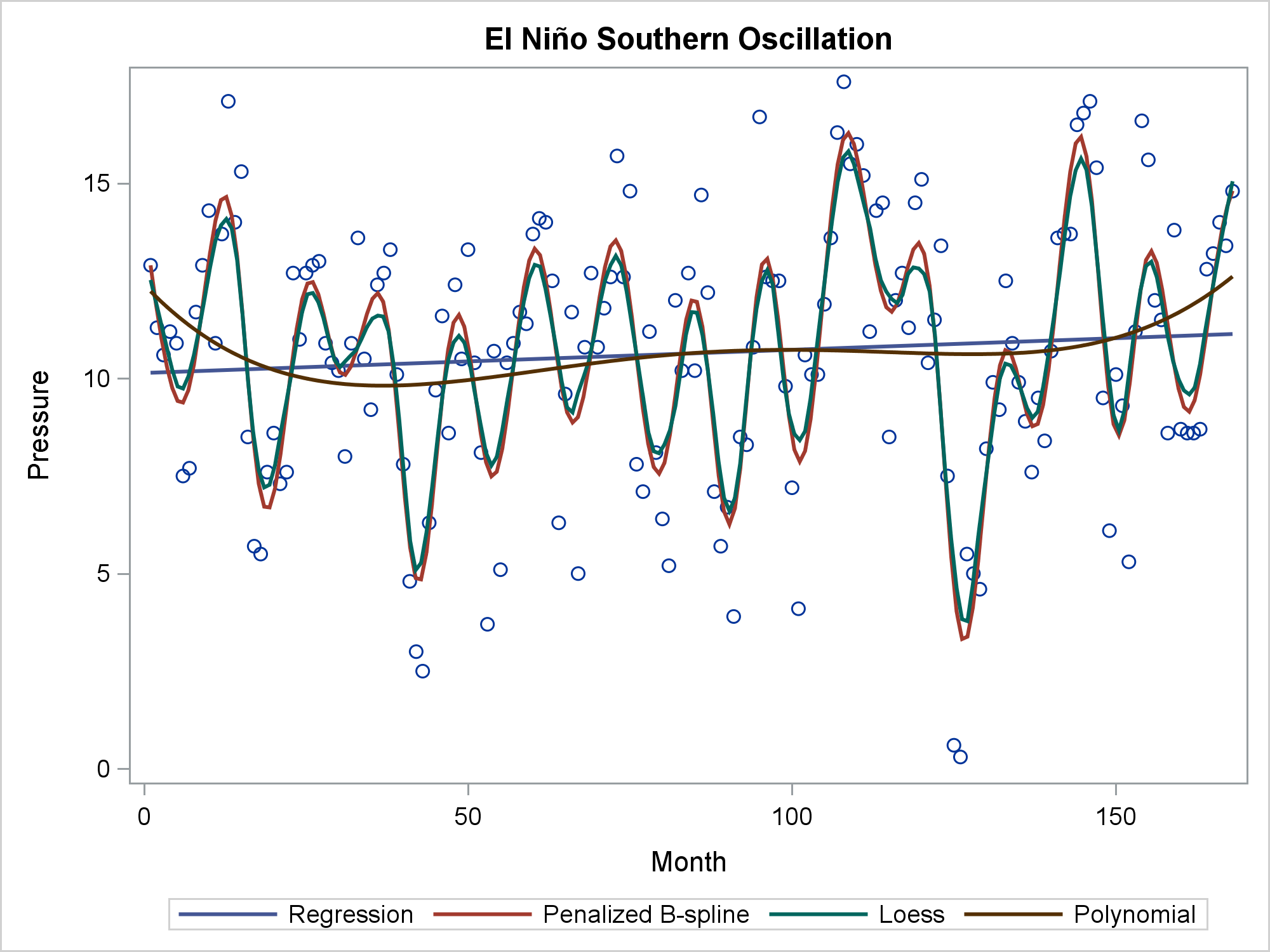
You usually specify one of these statements, but you can specify any number, and it is instructive to compare multiple functions in one plot. The linear regression function (DEGREE=1) is a straight line. The DEGREE=4 polynomial regression function has some curvature. The penalized B-spline and the loess fit are almost identical for these data. Both are highly flexible and automatically find the seasonal changes.
The PBSPLINE statement can also be used to fit polynomial spline functions with or without knots, and with or without automatic smoothing. These are the same kinds of functions that you can fit by using PROC TRANSREG. The REG statement and the first PBSPLINE statement (SMOOTH=0, NKNOTS=0, DEGREE=3) both fit a degree three polynomial with no smoothing or knots. Both produce the same cubic polynomial fit function. The SERIES statement displays the PROC TRANSREG predicted values, which are the same as the penalized B-spline with SMOOTH=0, DEGREE=3, and NKNOTS=9. The SMOOTH=0 option disables the automatic smoothing. You can vary the number of knots to fit more- or less-smooth piecewise polynomial spline functions.
proc transreg data=sashelp.enso plots=none noprint;
   model ide(pressure) = spl(month / nknots=9 evenly);
   output out=b p;
run;

proc sgplot data=b;
   pbspline y=Pressure x=Month  / smooth=0 nknots=0 degree=3
            legendlabel='B-Spline' lineattrs=GraphData1(thickness=10);
   reg      y=Pressure x=Month  / nomarkers degree=3 legendlabel='Polynomial'
            lineattrs=GraphData2(thickness=3);
   series   y=PPressure x=Month / legendlabel='Transreg'
            lineattrs=GraphData3(thickness=10);
   pbspline y=Pressure x=Month  / nomarkers smooth=0 nknots=9 degree=3
            legendlabel='B-Spline with Knots' lineattrs=GraphData5(thickness=3);
   keylegend / location=inside across=1 position=bottomleft noborder;
   yaxis label='Pressure';
run; |
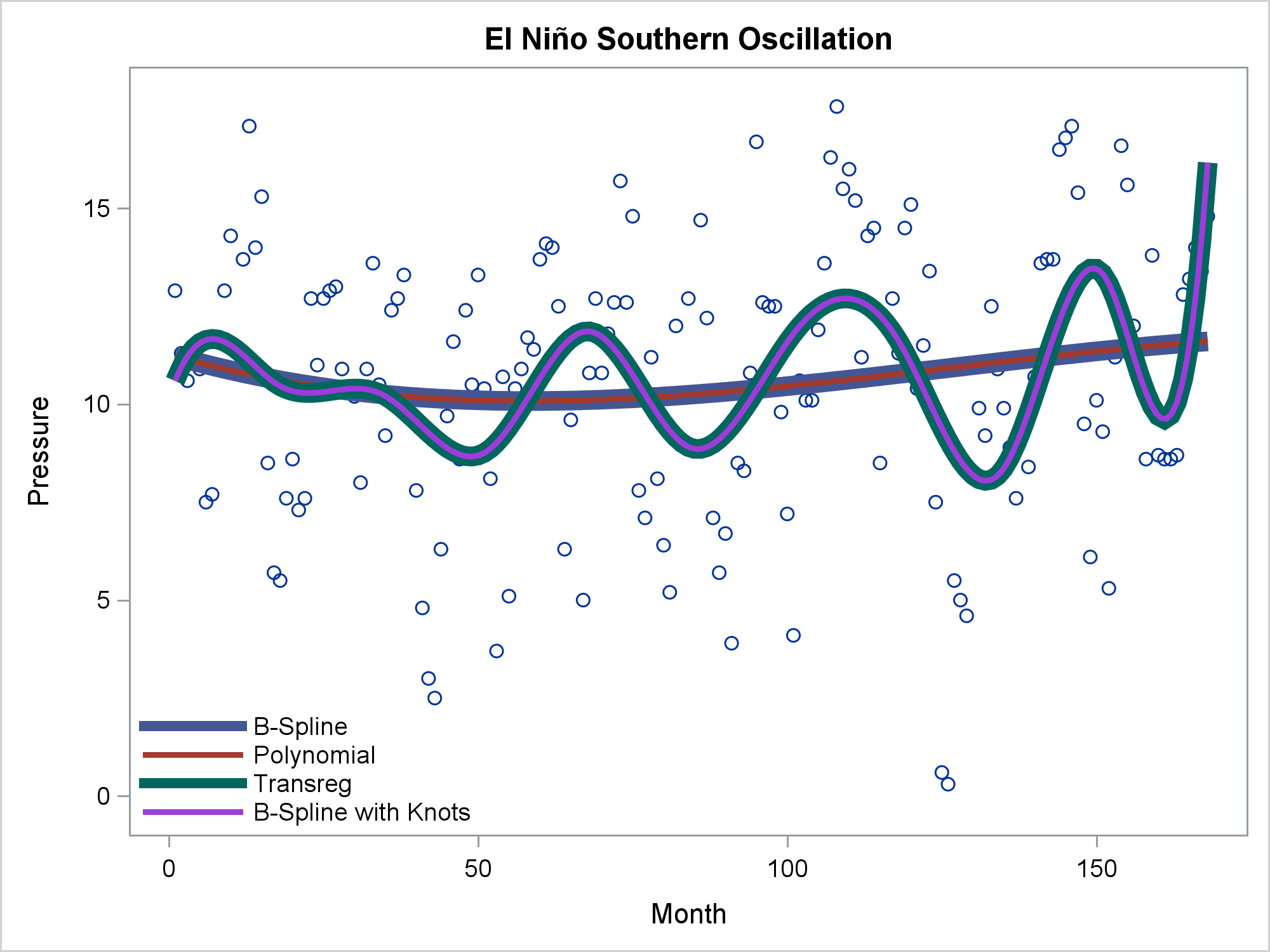
You can use the REG statement to fit linear or polynomial functions, the PBSPLINE or LOESS statements to fit smooth functions with automatic smoothing, or the PBSPLINE statement along with DEGREE= and NKNOTS= options to explicitly control the fit. This example also shows the SERIES statement, which connects the points with no smoothing. (The TRANSREG function appears smooth, even though there is no smoothing, because the line segments are short.)
Now consider the problem of displaying a curve that passes through a small number of points.
data tests; input Day mmddyy8. Results; y3 = Results - 0.015; y2 = y3 + 0.015; y1 = y2 + 0.015; cards; 9/16/15 .115 9/21/15 .108 10/19/15 .102 3/24/16 .082 5/12/16 .06 8/18/16 .027 11/28/16 .027 ; |
The following steps fit a line, a cubic polynomial, and a penalized B-spline.
proc sgplot data=tests; title 'Sparse Data - Unsatisfactory Results from Using the Wrong Methods'; reg y=Results x=day / legendlabel='Linear'; reg y=Results x=day / nomarkers degree=3 legendlabel='Cubic'; pbspline y=Results x=day / nomarkers; format day mmddyy8.; xaxis display=(nolabel); yaxis min=0 offsetmin=0; run; |
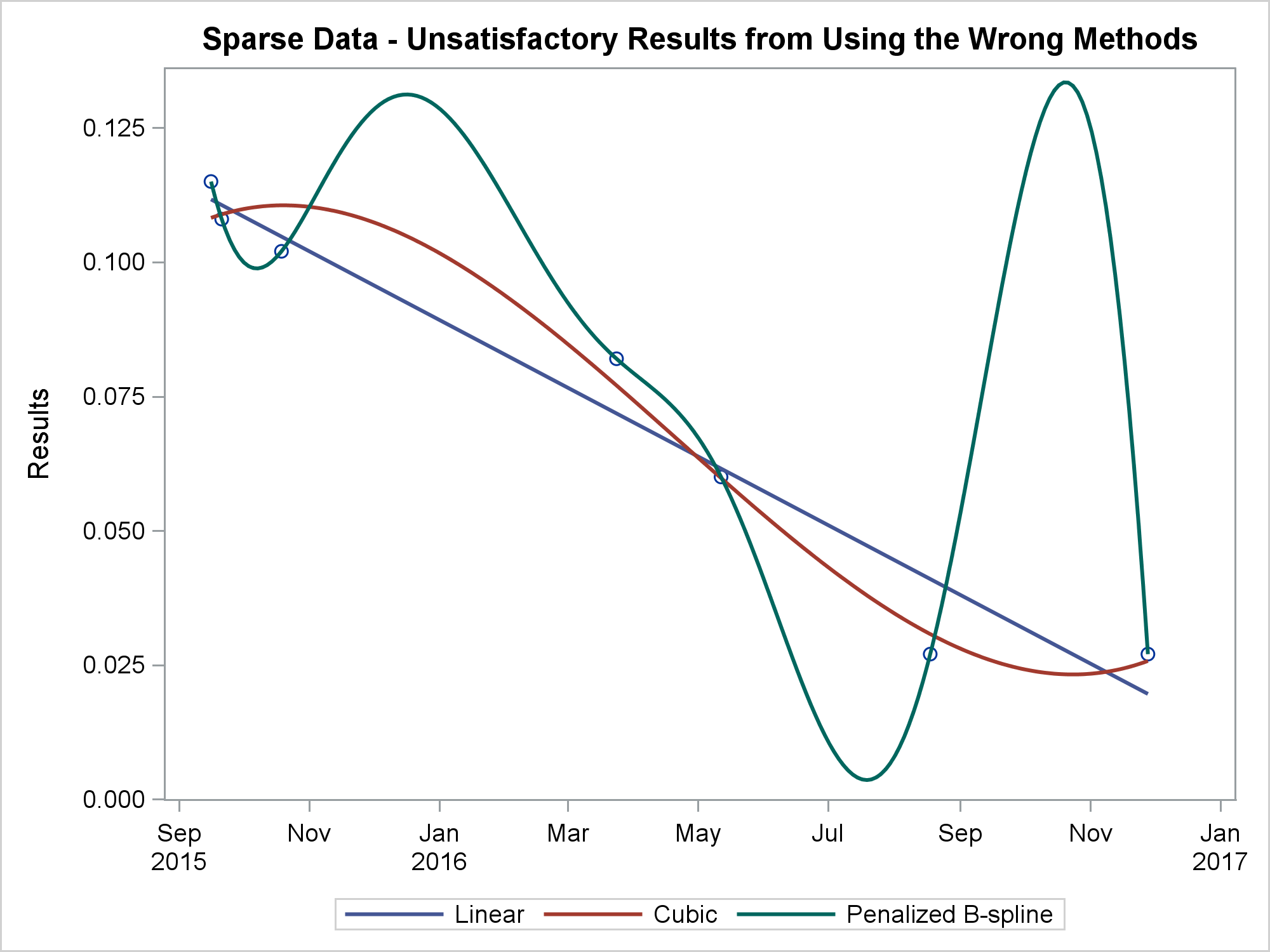
None of these is satisfactory, particularly the penalized B-spline, which is not designed for sparse data sets. The following step shows three alternatives:
proc sgplot data=tests; title 'Sparse Data'; scatter y=y1 x=day / markerattrs=GraphData1; scatter y=y2 x=day / markerattrs=GraphData2; scatter y=y3 x=day / markerattrs=GraphData3; series y=y1 x=day / lineattrs=GraphData1 legendlabel='Series' name='a'; spline y=y2 x=day / lineattrs=GraphData2 legendlabel='Spline' name='b'; series y=y3 x=day / lineattrs=GraphData3 legendlabel='Smooth' name='c' smoothconnect; format day mmddyy8.; xaxis display=(nolabel); yaxis min=0 offsetmin=0 label='Results' display=(noticks novalues); keylegend 'a' 'b' 'c' / location=inside across=1 position=topright; run; |
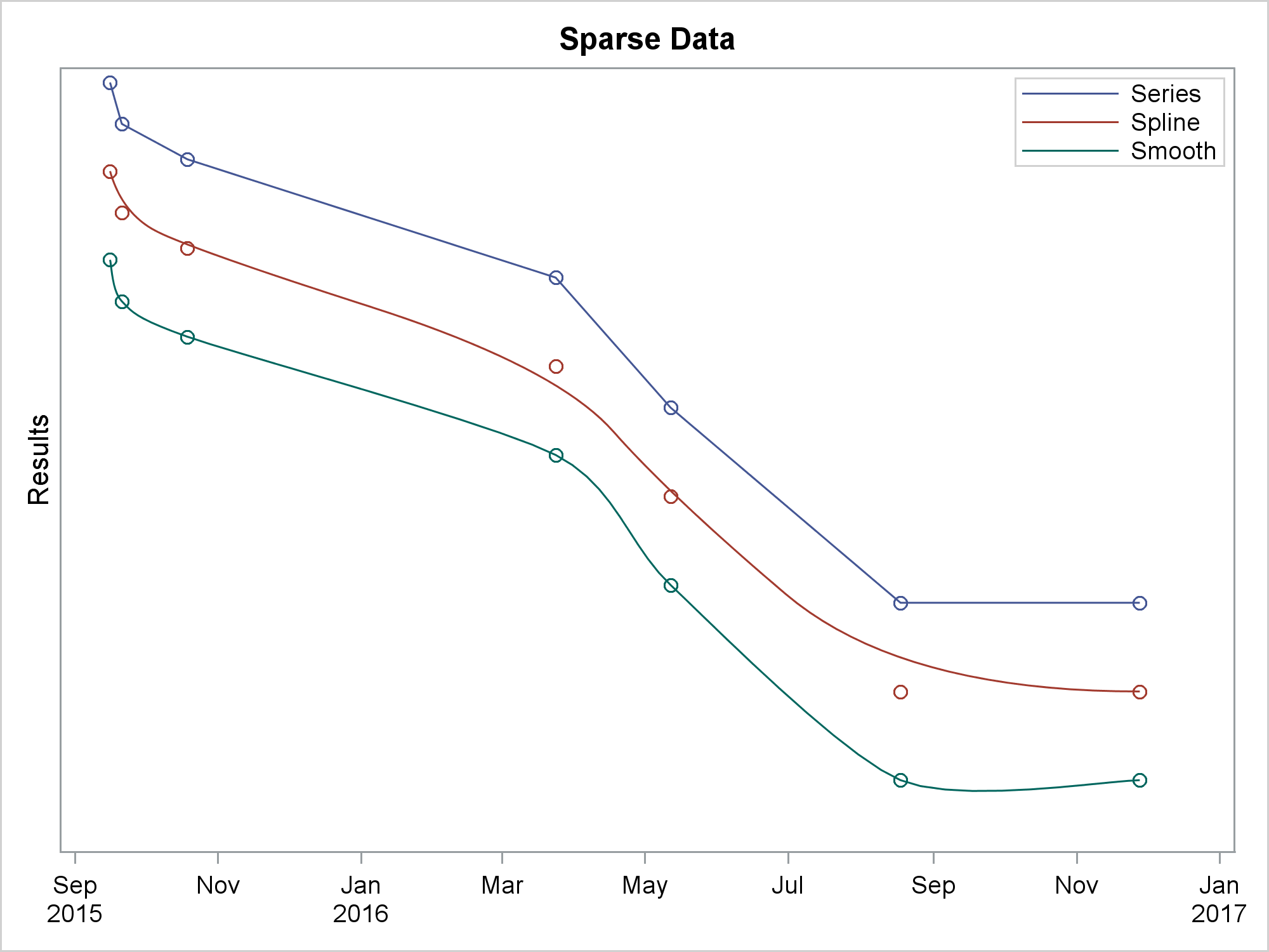
In the interest of space and clarity, all three functions are displayed in the same graph, but each is vertically offset so that they do not intersect. The first SERIES statement connects the points. The SPLINE statement is similar to the SERIES statement, but it draws a curve instead of a series of line segments, and the curve is not required to touch every point. The SERIES statement along with the SMOOTHCONNECT option connects every point by using a smooth function.
The next steps illustrate groups. The following step reads some artificial data for patients in two groups: treatment and control.
Click here for the data.
The following step displays the results for each patient:
proc sgplot data=patients; series y=results x=date / group=id; run; |
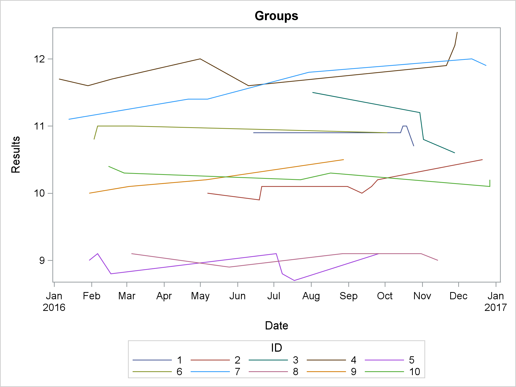
The patient ID is specified as the GROUP= variable. When a new group is encountered, the previous series plot ends and a new one starts. If you want to display a different group variable, then you need a different way to mark the end of a series plot. You can add a row to the data set that has a missing value for the Y= variable after each group:
data p2;
   set patients;
   by id;
   output;
   if last.id then do;
      results = .;
      output;
   end;
run;

ods graphics on / attrpriority=none;
proc sgplot data=p2;
   styleattrs datasymbols=(circlefilled squarefilled) datalinepatterns=(solid);
   series y=results x=date / break group=group markers;
run; |
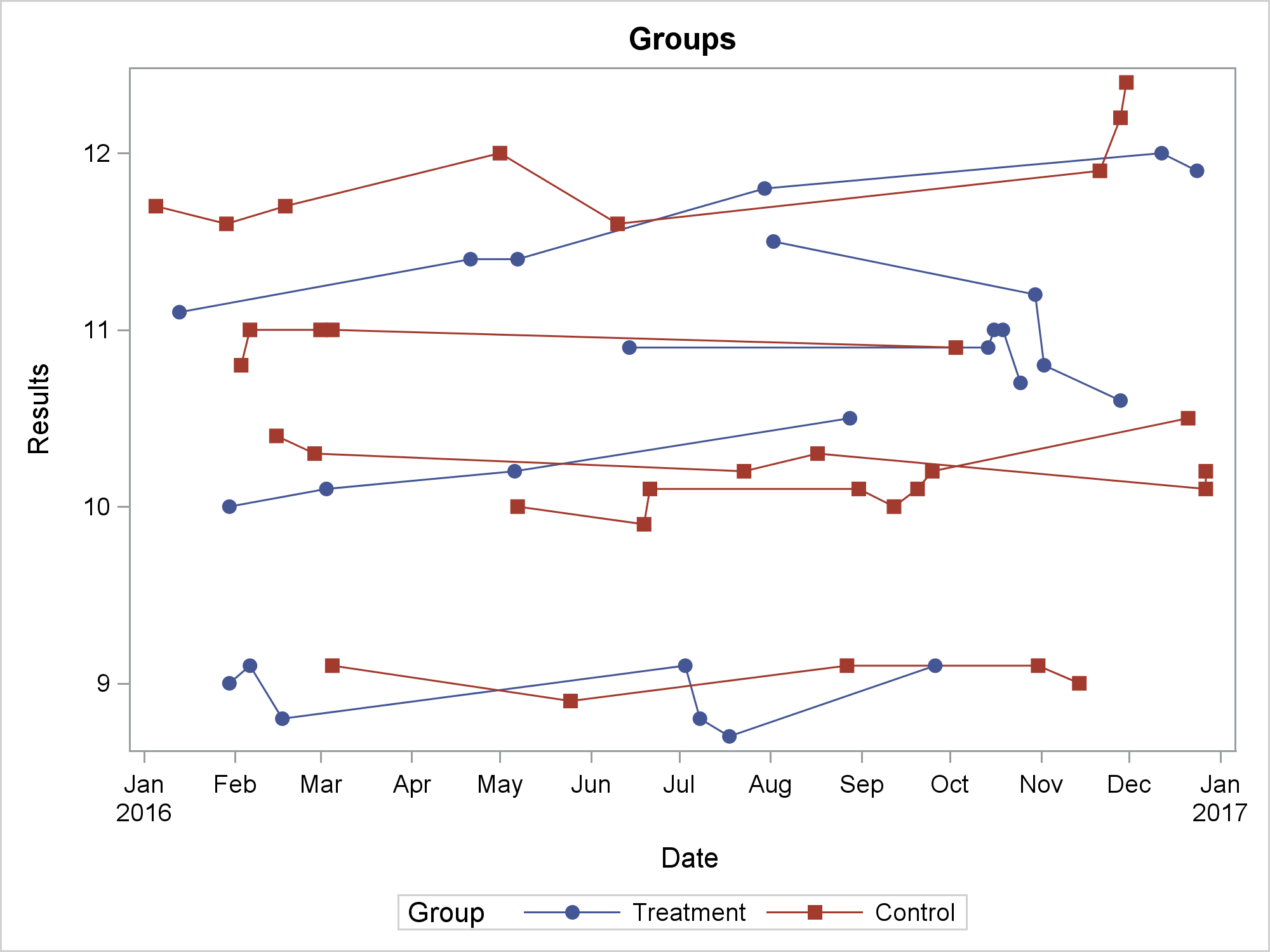
You can use the BREAK option to break each series plot at the missing value. Then you can use the GROUP= variable to differentiate the treatment and control groups.
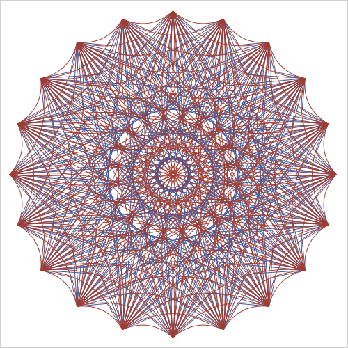
In summary, ODS Graphics provides you with many ways to add linear and nonlinear fit functions to your graphs. Furthermore, it provides ways to connect points using both lines and smooth functions. They have many uses. You can even use them to make art! This next example comes from my Advanced ODS Graphics Examples book. The code shows what happens when you connect all pairs of 20 evenly spaced points along a circle.
data x(drop=t);
   do id = 1 to 20;
      t = (id - 1) * 2 * constant('pi') / 20;
      x = cos(t);
      y = sin(t);
      output;
   end;
run;

data curves(drop=id t: m d);
   do id1 = 1 to 20;
      do id2 = id1 + 1 to 20;
         g  + 1;
         set x(rename=(x=t1 y=t2)) point=id1;
         set x(rename=(x=t3 y=t4)) point=id2;
         d  = (t4 - t2) ** 2 + (t3 - t1) ** 2;
         x1 = t1;
         y1 = t2;
         output;                            /* output the starting point */
         td = ifn(abs(t4 - t2) lt 1e-12, 1e-12, t4 - t2);
         m  = -(t3 - t1) / td;
         t1 = mean(t1, t3);
         t2 = mean(t2, t4);
         x1 = t1 + ifn(t1 gt 0 or td eq 1e-12, -1, 1) *
                   sqrt(0.1 * d / (1 + m * m));
         y1 = m * (x1 - t1) + t2;
         output;                            /* output the midpoint       */
         x1 = t3;
         y1 = t4;
         output;                            /* output the ending point   */
         end;
      end;
   stop;
   run;

title;
ods graphics on / width=480px height=480px;
proc sgplot data=curves noautolegend;
   series  y=y1 x=x1 / group=g lineattrs=graphdata1(pattern=solid);
   spline  y=y1 x=x1 / group=g lineattrs=graphdata2(pattern=solid);
   xaxis display=none;
   yaxis display=none;
run; |
For more information, see my free web books: Basic ODS Graphics Examples and Advanced ODS Graphics Examples. Also see the documentation for ODS Graphics.
