Axis tables are a popular topic in the Graphically Speaking blog, because you can do so many cool things with them. Today, I want to take a step back from cool applications and review some fundamental principles of creating graphs that have axis tables. You will learn the difference between creating axis tables together with graphs that have a TYPE=LINEAR or TYPE=DISCRETE axis. You will see that the options we use to create beautiful axis tables sometimes make it hard to see some of the underlying properties of the axes, and you will see how to temporarily avoid that.
The examples use an artificial data set. The numeric variable X ranges from 0 to 47. The numeric variable Y is identical to X. The numeric variable RowID ranges from 0 to 100 by 100 / 47. RowLab is a character variable that contains the values of Y formatted into words. Roman is a character variable that contains the values of Y formatted into Roman numerals. Tens and Group are character variables that contain the values of a function of Y formatted into Roman numerals. Group is set to blank for all values of Y except 0, 10, 20, 30, and 40. Both Tens and Group have duplicate values.
data x;
   do x = 0 to 47;
      y      = x;
      RowID  = 100 * y / 47;
      RowLab = put(y, words24.);
      Roman  = put(y, roman12.);
      Tens   = put(10 * floor(y / 10), roman12.);
      Group  = ifc(mod(y, 10) eq 0, Roman, ' ');
      output;
   end;
run; |
Click on graphs to enlarge.
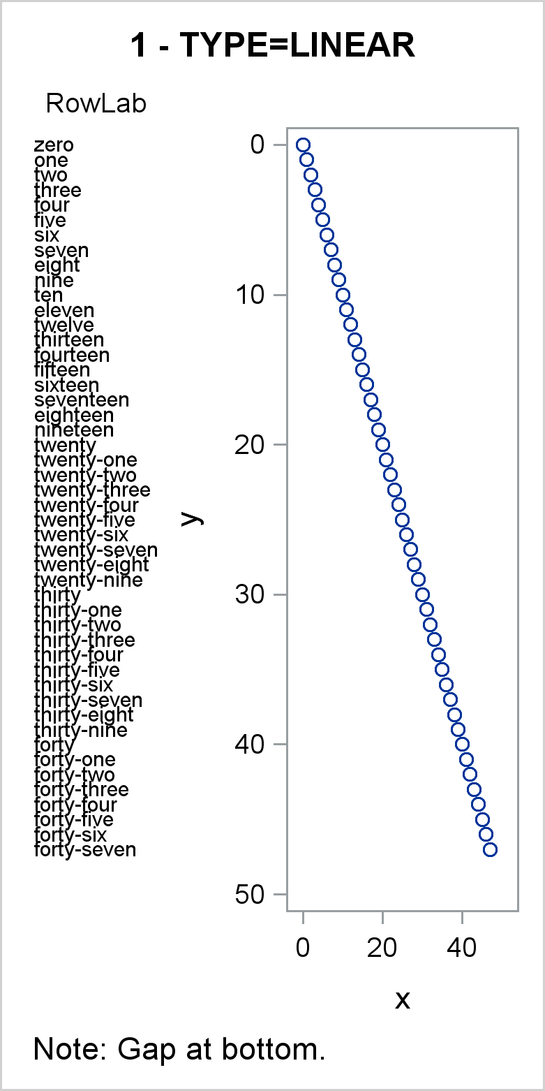
In the first graph, the scatter statement Y axis variable is the numeric variable Y, so by default, the Y axis is linear. Values of the Y variable map to values along the Y axis in a linear fashion---the distance between 10 and 20 matches the distance between 30 and 40. Since the axis shows a continuous mapping between data values and the axis, only a few values are displayed as ticks (0, 10, ..., 50). All 47 values in RowLab and Y appear in the axis table and graph. Notice that the largest tick, 50, is beyond the largest Y value, so there is a gap at the bottom of the graph. Later examples show how to remove that gap.
proc sgplot data=x tmplout='t1'; title '1 - TYPE=LINEAR'; footnote j=l 'Note: Gap at bottom.'; yaxistable rowlab / position=left; scatter y=y x=x; yaxis reverse; run; |
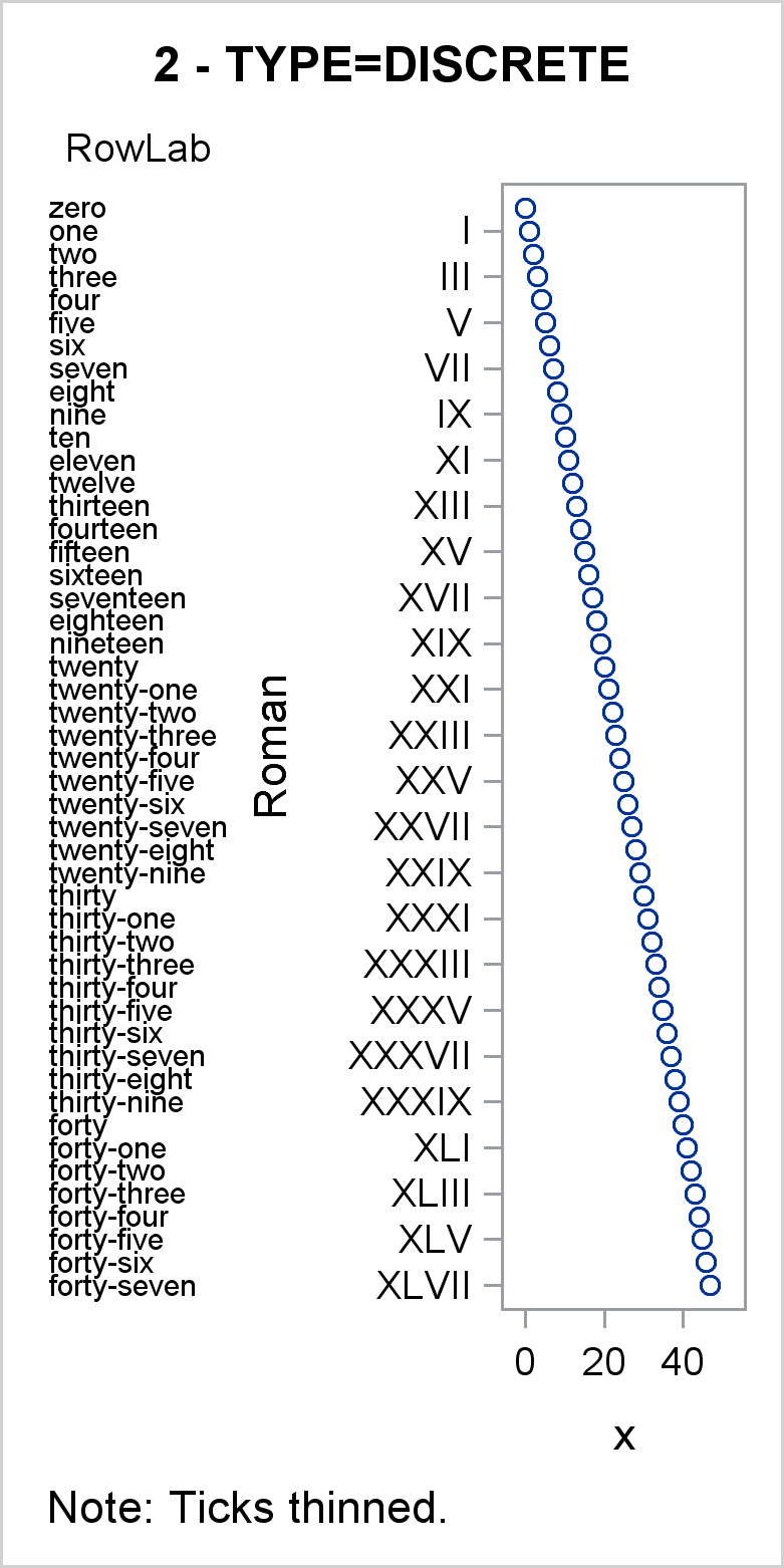
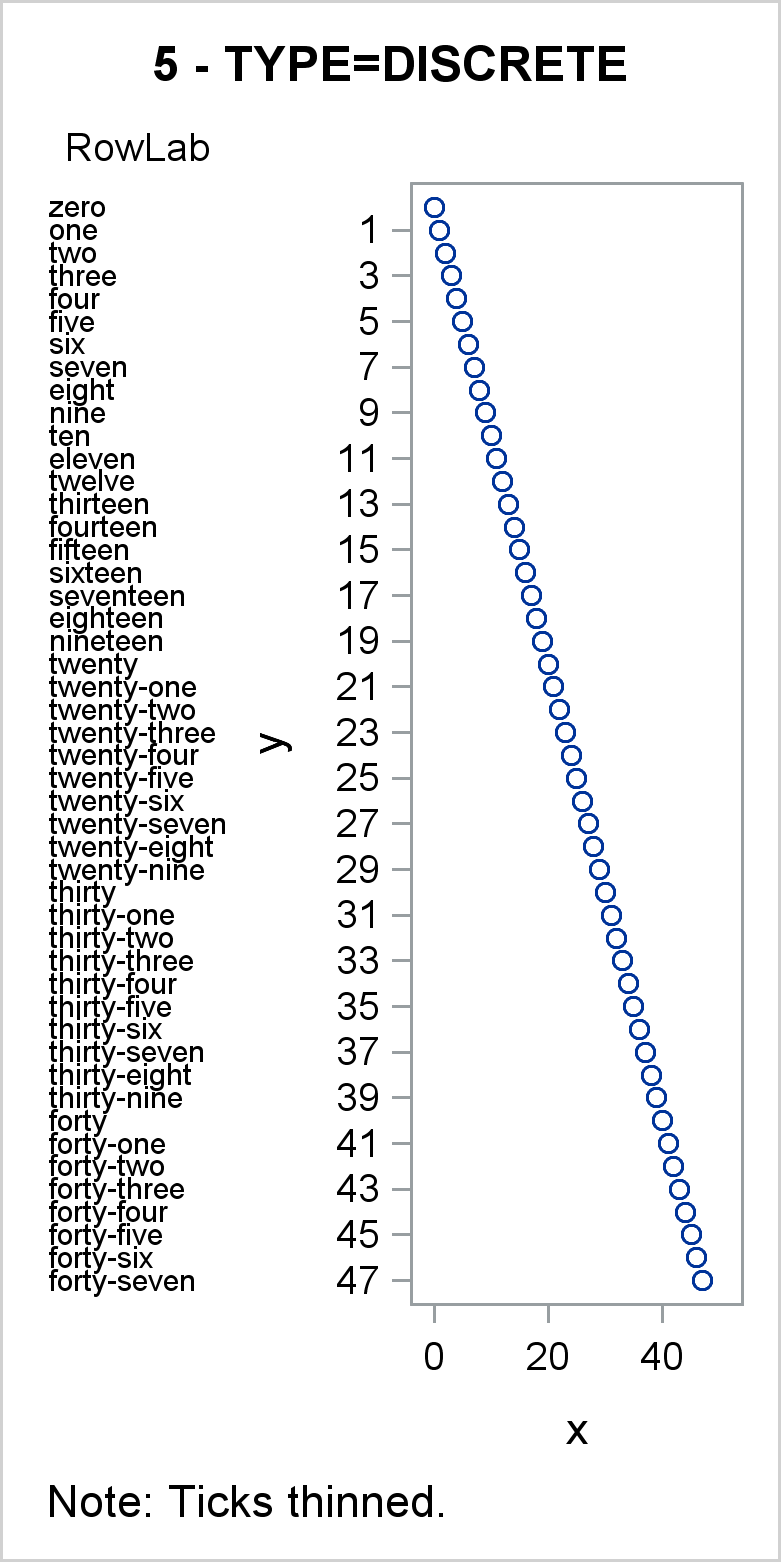
In the second graph, the scatter statement Y axis variable is the character variable Roman, and by default, the Y axis is discrete. Values of the Roman variable map to values along the Y axis in a discrete fashion---each unique value in Roman occupies the next spot on the Y axis. Some values are thinned and do not appear as ticks, but every unique nonblank value has a place on the Y axis, and all 47 values in RowLab and Y appear in the graph. Notice that unlike the first graph (which is TYPE=LINEAR), there is no gap at the bottom of this TYPE=DISCRETE Y axis. Tick values and axis table values are evenly spaced to fill all available space.
proc sgplot data=x tmplout='t2'; title '2 - TYPE=DISCRETE'; footnote j=l 'Note: Ticks thinned.'; yaxistable rowlab / position=left; scatter y=Roman x=x; yaxis reverse; run; |
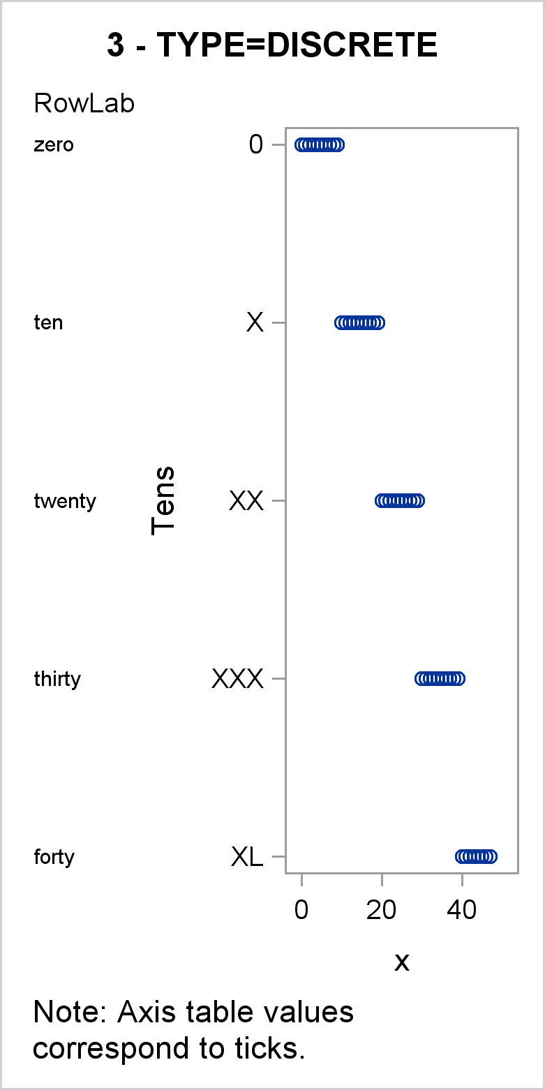
In the third graph, the scatter statement Y axis variable is a character variable, and by default, the Y axis is discrete. Values of the Tens variable map to values along the Y axis in a discrete fashion---each unique and nonblank value in Tens occupies the next spot on the Y axis. However, in this graph, there are multiple X values displayed for each Y value. All 47 points appear in the scatter plot. This graph shows the connection between the Y=Tens option in the SCATTER statement and the implicit Y=Tens option in the YAXISTABLE statement. The axis table only shows the first value of Tens that corresponds to the discrete values that appear on the Y axis.
proc sgplot data=x tmplout='t3'; title '3 - TYPE=DISCRETE'; footnote j=l 'Note: Axis table values correspond to ticks.'; yaxistable rowlab / position=left; scatter y=Tens x=x; yaxis reverse; run; |
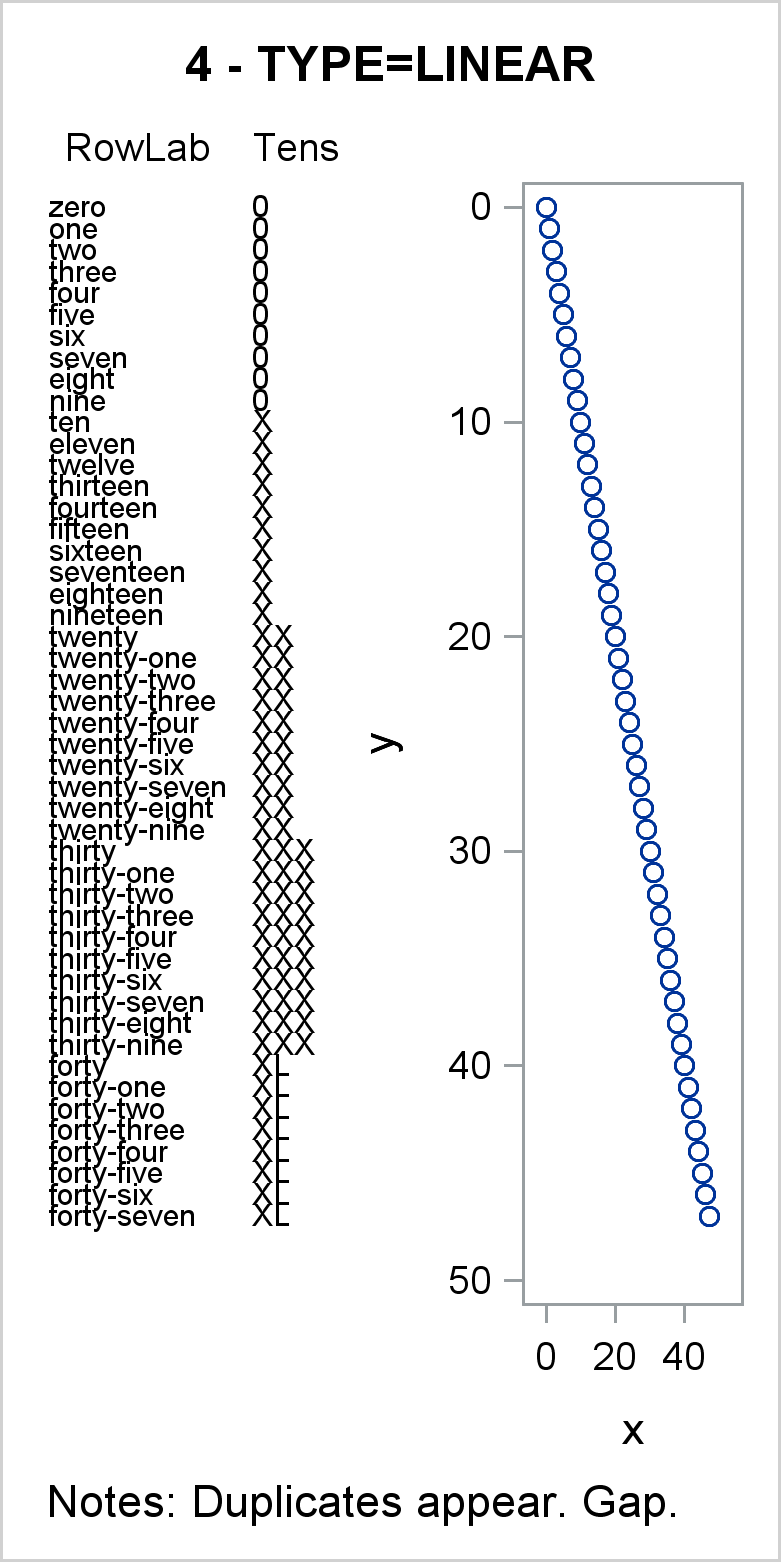
In the fourth graph, the Y=Y variable is numeric and the Y axis is linear. In this example, both RowLab and Tens are specified as axis table variables. Because the axis is numeric and all of those numeric values are unique, all values of the axis table values appear, including the duplicates in the Tens variable. Compare this with the third graph, in which duplicate values of the Tens variable are not displayed. Because of the numeric Y variable, which has values from 0 to 47, there is a gap at the bottom of the Y axis.
proc sgplot data=x tmplout='t4'; title '4 - TYPE=LINEAR'; footnote j=l 'Notes: Duplicates appear. Gap.'; yaxistable rowlab Tens / position=left; scatter y=y x=x; yaxis reverse; run; |
In the fifth graph, a numeric Y=Y variable is specified, but the YAXIS statement option TYPE=DISCRETE specifies a discrete axis. You can specify the TYPE= option in an AXIS statement to treat a numeric variable as discrete. Ticks are thinned, but all points are plotted in the graph and all values of the RowLab variable appear in the axis table. This approach works well, but it is likely to produce LOG notes about thinned ticks. In many cases, for both linear and discrete axes, these notes can be safely ignored.
proc sgplot data=x tmplout='t5'; title '5 - TYPE=DISCRETE'; footnote j=l 'Note: Ticks thinned.'; yaxistable rowlab / position=left; scatter y=y x=x; yaxis reverse type=discrete; run; |
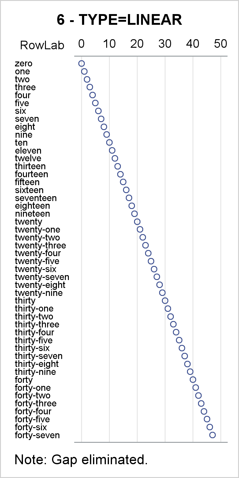
In the sixth graph, options are added to make the graph start to look more like a cool axis table example. Ticks are hidden, but since the Y axis variable is numeric, the axis is linear. Since the Y=RowID values range from 0 to 100, PROC SGPLOT will pick ticks in the 0 to 100 range, so the gap at the bottom of other TYPE=LINEAR axes is now gone. Options include NOBORDER in the PROC SGPLOT statement to suppress the plot border and NOAUTOLEGEND to suppress the legend. An invisible scatter plot adds the bottom axis line.
proc sgplot data=x tmplout='t6' noborder noautolegend; title '6 - TYPE=LINEAR'; footnote j=l 'Note: Gap eliminated.'; yaxistable rowlab / position=left; scatter y=rowid x=x / x2axis; scatter y=rowid x=x / markerattrs=(size=0); yaxis reverse display=none; x2axis grid display=(noticks nolabel); xaxis display=(nolabel noticks novalues); run; |
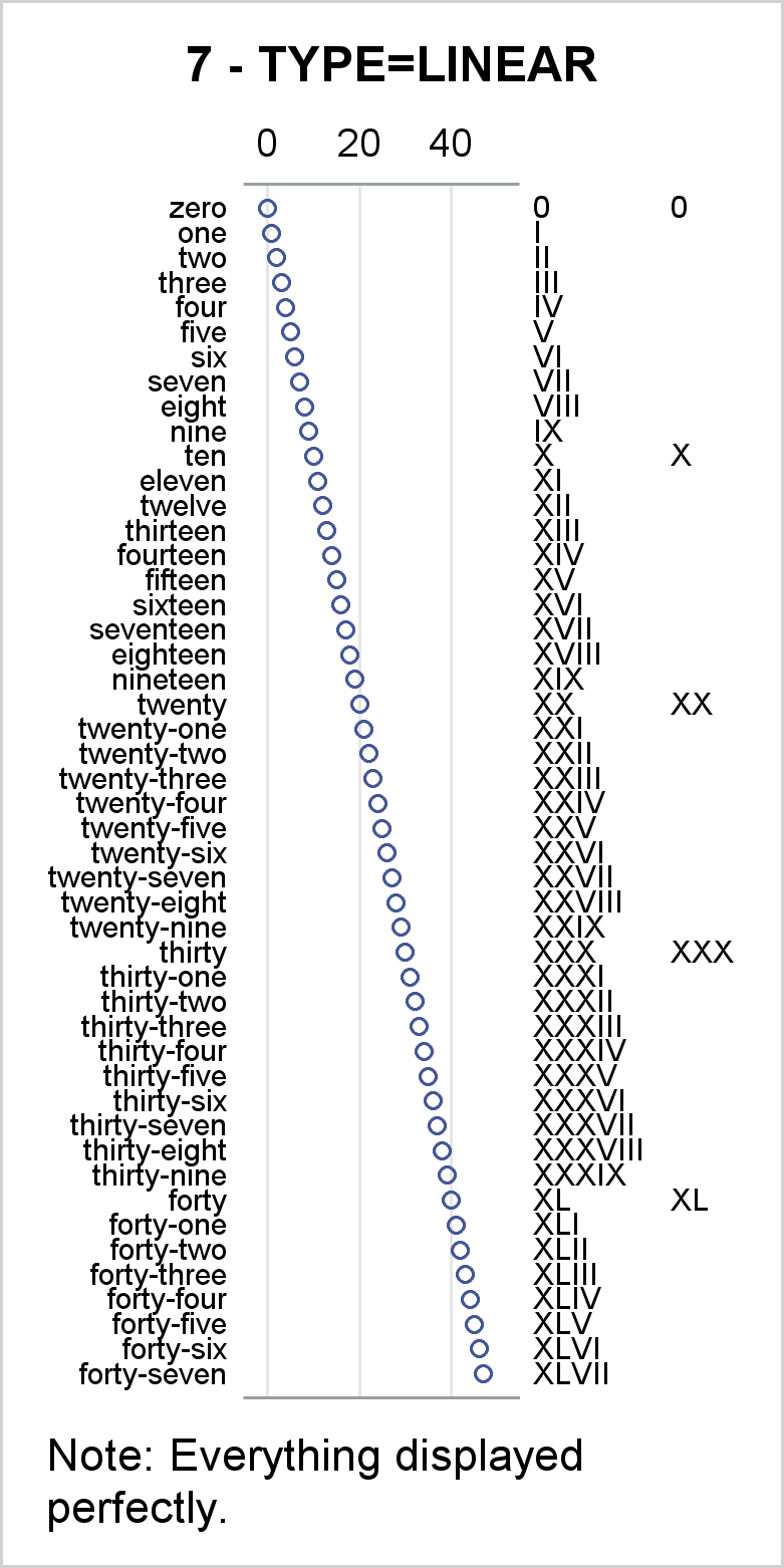
The seventh and final graph, while still showing artificial data, looks more like a cool axis table example. A linear Y axis variable with all unique values ensures that all values of the axis table variables are displayed even if some of them are not unique---most of the values in Group are blank. The range of the RowID variable from 0 to 100 ensures that there is no gap at the bottom.
proc sgplot data=x tmplout='t7' noborder noautolegend; title '7 - TYPE=LINEAR'; footnote j=l 'Note: Everything displayed perfectly.'; yaxistable rowlab / valuejustify=right position=left; yaxistable Roman Group / valuejustify=left position=right; scatter y=rowid x=x / x2axis; scatter y=rowid x=x / markerattrs=(size=0); yaxis reverse type=linear display=none; x2axis grid display=(noticks nolabel); xaxis display=(nolabel noticks novalues); label rowlab = '00'x Roman = '00'x Group = '00'x; run; |
When we create axis tables, we often display character variables or formatted numbers. In those cases, a TYPE=DISCRETE axis can be handy. However, the TYPE=DISCRETE axis starts becoming problematic when values are not unique. This can happen for many reasons. For example, you might want to display blank lines between groups of rows or you might continue long character variables onto another line, and the continuation lines might not be unique. Whatever the reason, you can get around this by using a numeric Y= variable and a linear axis even when the variables that you want to display are discrete. If you do that, care should be taken to ensure that the final value of that variable matches a value that PROC SGPLOT would pick as a final tick (such as a multiple of a power of 10).
We often use options such as DISPLAY=(NOLABEL NOTICKS NOVALUES) when we create axis tables. If something is not working the way you want, try removing these options (as is done in the first five examples) and see the actual ticks. That might give you the insight you need to solve the problem. Then you can go back to removing those elements from the display.
Also notice that all examples use the TMPLOUT= option to write the graph template to a file. You can look at that file if you ever have any questions about what roles each of the variables play or the type of the axis. In the last graph, the graph template has the option TYPE=LINEAR specified in six places including in XAXISOPTS=, X2AXISOPTS=, and YAXISOPTS= options in four LAYOUT OVERLAY blocks. The file also shows that all three AXISTABLE statements in the GTL have the option Y=RowID. This shows that the axis tables pick up their Y coordinates from the primary graph statement, which is the SCATTER statement.
Axis tables are versatile tools that enable you to make many useful graphs. They are easy to use when you understand the relationships between them, the primary graph statement, and the axis type.

1 Comment
This is great content Warren!
Thank you for sharing.