Browsing on the web, I ran into a simple but visually interesting graph of financial data. Really, it could be any data, but this one showed up under "Financial Graphs". I thought this would give me an opportunity to speak about an interesting new feature added to SERIES plot with SAS 9.40M3 - Arrowheads.
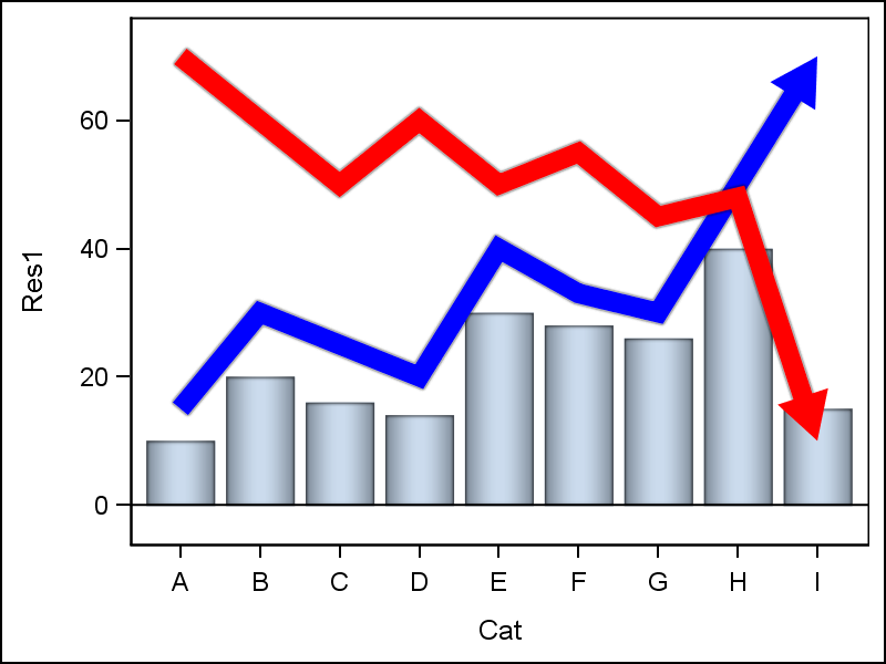
 The graph I saw on the web at this site is shown on the right. The illustration uses some 3D effects as can be seen from the bars and lines. However, these effects are not consistent. The key item that caught my eye was the arrowhead at the end of each line, indicating a direction.
Now, clearly, ODS Graphics and SGPLOT are designed for presentation of data without "Chart Junk" as defined by Tufte, and with minimal ink. However, it is possible to embellish the graph a bit to get effects as shown in the graph on the right, without compromising the integrity of the illustration.
 The first step is a simple graph with overlay of three plots as shown on the right. Note the data I use is simulated, and may not match up exactly. Note the use of the new options ARROWHEADPOS and ARROWHEADSHAPE. Arrowheads can be displayed at either or both ends of the series.
proc sgplot data=financial noautolegend;
vbarbasic cat / response=res1
dataskin=pressed;
series x=cat y=res2 / arrowheadpos=end
dataskin=pressed arrowheadshape=filled
lineattrs=(thickness=10 color=blue);
series x=cat y=res3 / arrowheadpos=end
dataskin=pressed arrowheadshape=filled
lineattrs=(thickness=10 color=red);
run;
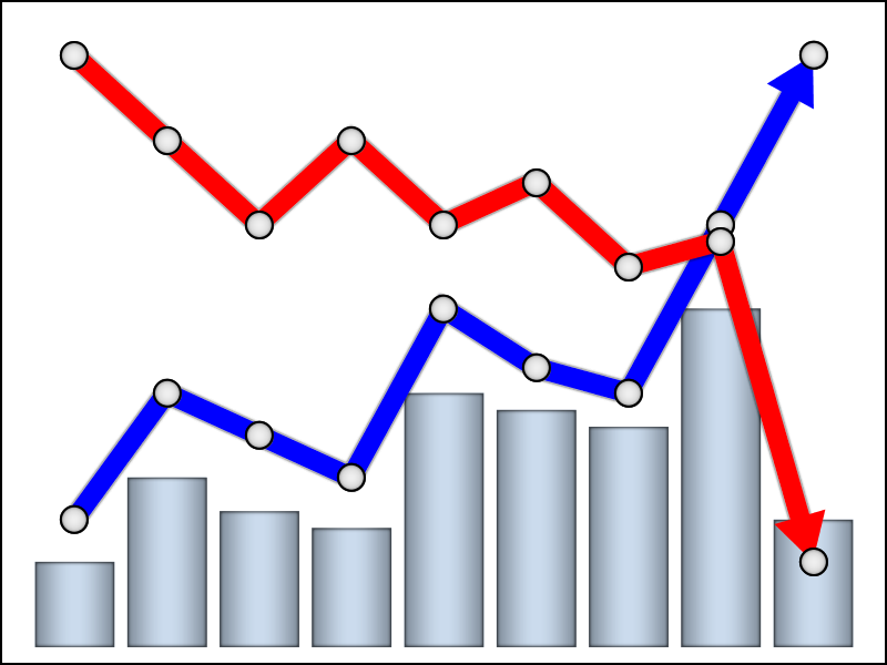 Now, let us clean this up a bit, remove the axes and the wall border and set offset to zero. We add the markers to the series. This is supported as part of the SERIES statement. Markers can be turned on, and also we ask for filled+outlined markers, and set the inside color to white.
proc sgplot data=financial
noborder noautolegend;
vbarbasic cat / response=res1
dataskin=pressed
baselineattrs=(thickness=0);
series x=cat y=res2 / dataskin=pressed
arrowheadpos=end arrowheadshape=filled
lineattrs=(thickness=10 color=blue)
markers filledoutlinedmarkers
markerattrs=(symbol=circlefilled size=14)
markerfillattrs=(color=white);
series x=cat y=res3 / dataskin=pressed
arrowheadpos=end arrowheadshape=filled
lineattrs=(thickness=10 color=red)
markers filledoutlinedmarkers
markerattrs=(symbol=circlefilled size=14)
markerfillattrs=(color=white);
xaxis display=none;
yaxis display=none offsetmin=0;
run;
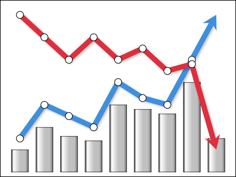 The above code gets us mostly there, but note there is marker at the end of the series at the arrowhead in the graph above. We do not want this last marker. So, we create another column in the data for plotting markers separately. In this column, the values are same as the response values for the two line plots, but the last value is set to missing.
Now, instead of using the marker options on the SERIES plot, we use separate SCATTER plots to display the markers using these new columns in the data. I adjusted the colors of the lines a bit and made the bars silver using the "gloss" skin.
proc sgplot data=financial noborder noautolegend;
vbarbasic cat / response=res1 dataskin=gloss fillattrs=(color=silver)
baselineattrs=(thickness=0) barwidth=0.7;
series x=cat y=res2 / arrowheadpos=end arrowheadshape=barbed
lineattrs=(thickness=10 color=cx3f8fdf) dataskin=sheen;
scatter x=cat y=res2m /
markerattrs=(symbol=circlefilled size=14)
filledoutlinedmarkers markerfillattrs=(color=white);
series x=cat y=res3 / arrowheadpos=end arrowheadshape=barbed
lineattrs=(thickness=10 color=cxdf2f3f) dataskin=sheen;
scatter x=cat y=res3m /
markerattrs=(symbol=circlefilled size=14)
filledoutlinedmarkers markerfillattrs=(color=white);
xaxis display=none;
yaxis display=none offsetmin=0;
run;
I avoided the urge to go all the way by adding a background image to show a shaded horizon. This can be done using SG Annotation.
By default, SGPLOT will create displays that follow the principles of "effective graphcis" for delivery of information. However, with a few tweaks you can spruce up the display when appropriate.
SAS 9.403 SGPLOT Code: financial

1 Comment
Very nice example Sanjay!