This is the 3rd installment of the Getting Started series, and the audience is the user who is new to the SG Procedures. Experienced users may also find some useful nuggets here.
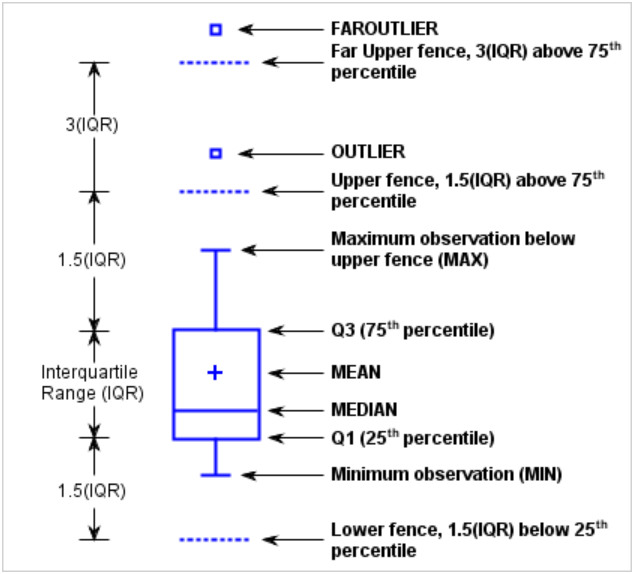 The Tukey box plot is popular among statisticians for viewing the distribution of an analysis variable with or without classifiers. The figure on the right is from the SGPLOT Box Plot documentation showing all the features of the box.
The code shown below creates the simplest box plot graph which displays the distribution of the analysis variable Cholesterol.
title 'Distribution of Cholesterol';
proc sgplot data=sashelp.heart;
vbox cholesterol;
run;
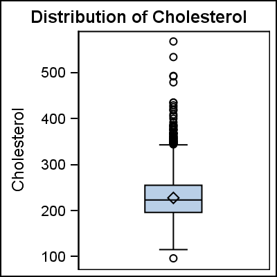 The graph on the right shows the results of the procedure step above and displays a box for the variable Cholesterol. The display includes a box spanning the Q1-Q3 inter-quartile range, with a line drawn at the median value. A marker is used to display the mean value. Whiskers are drawn to the observation nearest to the "Fence" as defined in the doc mentioned above, and "outlier" observations are displayed above and below the fences. See the online documentation for the GTL Box Plot for all the details of the various statistics that are displayed.
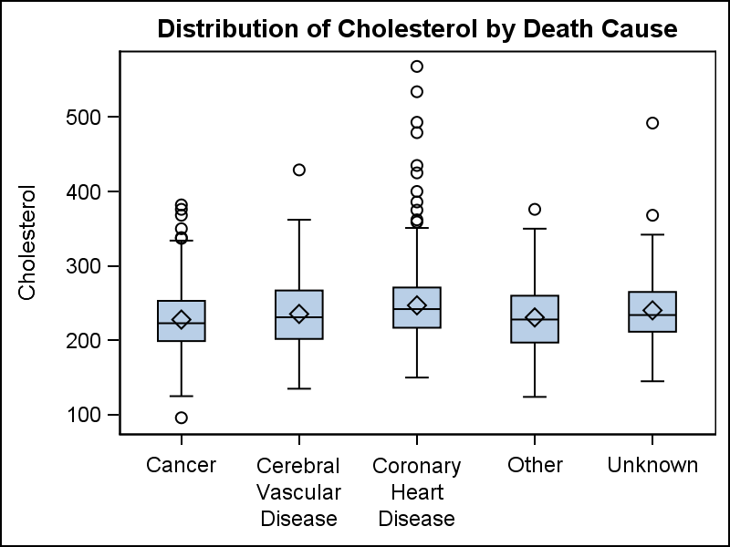
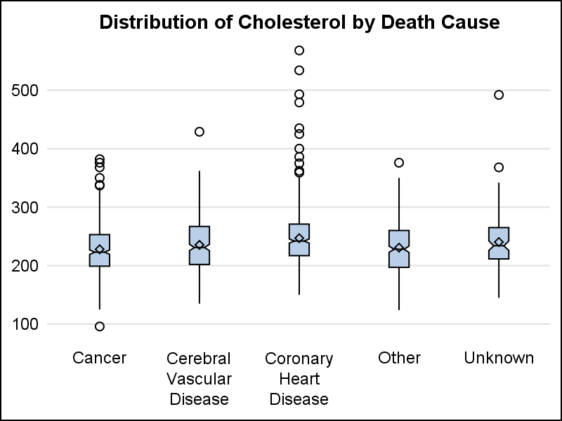
Box Plot by Category: The code below creates a box plot graph by a category variable - DeathCause. Note, we have used the XAXIS statement to remove the display of the label name on the axis.
 title 'Distribution of Cholesterol by Death Cause';
proc sgplot data=sashelp.heart;
vbox cholesterol / category=deathcause;
xaxis display=(nolabel);
run;
The graph on the right displays the distribution of the cholesterol values by death cause. Note, by default the graph will try to split long axis tick values at the "white space" in the value.
 Connect: A connect line is drawn connecting the mean statistic across the categories using the CONNECT=mean option. The connect line can connect any statistic like mean, median, Q1, Q3 etc.
For this graph, we have also simplified the layout by dropping the frame border of the wall, the axis lines, and added y-axis grids. This presents the data in an alternative visual manner that reduces clutter and is pleasing to the eye. A DATASKIN is set for visual effect.
title 'Distribution of Cholesterol by Death Cause';
proc sgplot data=sashelp.heart noborder;
vbox cholesterol / category=deathcause
connect=mean fillattrs=graphdata3
dataskin=gloss;
xaxis display=(noline nolabel noticks);
yaxis display=(noline noticks nolabel) grid;
run;
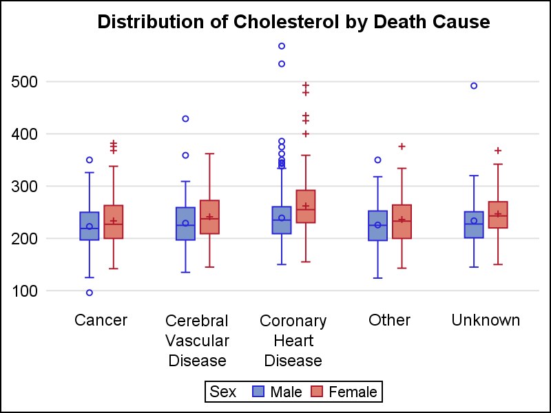 Grouped Box Plot: One additional classifier can be added - GROUP. The graph on the right displays the distribution of Cholesterol by death cause and sex. This is a common graph type useful in the Clinical Research domain where we want to view the results by category and treatment.
title 'Distribution of Cholesterol by Death Cause';
proc sgplot data=sashelp.heart noborder;
vbox cholesterol / category=deathcause
group=sex clusterwidth=0.5
boxwidth=0.8 meanattrs=(size=5)
outlierattrs=(size=5);
xaxis display=(noline nolabel noticks);
yaxis display=(noline noticks nolabel) grid;
run;
Cluster width can be set to make the cluster of boxes for each category tighter. Here we have set CLUSTERWIDTH=0.5, making the boxes for each category are more tightly packed. BOXWIDTH can also be used to make the individual boxed narrower or wider. BOXWIDTH=1 will make the boxes within each cluster touch. Attributes for the mean marker and outlier markers can be set using the appropriate ATTRS option.
 Notches: Notches can be displayed by using the NOTCH option. The graph on the right shows the result of the program shown below. Notches are displayed and the box width is reduced to 20% of the available spacing. The whisker cap is removed by setting CAPSHAPE.
title 'Distribution of Cholesterol by Death Cause';
proc sgplot data=sashelp.heart noborder;
vbox cholesterol / category=deathcause
boxwidth=0.2 meanattrs=(size=6)
notches capshape=none ;
xaxis display=(noline nolabel noticks);
yaxis display=(noline noticks nolabel) grid;
run;
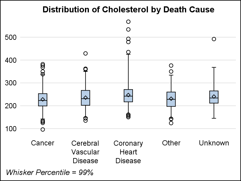 Whisker Percentile: The graph on the right shows how to control the whisker percentile. This is popular option requested by many users. WHISKER=value (0-25) can be used to set the length of the whisker as a percentile. WHISKER=1 creates a graph with 99% Whisker percentile.
By default, the box plot makes the category axis discrete. This happens even if the category variable is numeric or time. There are many cases where we want to see the distribution of some variable by a numeric x variable, such as weeks or over time. In such cases, we want the boxes to be positioned on the x-axis with the correct scale. This is supported and can be done by setting TYPE=LINEAR on the x-axis. We will discuss this in more detail in a subsequent article.
Full SAS Code: getting_started_3_vbox_3


4 Comments
Pingback: Getting started with SGPLOT - Index - Graphically Speaking
How can I change the display order of my category variable? I have a variable category results = Y or N. I want the sgplot vbox to display the Y first and then the N.
Correction it should be Group variable not category.
Setting GROUPORDER=DESCENDING on the VBOX statement should do it for you. Let me know if it doesn't.