Often I have written articles that are motivated by some question by a user on how to create a particular graph, or how to work around some shortcoming in the feature set to create the graph you need. This time, I got a question about Clinical Graphs that were mostly working as built by a user, with a small issue that was fixed in the latest SAS 9.4M3 release of SAS. So, there was not much for me to add to the graph. However, the graph was quite impressive and information rich and worth sharing with everyone.
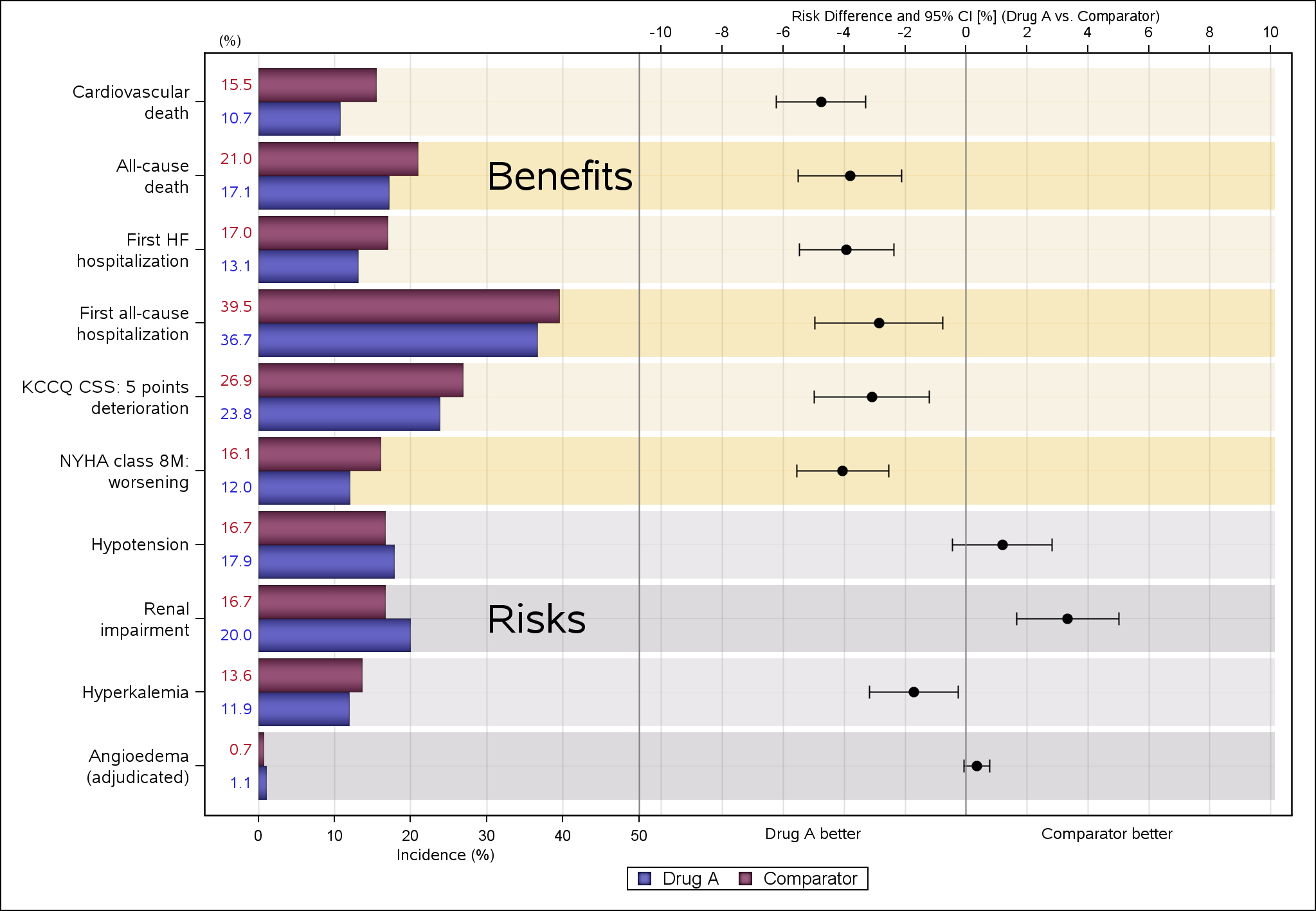 So, with the permission of the authors, David Carr and Andreas Brueckner of Novartis, here are a couple of impressive graphs. The first graph shown on the right displays the Risk Difference between Drug A and Comparator by various categories, classified as "Benefits" and "Risks". Click on the graph for a higher resolution image.
The graph uses a technique I have written about for splitting a SGPLOT data area into two separate parts along the x-axis, thus showing two graphs in one cell aligned by y-axis values. While this technique is no longer necessary when adding statistics tables with the advent of the AxisTable, it is still necessary to to create such a graph.
proc sgplot data=tmp2 dattrmap=AttrMap nocycleattrs sganno=anno;
/* This syntax plots the incidence lines on LHS */
highlow y=cat high=rate low=zero / group=group type=bar groupdisplay=cluster name='a'
lowlabel=IRLAB barwidth=1.0 clusterwidth=0.9 transparency=0 fill attrid=group
dataskin=pressed LABELATTRS= (size=8pt weight=normal family='Albany AMT') nooutline;
/* This syntax plots background shading */
highlow y=cat high=xmax low=rate1 / group=brtyp type=bar groupdisplay=cluster
barwidth=1.0 clusterwidth=0.9 transparency=0.70 fill attrid=brtyp nooutline;
/* This syntax plots the words Benefits and Risks at the respective y axis posotions */
highlow y=cat high=defx low=defx / type=bar highlabel=BRTXT barwidth=0 transparency=0 fill
LABELATTRS= (size=20pt weight=normal family='Albany AMT') nooutline;
/* This syntax plots the risk difference with error bars on RHS */
scatter y=cat2 x=rd /group=subg xerrorlower=rdlo xerrorupper=rdhi
x2axis y2axis attrid=subg;
/* Axis limits (0 to 50; -8 to 8) might need to be adjusted depending on data */
refline 50 / axis=x;
refline 0 /axis=x2;
xaxis display=(nolabel) offsetmax=0.60 grid values=(0 to 50 by 10) valueattrs=(size=7);
yaxis display=(nolabel) valueattrs=(size=9 family='Albany AMT') type=discrete
fitpolicy=splitalways splitchar="#";
x2axis display=(nolabel) offsetmin=0.42 grid max=64 values=(-10 to 10 by 2) valueattrs=(size=7);
y2axis display=(nolabel noticks novalues) values=(1 to 10 by 1) type=linear;
keylegend 'a';
run;
This graph uses overlays of multiple graph types to provide a lot of information in one graph, in a manner that is easy to understand, and pleasing in appearance. A cluster grouped HighLow plot us used to display the % incidence by drug on the left side. A Scatter plot is used to display the risk difference value and 95% CI on the right. The authors have made creative usage of HighLow plot to display alternating bands to indicate the "Benefit" and "Risk" items. HighLow plot is also used to place the "Benefits" and "Risks" labels.
SG Annotation is used to label the x and x2-axes (which could have been done using the LABELPOS option for the axes) and to display the "Drug A Better" and "Comparator Better" indicators. A discrete attr map is used to set the colors and marker attributes.
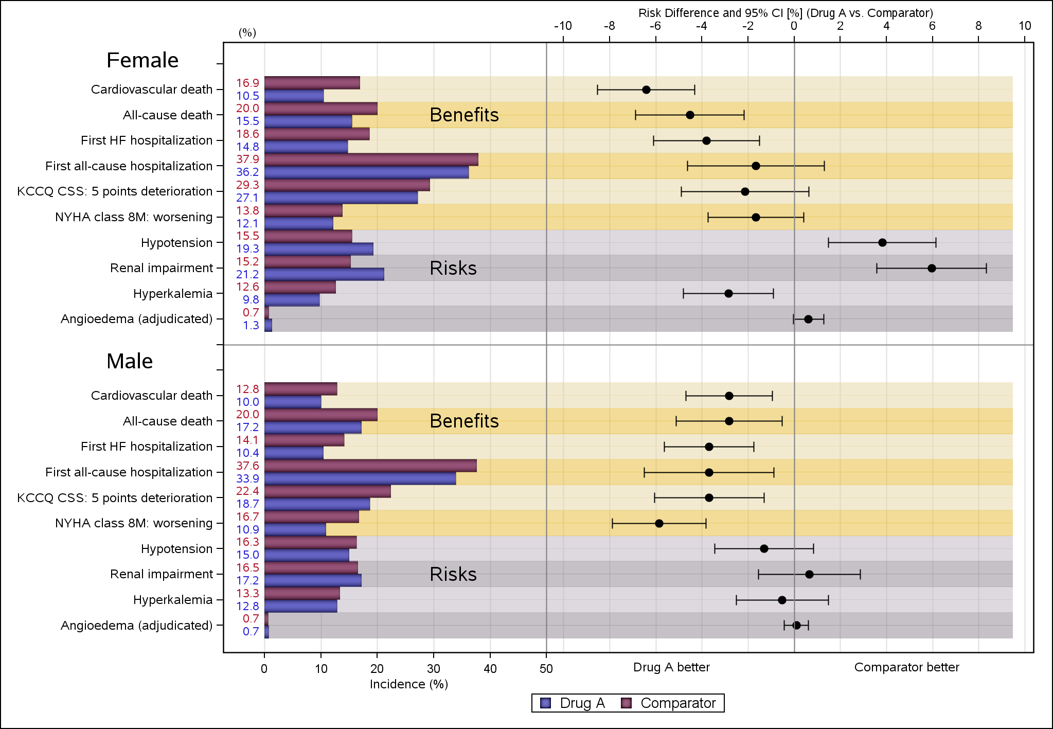 The second graph is a "Paneled" version of the same graph, paneled by gender, as shown on the right. Authors have made creative use of the SGPLOT procedure to display the same graph by gender. Personally, I would have tried using the SGPANEL procedure to handle the data and layout. Row headers could be suppressed, and Inset can be used to place the class value label in each cell.
All in all, a couple of great examples of creating complex clinical graphs using the SGPLOT procedure.

4 Comments
Is it possible to get the data set that plotting the graph?
Would you please share the data sets temp2, attrmap and anno?
This graph was contributed by David Carr and Andreas Brueckner of Novartis. So, I do not all the details.
can we plot this graph in R studio.