 For a long time, Starbucks represented to me as the good coffee cup, with me paying upwards of $4 for a Latte. But on a recent visit to San Francisco, my son introduced me to a few other options.
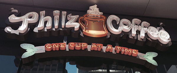
Philz crafts a great cup of java, with the barista making the coffee right there in front of you, just like you want it, and they'll go the distance to get it right. I believe I got the "Jacob's Wonderbar" with heavy cream. It was great.
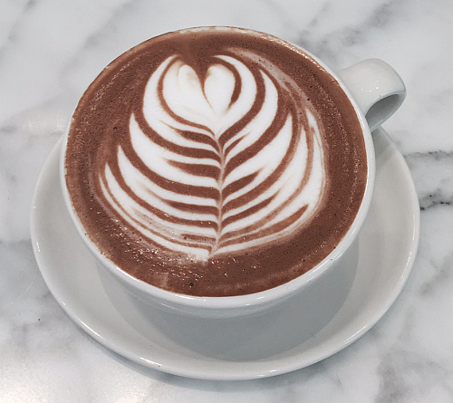 Then, I was introduced to Blue Bottle, another great (and maybe local) coffee bar. The ambiance was great. I got a Cafe Mocha. The Barista did a great design on the top by hand as shown on the right. Since the coffee has chocolate, it was mildly sweet already. It was served in a nice porcelain cup that was very enjoyable.
All this turned out to be a great lead-in to the article I had planned on creating an interesting graphic for coffee recipes in continuation on the series on "Info-Graphs".
Now to be sure there are many great coffee recipes, but I limited my task to display four common ones in a panel using the data shown below. The idea being this is all data driven, and more recipes can be easily added to create more graphs.
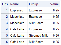
The four recipes are listed, each with its ingredients. "Expresso" has only Expresso, "Macchiato" has Expresso and milk foam, and so on. The fraction of the volume of the cup is shown under the "Value" column. So, "Cafe Latte" has 25% Expresso, 50% steamed milk and 25% milk foam.
First, we start with a plain stacked graph showing the recipes for each coffee type. The code is shown below. I used a HighLow plot instead of the VBarParm because I need the flexibility to raise the bottom of the bar to adjust to the mask later. For this, the two modified columns "Low" and "High" are used.
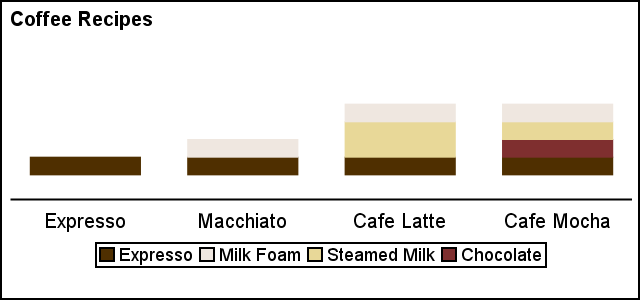 The result is shown on the right. The graph includes a legend to identify the ingredients. A discrete attributes map is used to set the preferred colors for each ingredient.
title j=l h=1 'Coffee Recipes';
proc sgplot data=Coffee noborder noautolegend nocycleattrs
dattrmap=attrmap pad=(bottom=10pct);
highlow x=name low=low high=high / group=group type=bar
nooutline barwidth=0.7 name='a' attrid=Coffee;
keylegend 'a';
xaxis display=( nolabel noticks) offsetmin=0.12 offsetmax=0.12;
yaxis display=none min=0 max=1 offsetmin=0.15 offsetmax=0.42 values=(0 0.5 1);
run;
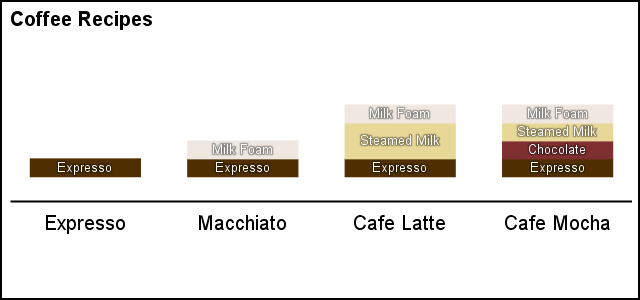 Next, we improve the graph by labeling each ingredient directly in the bar chart using a Text plot. Now, we can do away with the legend. The information is easier to consume with the ingredients labeled directly, thus reducing eye movement to decode each using the legend.
Note the use of "Backlight" for the Text plot. This ensures that text that is light on light can still be easily read. Click on the graph for a higher resolution image.
title j=l h=1 'Coffee Recipes';
proc sgplot data=Coffee noborder noautolegend nocycleattrs
dattrmap=attrmap pad=(bottom=20pct);
highlow x=name low=low high=high / group=group type=bar
nooutline barwidth=0.7 name='a' attrid=Coffee;
text x=name y=mid text=group / backlight=0.4
textattrs=(size=6 color=white);
xaxis <options>;
yaxis <options>;
run;
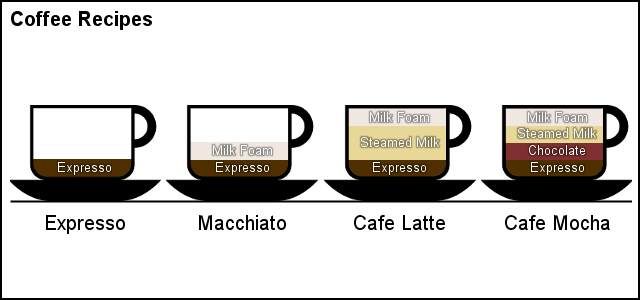 Now comes the fun part. We use the SAS 9.4 feature to define a marker from an image icon. In this case, we use an icon of the coffee cup. Then, we can layer a SCATTER plot over the HighLow to create the graph shown on the right.
We use an image where the middle portion of the cup is transparent. The cup part is in dark color and the outer pixels of the image are white. When this icon is layered over the bar, the bar colors show through the transparent portion of the cup, thus producing an interesting and memorable graphic.
 Finally, we use another icon to display the steam rising from the coffee. I hope you enjoy this cup of Java.
Thanks to Riley Benson, our super UX expert who helped me clean up the icons so the result was suitable for publishing.
See full code below for all the details. I have also attached a zip file of the icons needed for the graph.
To run the program, you will need to put the icons a in folder and supply the full path name to that folder in place of the <your folder> in the code for "Cup" and "Steam" macro variables.
Full SAS 9.4 Code: Coffee
Icon ZIP file: Icons


2 Comments
@Sanjay: I am Sara, MD of http://www.gladwinanalytics.com and a keen reader of your blog posts on SAS. Very impressive and useful for SAS professionals indeed.
I would like to promote your blogs on Gladwin Analytics under SAS Page - http://www.gladwinanalytics.com/company/team/143780126055b31b2c5d8af
Please let me know.
- Sara
Pingback: Directed Link Networks - Graphically Speaking