An interesting question came up recently, where a colleague wanted to create a bar line chart with Revenue on the Y axis and Profit on the Y2 axis. The Revenues were all positive, but the Profit had positive and negative values.
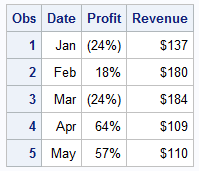 Some data I generated is shown on the right. Creating this bar chart is very simple, using the code shown below. Since there is only one value per month, I used the BarChartParm, with an overlay the Series plot. Some options are trimmed. See full code link below.
title 'Revenues and Profit by Month for 2014';
proc sgplot data=pnl;
vbarparm category=date response=revenue;
series x=date y=profit / y2axis ;
xaxis display=(nolabel);
run;
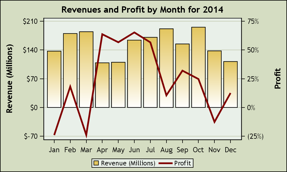
 The resulting graph is shown on the right. Click on the graph for a detailed view. Note, the "Revenue" is displayed on the Y (left) axis as a bar chart and has positive values. The "Profit" is displayed on the Y2 axis as a series plot, and has a range from -24% to +64%. The two axes are independent, and the zero values are not aligned. The zero value on the Y2 axis is floating in the middle, and so one has to examine the graph carefully to understand the data.
We thought it would add a lot to the readability of the graph if the zero values on both axes would be aligned. In the graph below, the zero value for both the "Revenue" and "Profit" are aligned, thus making it much easier to understand / interpret this graph.
 The way to do this is to evaluate the range of the data for each variable, and then computed a value for Y1Min based on the negative to positive ratio of the Profit data. Then, I applied the min and max values to the Y1 axis.
I kept my case simple to demonstrate the idea. More code may be needed if both variables have negative to positive range, so the min and max values are computed for both axes keeping their negative-positive proportions equal, and thus equalizing the zero line. If a VBAR is used, then you will need to work with the summarized values.
title 'Revenues and Profit by Month for 2014';
proc sgplot data=pnl;
vbarparm category=date response=revenue / fillattrs=graphdata1
filltype=gradient name='a' baselineattrs=(thickness=0);
series x=date y=profit / y2axis lineattrs=graphdata2(thickness=3);
xaxis display=(nolabel);
yaxis min=&y1Min max=&y1Max;
keylegend / linelength=24;
run;
Finally, I also want to add grid lines for the Y axis. Note, in the graph above, even though the zero line is equalized on both axes, the number of tick intervals on each axis are not equal. Y axis has 6 tick values while the Y2 axis has 5. Drawing grid lines will mean the grid lines will not be aligned and this will cause some confusion.
 The way to fix this is to ensure that both axes have the same number of tick values. The graph on the right makes both Y and Y2 axes with same number of tick values, while still keeping the negative to positive ratio about equal.
This produces a good graph, with equalized zero line, and equalized grid lines as shown on the right. I also underlaid a white bar chart to make the grid lines not show through the gradient bars. Click on the graph for a higher resolution image.
title 'Revenues and Profit by Month for 2014';
proc sgplot data=pnl;
vbarparm category=date response=revenue / fillattrs=(color=white)
baselineattrs=(thickness=0);
vbarparm category=date response=revenue / fillattrs=graphdata1
filltype=gradient name='a' baselineattrs=(thickness=0);
series x=date y=profit / y2axis lineattrs=(color=maroon thickness=3);
xaxis display=(nolabel);
yaxis values=(-70 to 210 by 70) grid;
y2axis values=(-0.25 to 0.75 by 0.25);
keylegend / linelength=24;
run;
In the graph above, I hard coded the Y and Y2 axis ranges and values to convey the idea. I am sure some creative coding can achieve the effect programmatically. We realize this is could be an important feature and we are debating to add options to the procedure to do this automatically. If this seems of interest to your use cases, please chime in.
Full SAS Code: Dual_Y_Axes_2


2 Comments
I have used graphics with multiple Y axis over the years very cautiously. This approach can give casual viewers a false impression of what is going on proportionally in the 2 y variables. I would not deny having done some axis min and max manipulations to tell the story the way I wanted to have it told. The world seems to be moving increasingly to casual viewers (I call them the Charlie Brown types) and away from the in-depth viewer (I call them the Charlie Rose type). When subjected to criticism, I replied --"OK, lets just put Y's in 2 separate graphs, side by side". Usually that quite the criticism.
I don't think I would spend a lot of time making this easier.
Happy new year. Missed seeing you at MWSUG this year!
Thanks for your insight, Roger.