 Bubble Plots provide additional ways to visualize your data. The plot supports display of multiple response characteristics of the data in one graph. Bubble plots were introduced with SAS 9.3 in GTL and SG Procedures.
A bubble is drawn at each (x, y) point in the graph, and each bubble is sized based on a third column. Bubbles can be grouped by a classifier as shown here, or can be colored by a numeric response variable.
In the example above, we have specified an aspect=0.7,but this is not necessary. Note, we have also used some special labeling to see how the markers sizes are scaled. The graph is shown on the right. Click on the graph for a higher resolution image. The SGPLOT code is shown below, where I have used an additional TEXT plot to display some data in the graph.
proc sgplot data=bubble noautolegend aspect=0.7; bubble x=x y=y size=size / group=type datalabel=linlbl splitchar='-' dataskin=gloss nooutline; text x=x y=y text=size / position=center; xaxis min=0 max=100 offsetmin=0 offsetmax=0.1 display=(nolabel) grid; yaxis min=0 max=70 offsetmin=0 offsetmax=0.1 display=(nolabel) grid; run; |
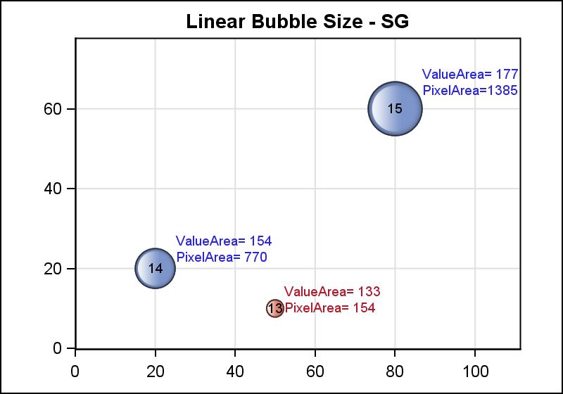
The bubbles are sized based on the SIZE role shown in the code above. By default, the sizing is done using a "Linear" scaling. The smallest bubble size (on screen) has a diameter of the default marker size (7 px) and the largest bubble has a diameter of the three times the default marker size (3*7 px = 21 px). The observation with the smallest value for "Size" gets the smallest bubble (7 px), and the observation with the largest value for "Size" gets the biggest bubble (21 px). The on-screen size for the smallest or largest bubble can be set using the BRADIUSMIN and BRADIUSMAX options. All other observations get a size between these two, scaled by the area of the bubble. This is the default "Linear" scaling method. More on this later.
 The graph above shows a bubble plot with "Relative" scaling. This means that the bubble sizes have no direct association with the dimensions on the axes. They are sized as noted above, relative to each other.
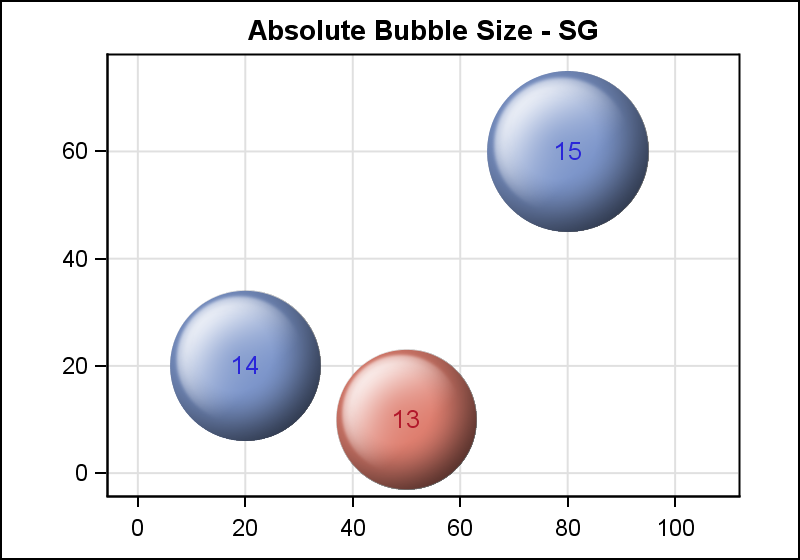
Another useful way to see a bubble chart is where the size values are relative to the axis values. In this case, a size of 10 means the bubble should have a radius of 10 units along the each axis. Such a graph is shown on the right.
In this graph, each bubble has a size on the screen such that the radius of the bubble represents the distance along the axis. So, the bubble with size=13 is centered at (50, 10), and has a radius of 13 units. Such graphs are very useful when the observations represent some physical entity in geographic space, and the X and Y axes are equated. In this graph we have set an ASPECT=0.7 and set the axes such that they have an aspect of 0.7. Note the use of the absscale option and the grid lines create a mesh of square regions.
proc sgplot data=bubble noautolegend aspect=0.7; bubble x=x y=y size=size / group=type datalabel=size datalabelpos=center <strong>absscale</strong> dataskin=sheen nooutline datalabelattrs=(size=10); xaxis min=0 max=100 offsetmin=0.05 offsetmax=0.1 display=(nolabel) grid; yaxis min=0 max=70 offsetmin=0.05 offsetmax=0.1 display=(nolabel) grid; run; |
 Let us take another look at the issue of "Linear" scaling in the graph at the top. Here, the relationship between different values can be a bit confusing. A bubble for an observation of size 2x will not be twice the size of the bubble for obs with size x.
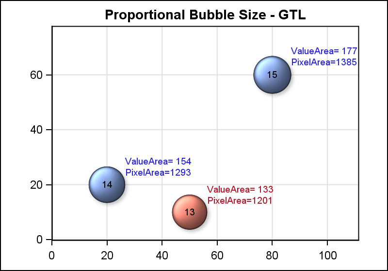
It is often useful to have a graph where an observation with size=100 will be drawn with a bubble area twice as much as the bubble for an observation with size=50. This scaling is called "Proportional", as shown in the graph on the right.
In the graph on the right, the "Size" is shown in the middle of the bubble, The "Value Area" and the "Pixel Area" are shown in the outer label. Now, the bubble of size 13 is only a little smaller than the bubble of size 15. If we had a bubble of size 7.5, its area would be exactly half of the bubble with size 15. In this method of scaling, the scaling line passes through zero and the max value. So, observations with a response value of zero can (technically) have an area of zero. However, BRADIUSMIN is used as a cutoff value to draw something on the screen.
The RELATIVESCALETYPE option can be used to get this last graph. Except, this option is not currently available with the SGPLOT Bubble Plot statement. If you need to create a bubble plot with proportional scaling, you will need to use the GTL version shown below.
/*--Template for Bubble Chart with Proportional scaling--*/ proc template; define statgraph Bubble; begingraph; entrytitle 'Proportional Bubble Size - GTL'; ; layout overlay / aspectratio=0.7 xaxisopts=(display=(ticks tickvalues line) griddisplay=on linearopts=(viewmin=0 viewmax=100) offsetmin=0 offsetmax=0.1) yaxisopts=(display=(ticks tickvalues line) griddisplay=on linearopts=(viewmin=0 viewmax=70) offsetmin=0 offsetmax=0.1); bubbleplot x=x y=y size=size/ group=type datalabel=PropLbl relativescaletype=proportional datalabelsplit=true datalabelsplitchar='-' name='a' dataskin=sheen display=(fill); textplot x=x y=y text=size / position=center; endlayout; endgraph; end; run; /*--Bubble Chart with Proportional scaling--*/ proc sgrender data=bubble template=bubble; run; |
In this case, we can actually use the GTL LAYOUT OVERLAYEQUATED. This layout ensures that each axis uses the same pixel to data scale, so a value interval of 10 units is represented by 10 pixels on each axis.
Full SAS 9.4 code: Bubble
Scaling Diagrams (by Rick Wicklin): Scaling_Diagram


2 Comments
Got two questions:
1. Is there a way to specify the colors of all bubbles manually?
2. Is there a way to make the label appear only if I hover my mouse over a bubble?
Thank you.
Yes, you can set color of all bubbles using the appropriate FillAttrs options. Or, color of individual bubbles can be set "by value" from another variable using the Discrete Attributes Map. There is no way to set individual bubble color directly from the data set. See article: http://blogs.sas.com/content/graphicallyspeaking/2013/04/02/attribute-maps-1/