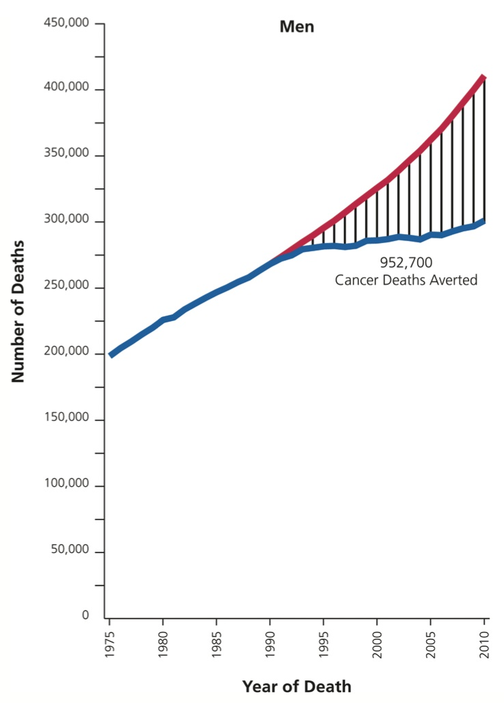
 Significant progress in reduction of Cancer mortality is shown in a graph that I noticed recently on the Cancer Network web site. This graph showed the actual and projected cancer mortality by year for males. The graph is shown on the right.
The graph plots the projected and actual numbers by year, and highlights the difference using the hatched pattern. The total number of Cancer Deaths Averted is shown.
The graph on the right includes a Y axis data range all the way down to zero, where it is really not necessary. But, we can use this space that is otherwise wasted to display more information.
Creating the graph is easy, using the following SGPLOT code. Some options are trimmed to fit the space. See full code in link at bottom for the details.
title 'Cancer Deaths'; proc sgplot data=mortality nocycleattrs nowall noborder; styleattrs datalinepatterns=(solid); highlow x=year low=actual high=projected / type=line; series x=year y=projected / name='b' legendlabel='Projected'; series x=year y=actual / name='a' legendlabel='Actual'; keylegend 'a' 'b' / location=inside position=topleft linelength=20; xaxis values=(1975 to 2010 by 5) grid; yaxis values=(0 to 450000 by 50000) grid; run; |
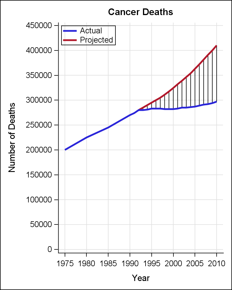 The graph is shown on the right is created by the code shown above. The data is "eye-balled" from the original graph and includes the columns of Year, Actual, Predicted and Diff. The total number of deaths averted is saved in a macro, and also inserted into the label to be displayed.
Two SERIES plots are used to plot the actual and predicted curves. A HIGHLOW plot is used to draw the vertical hatch marks showing the reduction in the cancer deaths since 1990. A legend is added to indicate the actual and predicted curves.
For the graph shown below on the right, a Band plot is added to display the reduction in cancer deaths by year explicitly. Also, we have used a TEXT plot statement to display the inset indicating the number of deaths averted.

There some benefits of this addition. The empty area at the bottom of the graph is utilized. The actual deaths averted are drawn from a common baseline, thus removing the distortions in the hatched area due the varying baseline. An an explicit inset shows the estimated number of deaths averted.
The TEXT plot is a SAS 9.4M2 feature, but one could use an INSET or a SCATTER with MarkerChar to do something similar.
Full SAS code: CancerDeaths


