Including special Unicode symbols into the graph is getting more popular. In general, SG procedures support Unicode strings in places where these strings are coded into the syntax such as TITLE, FOOTNOTE. These support Unicode characters and also the special {SUP} and {SUB} commands. This is because these statements are rendered by the graph using Java string API.
Curve Labels and Axis Labels that are assigned in the procedure syntax can also support Unicode, but not the {SUP} and {SUB} commands. This is because these items are passed to the graph rendering engine which cannot handle the {SUP} and {SUB} commands. However, most of the popular numeric sub and super scripts are available in the Unicode fonts, so much of the need is covered.
Recently, a user chimed in on the Communities page, wanting to include Unicode values in the Legend. The group variable values include Unicode strings like "Less than or equals", and the journal preferred usage of the Unicode <= symbol, not the "<=" sequence of characters.
 With all the releases of SAS till date, the SGPLOT procedure cannot support Unicode from data or formats into the graph legends or axis. However there is a way to do this by restructuring the grouped data into a multi-column format.
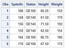
A few observations of the original data are shown on the right. I have added a column based on the level of the Systolic Blood Pressure called "Status".
We could plot a Graph of Weight by Height by Status, and get a scatter plot of the data, with the "Status" values displayed in the legend as "GE160" and so on. However that is not what user wants, and rather have the numeric values with the "<=" symbols.
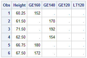 The transformed data set is shown on the right. Here, I have created four new columns, each containing the appropriate value for weight based on the Status. So, this result in some missing values in the new columns.
Now, instead of using one scatter plot with the GROUP option, we will plot these four columns using four scatter plots as shown below. All of the scatter plot are without any group variable, and I have used the LEGENDLABEL option to provide the label for each scatter plot. These labels include Unicode characters.
ods escapechar '~'; title 'Blood Pressure by Weight by Height'; proc sgplot data=heart_cols; scatter x=height y=ge160 / legendlabel="160 ~{Unicode '2264'x} Systolic "; scatter x=height y=ge140 / legendlabel="140 ~{Unicode '2264'x} Systolic < 160"; scatter x=height y=ge120 / legendlabel="120 ~{Unicode '2264'x} Systolic < 140"; scatter x=height y=lt120 / legendlabel="Systolic < 120"; keylegend / title='' location=inside position=topleft across=1; run; |
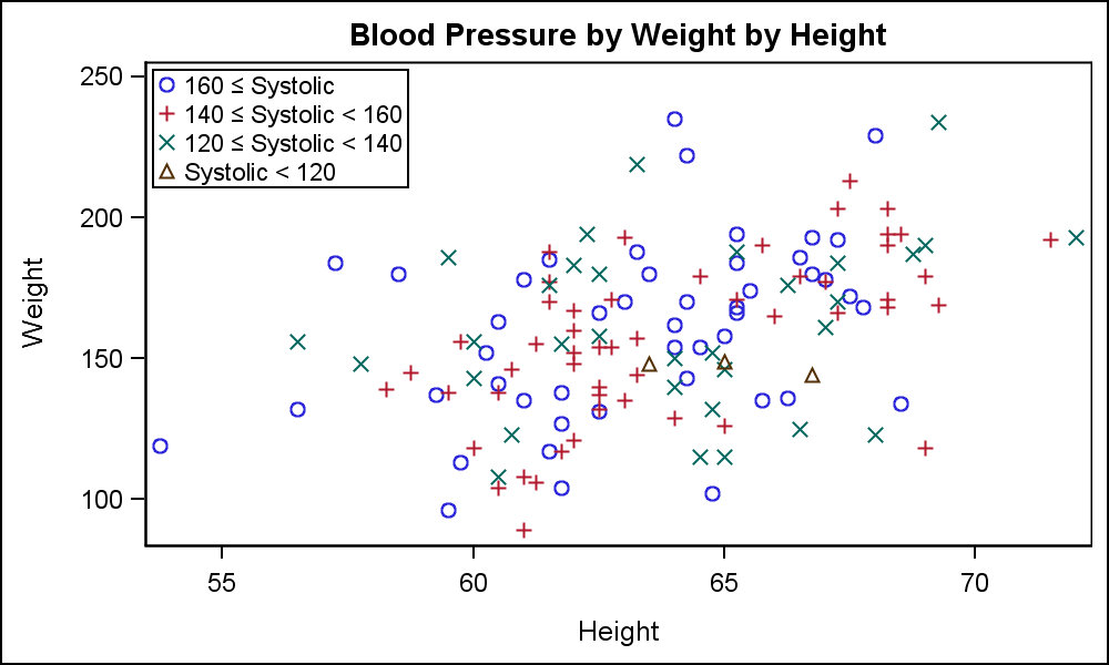
Click on the graph for a higher resolution view. Note the legend on the top left contains the ranges for the Systolic blood pressure, using the appropriate Unicode symbols. Each scatter plot in the graph is represented in the legend by the LEGENDLABEL. The legend label can be assigned Unicode values as shown above.
Now, the legend in the graph can be improved if we can position all the "Systolic" labels in the legend vertically aligned. To do this, one might want to add some blanks to the front of the text string in the Legend label for the fourth scatter plot. However, this will not work, as all leading blanks are automatically stripped. But, the system can be tricked to not strip the leading blanks by first adding a non-breaking space character 'A0'x in the label string followed by the required number of blanks. This is shown in the code and graph below.
ods escapechar '~'; title 'Blood Pressure by Weight by Height'; proc sgplot data=heart_cols; scatter x=height y=ge160 / legendlabel="160 ~{Unicode '2264'x} Systolic "; scatter x=height y=ge140 / legendlabel="140 ~{Unicode '2264'x} Systolic < 160"; scatter x=height y=ge120 / legendlabel="120 ~{Unicode '2264'x} Systolic < 140"; scatter x=height y=lt120 / legendlabel="~{Unicode '00a0'x} Systolic < 120"; keylegend / title='' location=inside position=topleft across=1; run; |
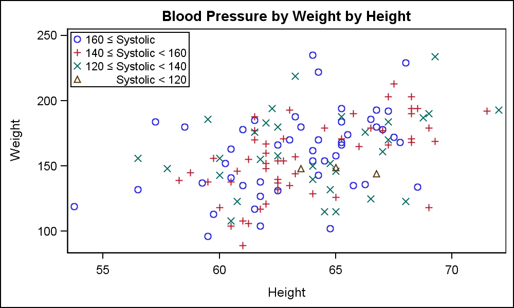
In the legend for the graph above, all the "Systolic" terms are correctly aligned, making the legend a bit easier to read. Note, this process needs custom handling. Full code is provided in the link below.
The good news is that support for Unicode in the graphs will be included with SAS 9.40M3 release using User Defined Formats. With this approach, you will be able to format any data value into a string that can include Unicode symbols. Thus group values or axis tick values can be customized programmatically.
Full SAS 9.3 Code: LegendSymbols_930


2 Comments
Hi Sanjay,
So, if I understand correctly, SAS9.40M3 will alow us to use unicode characters as the data marker symbols, too? This is a feature that I was looking for since quite some time.
This is already supported with SAS 9.40M1. You can use the SYMBOLCHAR statement to define symbols from UNICODE characters, which can then be used in the list of group symbols. See Graphically Speaking article on Marker Symbols