Over the Christmas Holidays I saw an graph of agricultural exports to Russia in 2013. The part that caught my eye was the upper part of the graph, showing the breakdown of the trade with Russia as a horizontal stacked bar with custom labels.
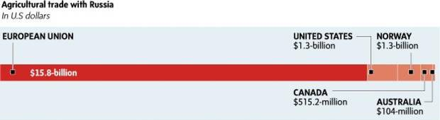 The value for each region / country is labeled individually along the top and bottom of the bar for each segment, as shown on the right. Each label is at a custom location along the bar with some on top, some at the bottom. Most labels include the name of the region and the amount, but others have the name in the label, but the amount in the bar (European Union).
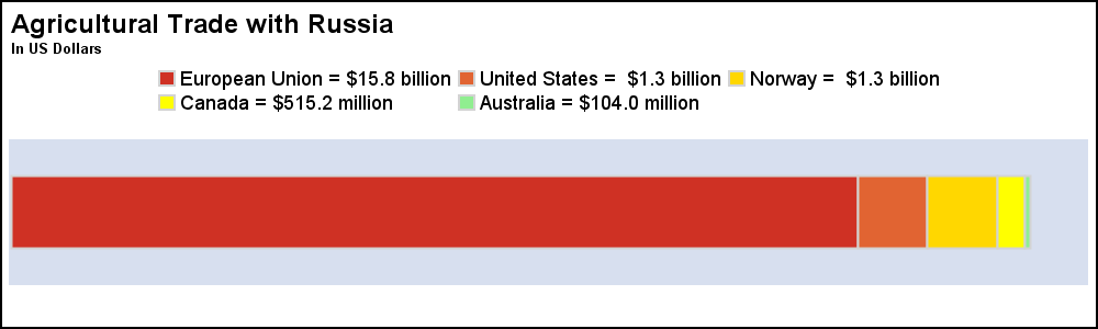 Making this graph as a regular stacked horizontal bar with a legend is very simple and also scalable and extensible to other data. I used the colors from the graph above, but then added a few other colors to distinguish the segments so they can be identified in the legend. Click on the graph for a more detailed view.
proc sgplot data=russia noborder nocycleattrs; styleattrs datacolors=(%rgbhex(207, 49, 36) %rgbhex(225, 100, 50) gold yellow lightgreen); hbarparm category=cat response=value / group=label groupdisplay=stack outlineattrs=(color=lightgray) baselineattrs=(thickness=0) barwidth=0.5 grouporder=data; keylegend / title='' noborder location=inside position=top; yaxis display=none colorbands=odd offsetmin=0.3; xaxis display=none; run; |
The main reason the original graph is interesting is the attempt to "move" the legend entries closer to the bar itself. The benefit of this is that the values can be read directly and easily and the graph is easier to decode. In the legend case, one has to move the eye between the legend and the graph. First, identify the color of the segment in the bar, then find its value from the legend. Also, the small green segment for Australia could be missed.
Direct labeling is often useful for decoding a graph, especially where the graph is not too complicated. But, direct labeling in this case also requires custom code, either annotation or something else. So, there is a balance to be achieved between the two.
 Since I try to avoid annotation as much as possible, first I tried to create this graph using other means with SAS 9.4M2. Here is what I was able to do with some coding. My goal is to break up the legend and move each individual value closer to the bar segment itself. I kept the color swatches to avoid the need the call-out line to each bar segment.
Clearly, the coding is more elaborate, as I have to place each color marker and the text close to where it needs to go, switching between above and below the bar as shown in the code below. Some appearance options are trimmed to fit. See full code in the link below.
proc sgplot data=russia_labels noborder noautolegend nocycleattrs; styleattrs datacolors=(%rgbhex(207, 49, 36) %rgbhex(225, 100, 50) gold yellow lightgreen) datacontrastcolors=(%rgbhex(207, 49, 36) %rgbhex(225, 100, 50) gold yellow lightgreen) datasymbols=(squarefilled); hbarparm category=cat response=value / group=label groupdisplay=stack baselineattrs=(thickness=0) barwidth=0.5 grouporder=data; scatter x=xlbl1 y=cat / discreteoffset=-0.35 group=label; text x=tlbl1 y=cat text=label / discreteoffset=-0.35 position=left contributeoffsets=none splitpolicy=splitalways splitchar='='; scatter x=xlbl2 y=cat / discreteoffset= 0.35 group=label; text x=tlbl2 y=cat text=label / discreteoffset= 0.35 position=left contributeoffsets=none splitpolicy=splitalways splitchar='='; yaxis display=none colorbands=odd; xaxis display=none; run; |
Note, the code is longer because there are 2 pairs of scatter and text plot statements, one for the labels along the top and one for those at the bottom, because of the different values of DiscreteOffset. The positions for the markers and the text are computed for each value in the code. Now, each label and value are effectively moved close to the segment, making the graph easier to decode.
In this exercise, I have used the new TEXT plot statement added with SAS 9.4M2. This statement is customized to draw text strings in the graph, and has many features for handling text. We did not want to overload the scatter plot (with MarkerChar). Going forward, you would be better off using the TEXT plot in place of cases where you used MarkerChar. For earlier releases, you could use the scatter with MarkerChar or DataLabel to do something similar. This exercise is left to the motivated reader.
Alternatively, one could exactly duplicate the original graph by using SG Annotate to do the labeling, including the call out lines from the text to the segment. In both cases, the code is heavily customized, and not easily scalable to other data.
I have presented my opinion on the pros and cons of each method. I would love to hear your opinion too.
SAS 9.4M2 Code: Russia_3


4 Comments
Agree. Finding the balance between standard proc code, annotation, the desired output and the SAS Software release installed are aspects that need to be considered to determine what path to take. I like how you specify in your blog posts the version of SAS Software you've used and sometimes the alternative ways are to achieve the same graph in other versions of SAS.
Sanjay,
Thank you for this very useful code. I will be able to apply this to much of the work I do.
I was wondering if the location of the datalabels can be modified? Specifically, I would like the data labels to be displayed directly above the marker. The default setting puts the data label slightly to the side of the marker, which doesn't look as nice for the particular graph I'm working on.
Yes, DataLabels can be positioned anywhere around the marker.