Have you ever wondered why sometimes a SGPLOT or GTL graph has markers drawn beyond the extreme tick and value on an axis and sometimes not? And, if you prefer your graphs to always have tick values on the axis that cover the whole range of data, how can you do that?
 Let us look under the covers a bit to see what is going on and why. First of all, the above behavior is intentional and referred to as "Thresholding". It has a specific purpose as displayed in the graph on the right. Here I have generated some data where x is between 0.9 and 4.1 and made this graph using the SAS/GRAPH GPLOT procedure with default axis settings.
Note, GPLOT has used 6 "nice", round number tick values of 0-5 on the x axis to include the entire data range on the axis. Since the data are only between 0.9 and 4.1, the plot region to the left and right of the data is not utilized. In this case, almost 40% of the horizontal space is not used.
 The graph on the right plots the same data using the SGPLOT procedure which uses the full available width of the graph, thus using the space efficiently. This is the result of the default thresholding heuristics used by SGPLOT and GTL. SGPLOT also starts out wanting to use 0-5 ticks, but the "0" and "5" ticks are deemed to be unnecessary and dropped, displaying only values 1-4. Some of the observations are drawn outside the ticks, but the axis range itself covers the full range of the data.
Whether or not to display the outermost ticks and values is determined by the axis threshold on each side independently. The threshold value can be between 0.0 and 1.0, with a default of 0.3. This means that if the outermost data value on one side of the axis is more than 30% of the midpoint spacing away from a possible outer tick, then the outer tick is dropped.
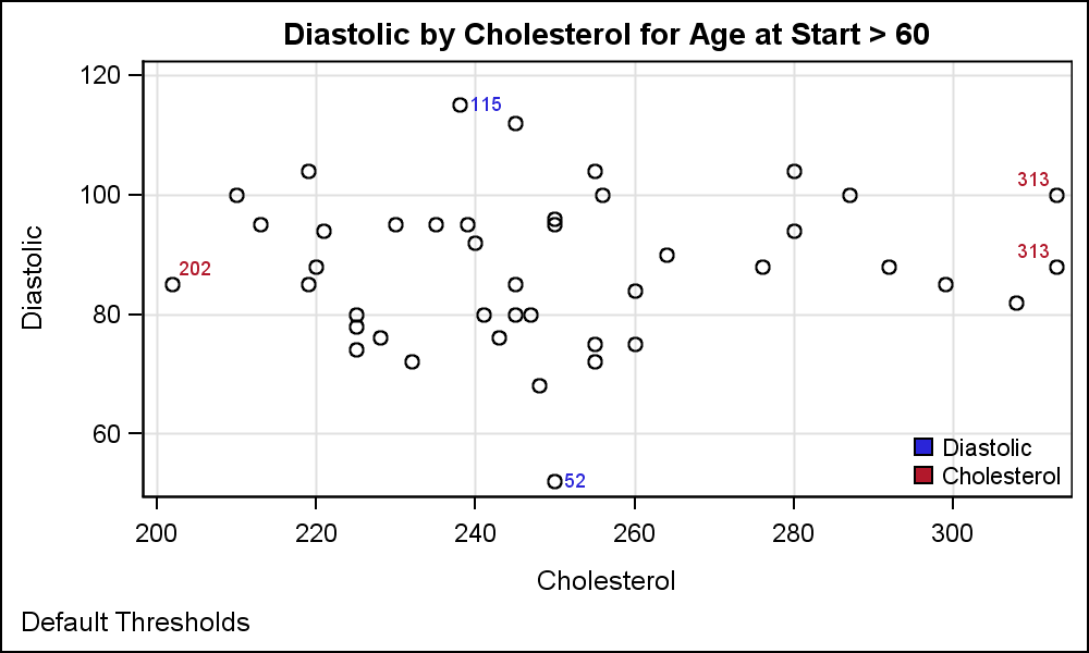 The graph on the right displays Diastolic x Cholesterol for all subjects with an AgeAtStart > 60. The extreme values are labeled showing the Diastolic values in blue and the Cholesterol values in red as indicated in the legend.
Note, on the x-axis, the midpoint spacing is 20. The extreme right marker has a value of 313. This is 100*(1-13/20)=35% away from a potential outer tick at '320'. Since this is > 30%, the outer tick is dropped. So, using default threshold of 30%, only upto 30% of the midpoint spacing will be unused at a max. For Diastolic on the y axis, the upper extreme observation has a value of 115, which is 100*(1-15/20)=25% away from the outer tick of '120', so that tick is retained.
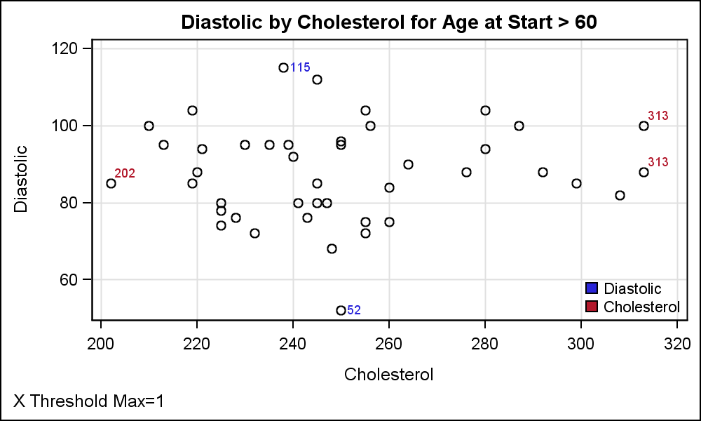 So, what can you do if you always want to see the outer ticks? The answer is simple - set the ThresholdMin or ThresholdMax options on the axis. Setting Thresholdmax=1 will ensure that the outer tick will always be shown on the maximum side of the axis as shown in the graph on the right Now, the outer tick of "320" is displayed on the x-axis. The code snippet is shown below. See the attached file for the full code.
SGPLOT code:
proc sgplot data=heart nocycleattrs noautolegend; scatter x=cholesterol y=diastolic / datalabel=clabel datalabelattrs=graphdata2; scatter x=cholesterol y=diastolic / datalabel=dlabel datalabelattrs=graphdata1; xaxis grid thresholdmax=1; yaxis grid; run; |
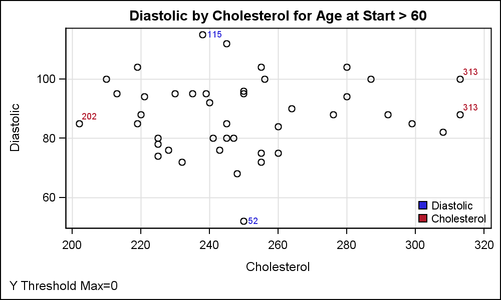 On the other hand, setting ThresholdMin or max to '0' will force the outer ticks to be always dropped. For the graph on the right, I have set the ThresholdMax=0 on the y axis along with the ThresholdMax=1 on the x axis. Now, the x axis always has outer ticks, and the y axis never has the outer ticks.
Full Program: Threshold


1 Comment
This post has greatly helped me to understand Axis Thresholds, and when I experimented and changed the Cholesterol value from 313 to 314, the maximum tick mark went to 320 as expected.
Thank you Sanjay!