Often we need to plot the response values for binary cases of a classifier. The graph below is created to simulate one seen at http://www.people.vcu.edu/ web site of the shock index for subjects with or without a pulmonary embolism. In this case, the data is simulated for illustration purposes only.
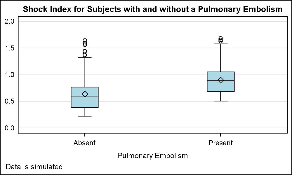 There are two levels for the classifier for presence of pulmonary embolism, "Absent" and "Present". The response values are plotted as a box plot. I call this graph the "Binary Response Graph" as I could not find the common name for such a graph. I would be happy if someone can provide the industry standard name for such a graph.
SAS 9.3 code for box plot:
proc sgplot data=Pulmonary; vbox shock / category=pulmonary boxwidth=0.2 fillattrs=(color=lightblue); yaxis display=(noticks nolabel noline) min=0 max=2 grid; run; |
Note in the graph, the two class values "Absent" and "Present" are placed on the x axis with an offset of 1/2 the midpoint spacing on each side on the axis. This is the standard placement of category (aka midpoint) values along a discrete axis for plots like Bar Charts, Box Plots and so on.
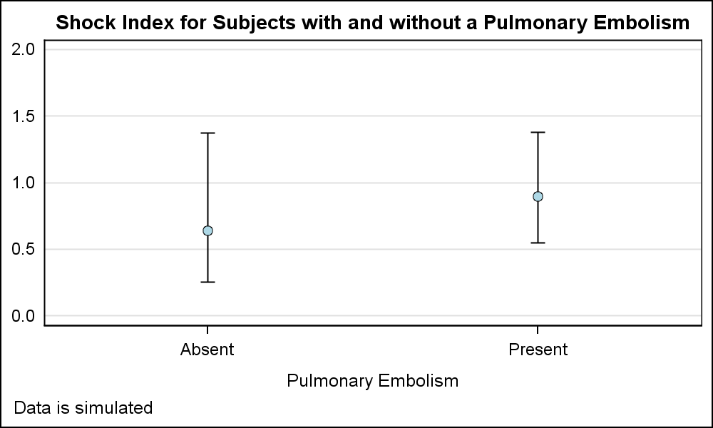
 Now, let us plot the mean, the 5th and the 95th percentile for the same data using the scatter plot. I used the MEANS procedure to compute the mean, P5 and P95 values to create the data set for the graph shown on the right. Note, something different happened here with the placement of the category values on the x axis.
Aside: In this graph I have used two scatter plots just to simulate the filled and outlined mean marker. With SAS 9.4, this can be done with an option. Click on the graph for a high resolution image.
SAS 9.3 code for scatter plot:
proc sgplot data=Pulmonary; scatter x=pulmonary y=mean / yerrorlower=p5 yerrorupper=p95 markerattrs=(symbol=circlefilled color=black); scatter x=pulmonary y=mean / markerattrs=(symbol=circlefilled color=lightblue size=6); yaxis display=(noticks nolabel noline) min=0 max=2 grid; run; |
In the graph above, the category values are displayed at the ends of the axis, with an offset of half the size of the marker at each end of the axis. This is the standard behavior of the scatter plot on any type of axis. Setting x axis Type=Discrete does not make any difference. While we noticed this behavior, we could not change it because the scatter plot is the most extensively used plot type and such a change would create too many problems for many graphs.
However, in such cases, it is often desirable to get the discrete axis behavior similar to the first graph shown above. How can we get that? Well, as usual, there are multiple (simple) ways to get the result we want.
 First, recall we can (and are) using layers of plots to create the graph. I can place a high low plot of the same data prior to the scatter plot. The high low plot prefers a Bar Chart like category axis, and placing it first makes it the "Primary" plot, thus forcing the x axis to its liking and forcing other plots to follow its lead.
The high low plot also does not force a baseline of zero on the y axis, like the bar chart does. So, it is the ideal choice in this case. The low and high values of the high low plot are the same (mean), so a dot is drawn at this location that is overdrawn by the scatter marker. Note, the resulting graph is now the way we want as shown above.
SAS 9.3 code for scatter plot with high low:
proc sgplot data=Pulmonary; highlow x=pulmonary low=mean high=mean; scatter x=pulmonary y=mean / yerrorlower=p5 yerrorupper=p95 markerattrs=(symbol=circlefilled color=black); scatter x=pulmonary y=mean / markerattrs=(symbol=circlefilled color=lightblue size=6); yaxis display=(noticks nolabel noline) min=0 max=2 grid; run; |
 Another way to achieve a similar result is to use a "dummy" group variable on the scatter plot with GroupDisplay=Cluster. This forces the axis to what we want as shown on the right.
SAS 9.3 code for scatter plot with cluster group:
proc sgplot data=Pulmonary; scatter x=pulmonary y=mean / yerrorlower=p5 yerrorupper=p95 group=pulmonary groupdisplay=cluster markerattrs=graphdatadefault errorbarattrs=graphdatadefault; yaxis display=(noticks nolabel noline) min=0 max=2 grid; run; |
Full SAS 9.3 code: Pulmonary_93


6 Comments
The web site link does not go to a specific page, so it isn't possible to see the reference graph. Can you fix it?
Please see previous reply.
Is this the page?
http://www.people.vcu.edu/~albest/DENS580/DawsonTrapp/Chap3.htm
Here is the link: http://www.people.vcu.edu/~albest/DENS580/DawsonTrapp/Chap3.htm. See Figure 3-6. The first graph in the article is based on Figure 3-6.
I think many statisticians would simply call this a one-way Analysis of Variance (ANOVA) plot. It is used to show the distribution of the response for various categories. The box plot is produced automatically by PROC ANOVA for balanced designs (same number of obs in each group) and by PROC GLM for unbalanced designs (some groups have more obs than others):
If there are two categories, this plot is also produced as part of a t test anaylsis by PROC TTEST.
Good stuff. Thanks for sharing.