A couple of days back, Rick Wicklin forwarded me a link to an article on the BadHessian Blog on creating a Bar Chart using six different freeware packages in R, Python and Julia. The target bar chart was one produced by the Jetpack stat module with WordPress. The graph is shown below.
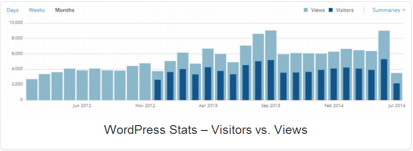
The unique feature of this graph that had caught the eye of the author was the overlaying of two bar charts, one within the other. The author's goal was to investigate the capabilities of other graphics packages to create a similar graph, such as R base graphics package, GGPLOT2, Python - Matplotlib, Python - Seaborn, Julie - Gadfly and Julia - Plot.ly.
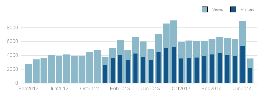
As users of SAS SG Procedures and GTL are aware, such graphs are very easy with the SGPLOT procedure, and examples of such graphs have been shown in this blog and in other places. Here is the same graph created using the SGPLOT procedure.
SAS 9.3 SGPLOT program:
proc sgplot data=visits nowall noborder; styleattrs datacolors=(%rgbhex(140, 185, 202) %rgbhex(19, 85, 137)); vbar month / response=views nostatlabel nooutline; vbar month / response=visitors nostatlabel barwidth=0.5 nooutline; keylegend / location=outside position=topright noborder valueattrs=(size=5); xaxis fitpolicy=thin display=(nolabel noticks) valueattrs=(size=6 color=gray); yaxis grid display=(noline noticks nolabel) valueattrs=(size=6 color=gray); run; |
The %RGBHEX macro is supplied by Perry Watts, and converts a RGB value to CX color value. It is included in the attached full code. Many options used here are needed to make the graph visually similar to the original, and are not necessary if one was to accept the default settings for the procedure. That would reduce the code by a large fraction.
The author of the post has set the X axis spacing of 5 months. The reason for this is not clear, maybe it is to allow different months to be displayed. For a discrete axis, SGPlot will try to show all the values on the axis, unless they don't fit cleanly. Then, as in this case, the values are thinned symmetrically. If the axis was numeric with a time format, you will get thinned axis tick values.
The author mentions a preference for the outer Y grid line (for Y=10000), and has made an extra effort to include this in the graphs. For SGPLOT, the preferred default is to include a tick value outside the data range only if the extreme data point goes beyond 30% of the tick interval with inner ticks. In this case, since the data does not seem to go very much past 8000, the tick value at 10000 is not shown by default. This prevents wasteful white space outside the data. Of course this can be changed to produce an outer tick value if a user really wants it using the Threshold option.
SGPLOT has a way to customize the tick values one wants to see on the discrete axis using TickValueList and TickDisplayList. However it is clear we could use a simpler option to do this. This can be useful when the discrete data has sequential numeric, time or some other predictable values.
Another noteworthy item in the SGPLOT graph is the outline on the color swatches in the legend. This is done to allow swatches of very light color to be visible. However, a case could be made to provide an option to suppress the outline to match the bar.
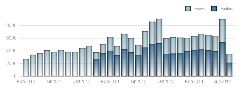
Users looking for a bit more aesthetic rendering can use skins and gradients without distorting the data as shown below.
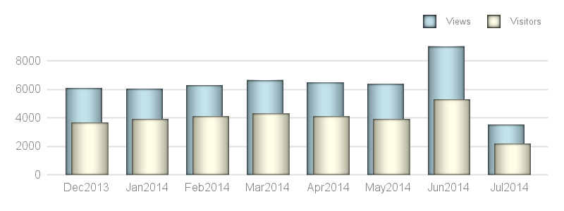
For graphs with a smaller amount of data, it may be desirable (based on individual preference) to offset the two bars by a small amount to show overlapped bars. This too is easily done with SGPLOT procedure by using the DiscreteOffset option as shown in the graph below.
Full SAS 9.3 Program: Bars


2 Comments
I have memories of creating these types of plots using annotate... Great to see how easy it is with sgplot now!
Some sharp eyes have reported that I may have let slip a SAS 9.4M2 feature in this article. This is the FILLTYPE=GRADIENT, used in the 3rd graph to draw bars with a gradient fill from top to bottom of the bar. You can remove that option from the code when you try it with an earlier version, and still get a good graph..