Spirals are cool. And useful. We use them every day without thinking about it. Every time the road turns from a straight line to a curve, we go through a transition spiral. Spirals allow us to change curvature in a steady increasing or decreasing fashion. Without a spiral, this transition would be abrupt.
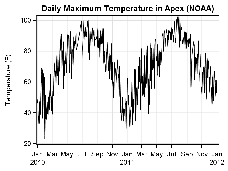 For our purpose, spirals can also be useful for visualizing data that is cyclical in nature. If you are visualizing daily high temperature over a 2 year period, you could plot it on a straight X axis as shown on the right.
The cyclical nature of the data is evident in the graph. But, this same cyclical behavior may be easier to understand on a spiral with one cycle per year. So, that is the plan for today.
A visit to Wikipedia page on spirals reveals there are many kinds of spirals including logarithmic, hyperbolic and many more. Let us start with the simple Archimedean Spiral. This has the simple formula: R = A + B * theta.
Experimenting with this equation yields these different spirals for various values of A and number of cycles.
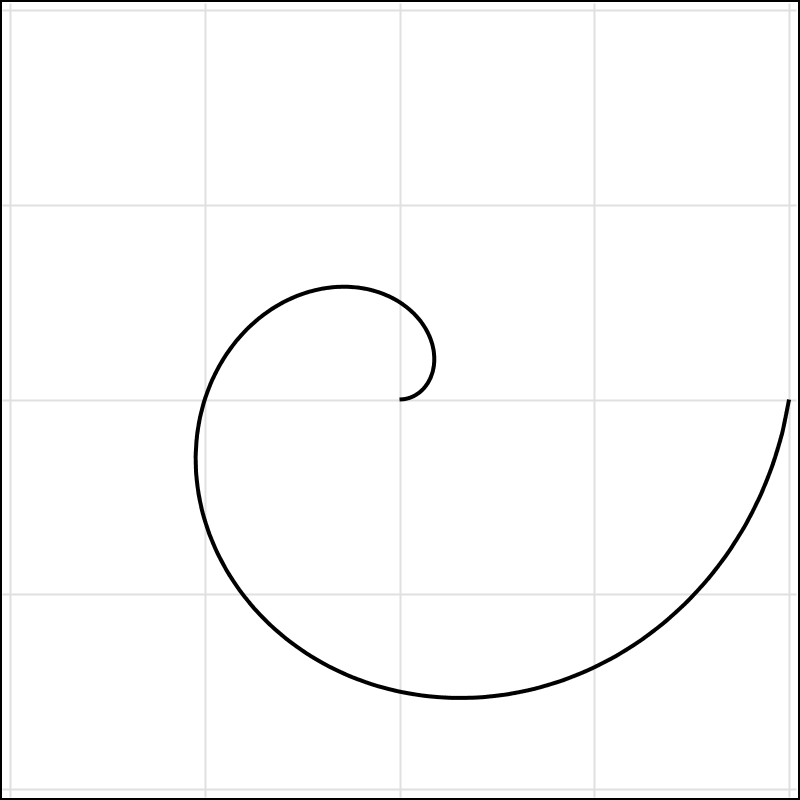 A=0, Cycles=1
The x and y points are computed using the spiral equation, for theta values up to N * 360, where N is the number of cycles. The curve is plotted using the series statement of the SGPLOT procedure.
proc sgplot data=spiral nowall noborder pad=0;
series x=x y=y / smoothconnect;
xaxis min=-&max max=&max grid display=none;
yaxis min=-&max max=&max grid display=none;
run;

A=0.5, Cycles=2
The first spiral starts from the center (A=0) and turns through 360 degree cycle. The second spiral starts at an offset of 0.5 the radius and turns through 720 degrees.
Once the spiral is drawn, now we need to map the data on to the spiral so that the time axis is along the spiral and the response values are drawn normal to the spiral, towards the center.
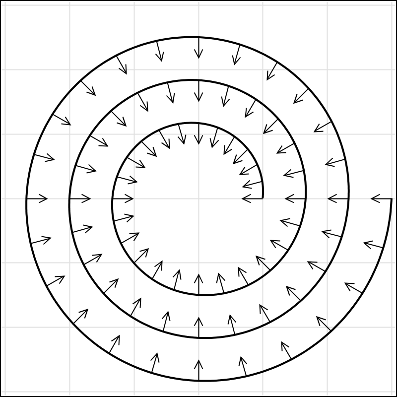 The graph on the right shows the basic idea. At each point along the time axis, we compute the theta and then find the (x, y) point on the spiral. The direction vector (cx, cy) for the response (the arrows) is towards the center of the spiral (0, 0). In the example on the right, all arrow heights are half the spiral spacing. So, we can compute the (x2, y2) location of the arrow heads from (x, y) and (cx, cy) as shown in the program.
I have used some SAS 9.4 features to draw smooth curves and remove background wall and border. A SAS 9.3 version program is also included.
 With real time series data, we would normalize the response over the entire range, and plot the data one side of the spiral by using the abs() value and a color to signify sign. Then, scale the vector by response and plot. A simulated example is shown on the right.
We will cover the mapping real world time series data (as shown in the first graph on top) on to the spirals in next article on Spirals.
SAS 9.4 Program: Spiral_Macro_94
SAS 9.3 Program: Spiral_Macro_93


5 Comments
In your future spiral post, could you do a heat map? Here is an example of using a donut chart, but It would be better as a spiral so December 2013, would match up with January 2014.
https://www.dropbox.com/s/i7f7clipc4umj3m/Calendar%20as%20Donut.png
Here is my intial attemp of using your spiral macro to make a gmap map file. Now I need to figure how and where to label months and years.
https://www.dropbox.com/s/4azvar5ynjas02t/spiral.sas
Very cool. This is very close to what I did to create the Spiral Heat Map from the weather data set. I will write it up for the next article. I used the new Polygon Plot, but you can easily use GMAP too.
I don't know where to find the SAS dataset named "treenet.parks2steve" using the SAS code "spiral.sas". Also wonder if the completed "Spiral Heat Map" has been created using SAS?
Thanks.
Pingback: Splines - Graphically Speaking