It was almost two weeks ago that I got started making a display for lab tests for a subject, based on a graph I saw on the web for an article on this blog. 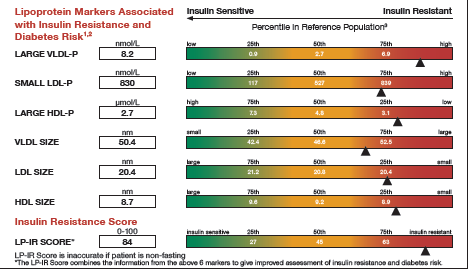
This graph is a part of a larger panel display of the lab values for a subject. The panel includes the display of multiple lab values, including a gradient range of the percentile values for the general population. The lab value for the subject is shown in the box on the left and also in the gradient range. The graph is shown on the left.
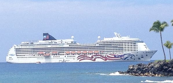 While working on this article, I ran into a few issues including the minor issue of a long planned vacation to Hawaii that included a cruise around the islands. Suffice it to say, the the islands are fabulous, and the cruise lived up to all the expectations one can imagine. Here is a picture I took of the boat, when anchored off Kona on the Big Island.
Then, it was time for PharmaSUG in San Diego. The conference was a resounding success, and I had the opportunity to meet with SAS users interested in creating graphs using ODS Graphics. The presentations were excellent, with users much more likely to be persuaded by the experiences of fellow SAS users rather than hearing from SAS staff.
Back from these two diversions, I finally got back to this project. Here is the step by step progression to making this graph.
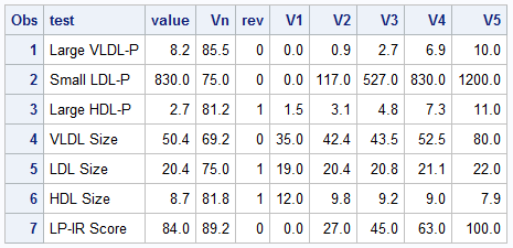 First, on the right is the data I gleaned from the web image, and with Rick's help, created this data set of the values in the graph. Now, the expectation is that when you make such a graph, you have all the pertinent data in hand. Note that each value V1, V2, etc. are for the 0, 25th, 50th, 75th and 100th percentile of the data. Note, for all tests, the "better" numbers are on the left, and the "worse" numbers are on the right. I use the column "Rev" to indicate the ranges are reversed, with higher numbers to the left.
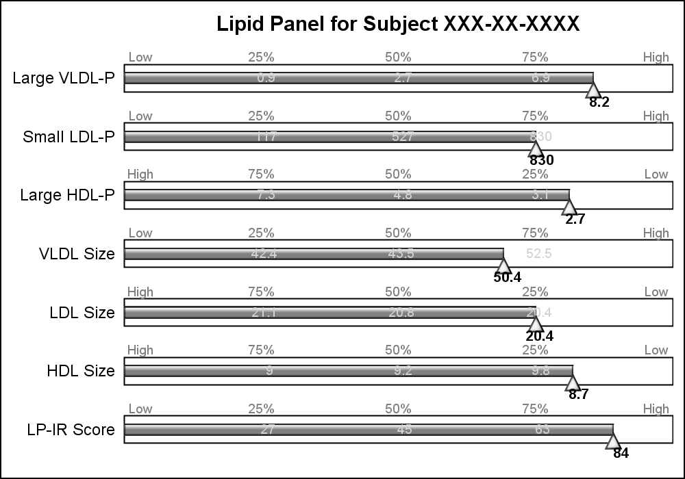 This graph uses SAS 9.4 but all significant feature of the graph can be created using SAS 9.3. Here is the simple graph showing the test, values and the percentile ranges.
For each test, the percentile values for the larger population are shown on the right, with the percentile values above the box, and actual test values inside the box. The actual test value for the subject is also shown at the correct percentile location on each bar.
title 'Lipid Panel for Subject XXX-XX-XXXX';
proc sgplot data=Lipid noautolegend nowall noborder;
  highlow y=test low=low high=high / type=bar outline nofill barwidth=0.5 ;
  hbarparm category=test response=vn / barwidth=0.2  dataskin=gloss
           fillattrs=(color=gray) nooutline baselineattrs=(thickness=0);

  scatter y=test x=vn2 / markerchar=v2 markercharattrs=(color=lightgray);
  scatter y=test x=vn3 / markerchar=v3 markercharattrs=(color=lightgray);
  scatter y=test x=vn4 / markerchar=v4 markercharattrs=(color=lightgray);

  scatter y=test x=vnl / markerchar=lvn1 markercharattrs=(color=gray) discreteoffset=-0.35;
  scatter y=test x=vn2 / markerchar=lvn2 markercharattrs=(color=gray) discreteoffset=-0.35;
  scatter y=test x=vn3 / markerchar=lvn3 markercharattrs=(color=gray) discreteoffset=-0.35;
  scatter y=test x=vn4 / markerchar=lvn4 markercharattrs=(color=gray) discreteoffset=-0.35;
  scatter y=test x=vnh / markerchar=lvn5 markercharattrs=(color=gray) discreteoffset=-0.35;

  scatter y=test x=vn / markerattrs=(symbol=trianglefilled size=12) discreteoffset=0.2
          filledoutlinedmarkers markerfillattrs=(color=white) dataskin=gloss;
  scatter y=test x=vn / markerchar=value discreteoffset=0.4
          markercharattrs=(size=8 weight=bold);

  xaxis display=none offsetmin=0 offsetmax=0;
  yaxis display=(nolabel noticks noline);
  run;
The program above uses a HighLow plot to draw the box of ranges, and a scatter plot with markerchar option to display the percentile values above the box and the actual values in the middle. An offset triangle marker is used to denote the percentile location of the actual value, and the value itself is displayed below the marker.
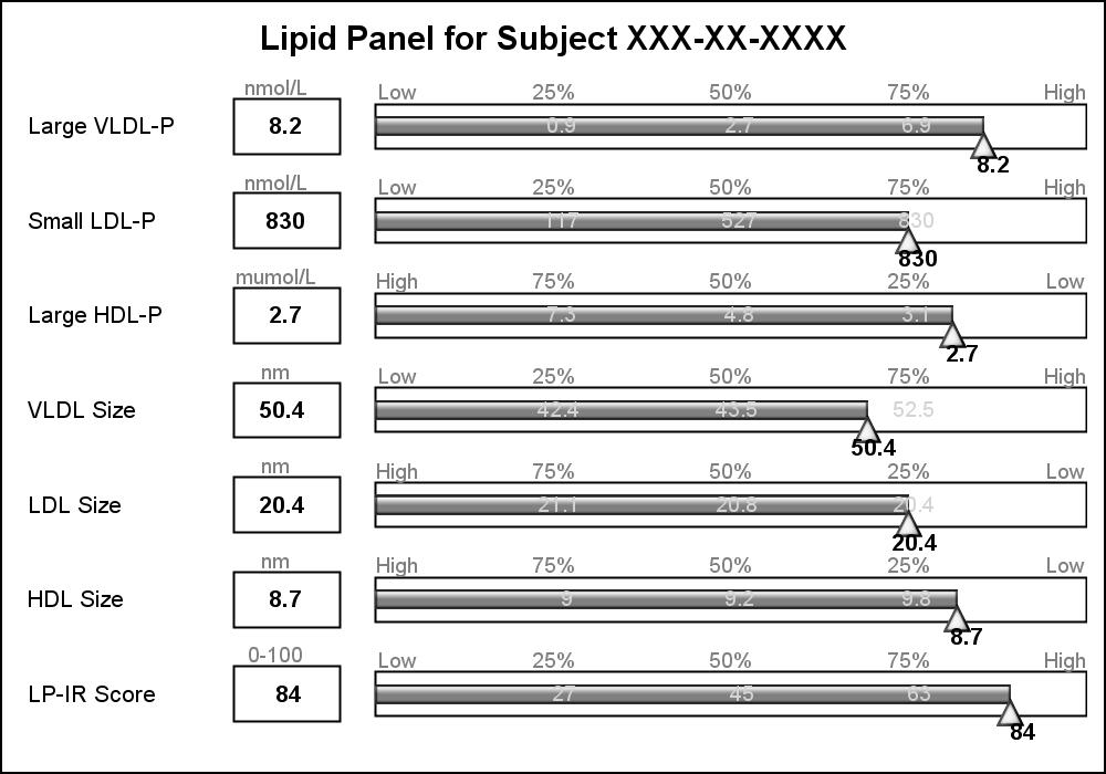 The test names in the original graph are left aligned, and the values are displayed in a box next to the test name along with the units of the values. I added this information using additional HighLow plots with HighLabel option to display the test name, the test value and the units.
The only unit that needs improvement is the "muMol/L", where it would be better to use the greek symbol for "mu".
title 'Lipid Panel for Subject XXX-XX-XXXX'; proc sgplot data=Lipid noautolegend nowall noborder; highlow y=test low=boxL high=boxH / type=bar nofill outline lineattrs=(color=black) barwidth=0.6; scatter y=test x=boxM / markerchar=value discreteoffset=0 markercharattrs=(size=8 weight=bold); scatter y=test x=boxM / markerchar=units discreteoffset=-0.4 markercharattrs=(size=7 color=gray); highlow y=test low=nameL high=nameH / type=bar nooutline barwidth=0.6 fillattrs=(transparency=1); scatter y=test x=nameL / datalabel=test datalabelattrs=(size=8 weight=normal) datalabelpos=right markerattrs=(size=0); highlow y=test low=low high=high / type=bar outline nofill barwidth=0.5 ; hbarparm category=test response=vn / barwidth=0.2 dataskin=gloss fillattrs=(color=gray) nooutline baselineattrs=(thickness=0); scatter y=test x=vn2 / markerchar=v2 markercharattrs=(color=lightgray size=7); scatter y=test x=vn3 / markerchar=v3 markercharattrs=(color=lightgray size=7); scatter y=test x=vn4 / markerchar=v4 markercharattrs=(color=lightgray size=7); scatter y=test x=vnl / markerchar=lvn1 markercharattrs=(size=7 color=gray) discreteoffset=-0.35; scatter y=test x=vn2 / markerchar=lvn2 markercharattrs=(size=7 color=gray) discreteoffset=-0.35; scatter y=test x=vn3 / markerchar=lvn3 markercharattrs=(size=7 color=gray) discreteoffset=-0.35; scatter y=test x=vn4 / markerchar=lvn4 markercharattrs=(size=7 color=gray) discreteoffset=-0.35; scatter y=test x=vnh / markerchar=lvn5 markercharattrs=(size=7 color=gray) discreteoffset=-0.35; scatter y=test x=vn / markerattrs=(symbol=trianglefilled size=12) discreteoffset=0.2 filledoutlinedmarkers markerfillattrs=(color=white) dataskin=gloss; scatter y=test x=vn / markerchar=value discreteoffset=0.4 markercharattrs=(size=8 weight=bold); xaxis display=none offsetmin=0 offsetmax=0; yaxis display=none; run; |
Now, let us get to the display of the gradient green-yellow-red ranges in the display. There is no plot statement in SG or GTL that can draw a gradient color across three colors. Some plot statements support a Color Response option, but essentially the entire entity is rendered with the color derived from the color gradient.
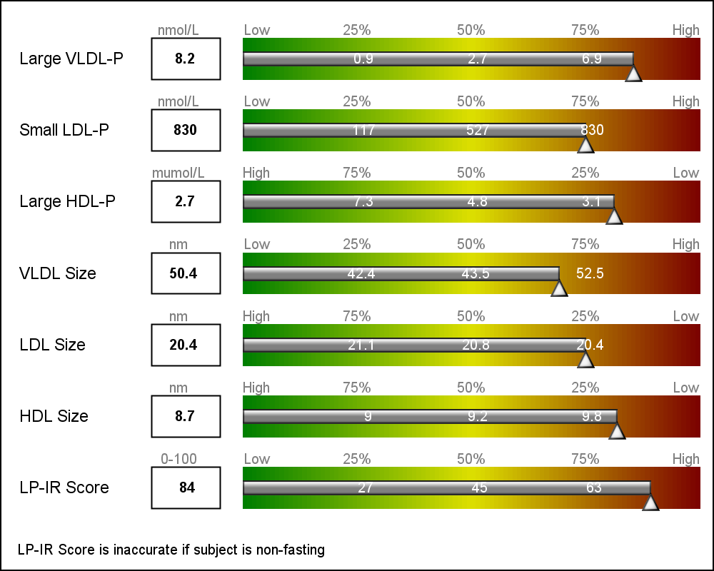 Once again, we resort to using the versatile HighLow plot to draw the gradient. HighLow plot does not support a color gradient option, but does support a GROUP option that colors each segment with the group color from the style, or a Discrete Attributes Map. Here, we will use the DAttrMap option of the SGPLOT procedure to draw the ramp.
We create Low and High columns for 100 HighLow segments for each test name. Each segment is 1 unit, in a do loop from 0 to 99 by 1. Each segment has an id - the loop variable.
We also create a DAttrMap data set, such that each value 1-99 has a corresponding color that gradiates from green to yellow to red. See the code in the full program attached at the bottom. The result is the gradient ranges as shown in the graph above.
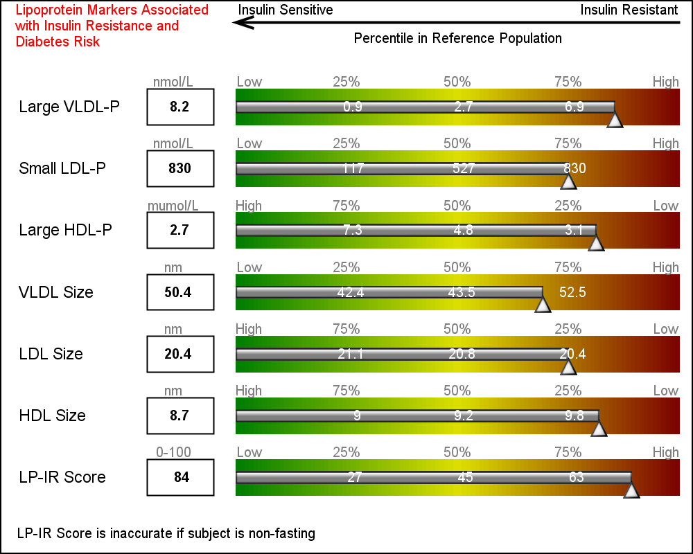 Finally, we use some simple annotations to add the information at the top of the graph. Five observations in the SGANNO data set describe the way to draw the four text strings and the arrow object.
Once again, this exercise has exposed the need for some more features that will make this task easier such as support of ColorResponse for bar charts and Highlow plot. We will look into adding such options in a future release.
The technique to creating such non standard and complex graphs using SG or GTL is to analyze the graph, and break it down in to its component parts. Then use the appropriate plot statement "creatively" to build the graph l layer at a time. Some details that cannot be done using plot statement can be handled by annotate.
Full SAS9.4 Code without the Gradients: Lipid_Dashboard
Full SAS9.4 Code with Gradients: Lipid_Dashboard_Gradient
Full SAS9.3 Code with Gradients: Lipid_Dashboard_Gradient_93


2 Comments
"Once again, this exercise has exposed the need for some more features ...". You seem to have run up against the problem which bedevils SAS: features which work in some places but not others. Why can't all graphic objects which represent a range of numeric values support a color ramp? I assume that they aren't really objects, or if they are in the background, that the SAS syntax does not allow simple access to them and their properties. It is this complexity that makes learning SAS so difficult: what you learn in one place doesn't work in others (always).
The answer to your question is "Due to priorities and deadlines". Like everyone else, we have to work with limited resources, and address the known priorities within the deadlines. Yes, we too would love to get all possible features in the first release, but then we would likely still be working on the first release :-). Also, sometimes it is better to wait and see if a particular feature is really necessary, and how it would be used. Then, a case can be made for its inclusion and the right implementation can be done. Hearing from SAS Users on specific needs and requirements really helps us in delivering software that is useful.