When you hear of a Scatter Plot or a Series Plot, you have a picture in your mind what we are talking about. But one of the plot statements available in GTL, and soon with SGPLOT, is the BLOCK plot. I am sure this leaves many users scratching their heads, wondering what in heaven's name is a BLOCK plot? So, in this article we will shed some light on this unique and useful plot.
 The block plot is a one dimensional plot with the syntax as shown below:
BLOCKPLOT X=var BLOCK=var < / options>;
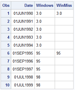
For the data set shown on the right, we will use X=DATE and BLOCK=WINDOWS. The plot will create contiguous horizontal rectangular "blocks" along the x axis while the block variable value is the same. So, in this case, a rectangular block will be created from '01Jun1990' to '01Sep1995' with the block value of "3.0". Then, when the new block value of "95" is encountered, a new block will be created while the block value stays as "95" till '01Jul1998', when it changes to the new value.
Thus, the BlockPlot statement creates such horizontal blocks and displays them in the plot. Now, for convenience, a missing value can be considered to be a continuation of the previous block value. So, the column "WINMISS" would have a similar result. As you can imagine, the plot needs the X variable to be sorted.
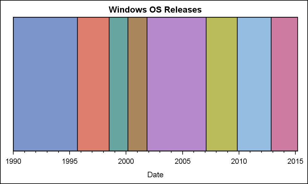 The graph shown on the right is created using this data. For each contiguous range along the x axis where the block variable is the same, a block is displayed in the graph. Each successive block gets the attributes from the GraphData1 to GraphData12 style elements. The GTL code for this is shown below.
SAS 9.3 GTL code:
/*--Basic BlockPlot--*/ proc template; define statgraph Block; dynamic _display _type; begingraph; entrytitle 'Windows OS Releases'; layout overlay / xaxisopts=(timeopts=(minorticks=true)); blockplot x=date block=windows / display=_display valuehalign=center filltype=_type; endlayout; endgraph; end; run; /*--Basic BlockPlot--*/ proc sgrender data=Windows template=Block; run; |
Note, in the program above, we have provided for a couple of dynamics "_DISPLAY" and "_TYPE" that are not defined in the SGRENDER step so far. So, these options are ignored, as if they are not even coded. This results in the most basic of block plot outputs.
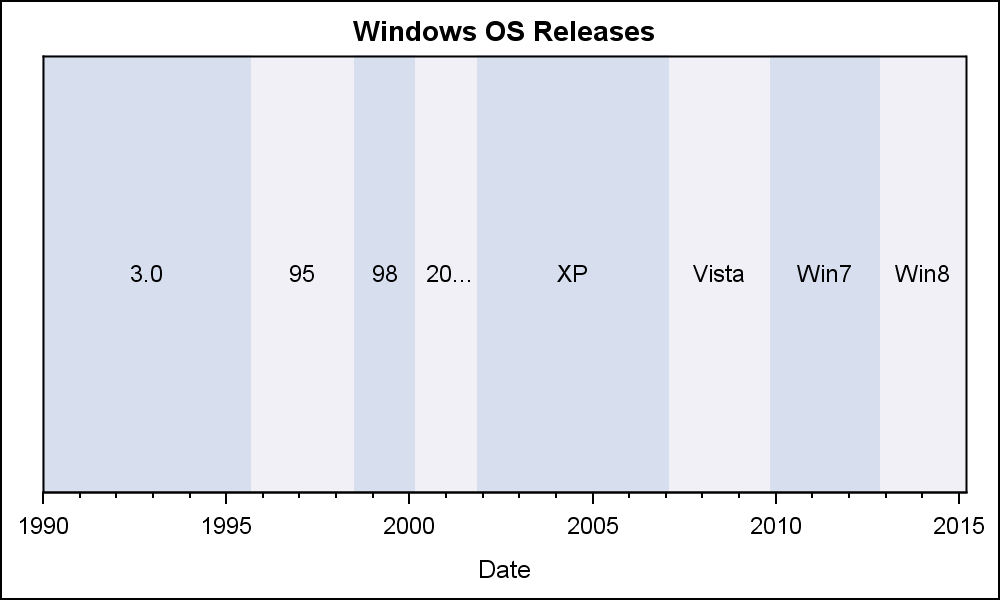 Clearly, displaying the "Block" values in each block is often useful, and this can be enabled by specifying the "Values" in the DISPLAY option. Additionally, the plot supports a different fill type called "Alternate". In this case, instead of using a unique color per block, the blocks are drawn using alternating colors as shown in the graph on the right. Here is the code for this graph, using the same template we have define above.
SAS 9.3 GTL code:
/*--Block Values Alternate colors--*/ proc sgrender data=Windows template=Block; dynamic _display='fill values' _type='Alternate'; run; |
In the use case above, we have set _DISPLAY='fill values' and _TYPE to 'Alternate'. ValueHAlign is set to CENTER and ValueVAlign is CENTER by default. So the block values are displayed at the center of each block. The blocks now get alternating colors.
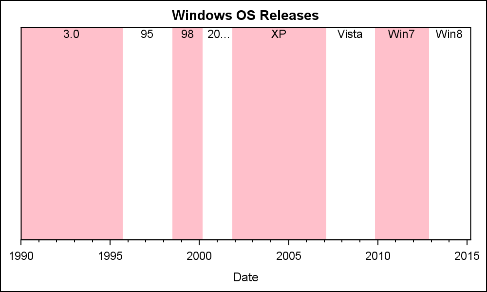 In the alternating color band case, the attributes of the bands can be set using the FillAttrs and the AltFillAttrs option. As for all fill attributes, transparency can be used inside the fill attribute. In the example on the right, we have used a pink color in the FillAttrs, and set the AltFillAttrs to fully transparent, so whatever is behind it will show through. In this case, the wall. We have also move the value labels to the top of the block using the ValueVAlign option.
Normally, the Block Plot is used in conjunction with some other plot statement. In the example below, we have used this same data along with a SERIES plot of the monthly closing value for the Microsoft stock price from the SASHELP.STOCKS data set. The data in the stocks data set only goes up to about April 2005, so I have restricted the data to that range.
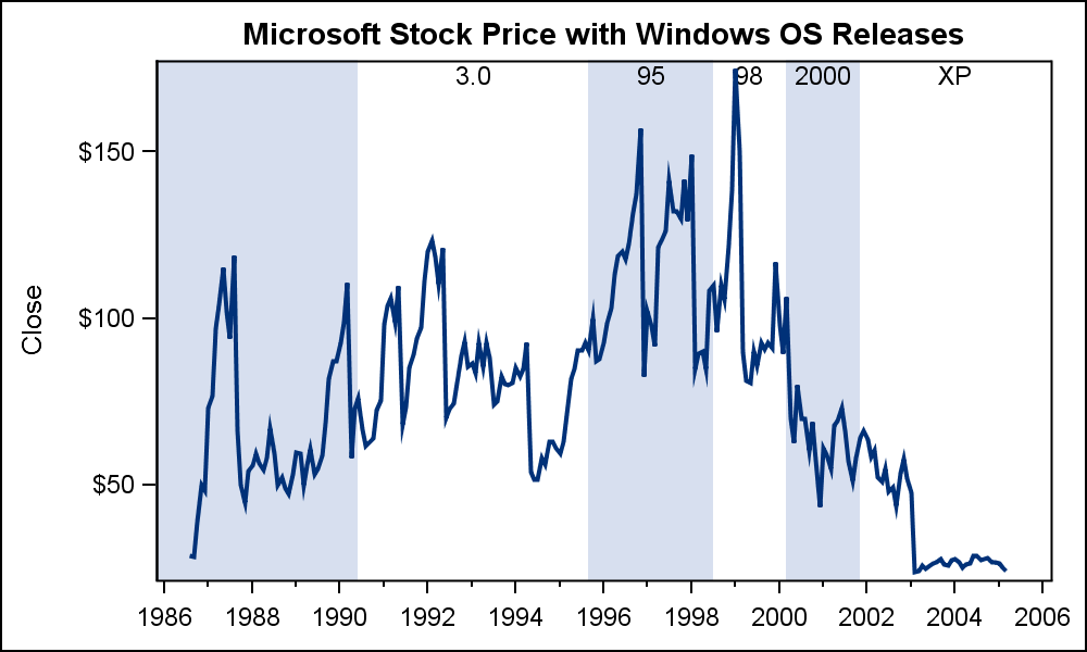 First, we extract the data for STOCK='Microsoft' from the SASHELP.STOCKS data set and sort it by Date. Then, we merge the block data with the stock data by date. See the attached program for full details. Now, we add the SERIESPLOT statement to the GTL template to create the graph on the right.
Note the use of EXTENDBLOCKONMISSING to allow missing values to be used a continuation of previous block value.
SAS 9.3 GTL code for Stock Plot with Blocks:
/*--Block and Series Overlay plot--*/ proc template; define statgraph BlockStock; begingraph; entrytitle 'Microsoft Stock Price with Windows OS Releases'; layout overlay / xaxisopts=(timeopts=(minorticks=true) display=(ticks tickvalues)); blockplot x=date block=windows / display=(fill values) valuehalign=center valuevalign=top filltype=alternate altfillattrs=(transparency=1) extendblockonmissing=true; seriesplot x=date y=close / lineattrs=graphfit; endlayout; endgraph; end; run; /*--Block and Stock--*/ proc sgrender data=Series (where=(date < '01apr2005'd)) template=BlockStock; run; |
As we saw in the previous examples, when a block plot is placed in a LAYOUT OVERLAY, the plot fills the entire height of the overlay region inside the axes. The width of each block is determined by contiguous values of the BLOCK role. That is why we call this a one-dimensional plot.
If multiple block plots are overlaid, each will fill the full height, and the last one will over write the previuous. Using transparency for the FillAttrs can help in such cases. However, this plot is one of the few the can also be placed in the INNERMARGIN of a layout overlay. The INNERMARGIN is a region at the bottom of each overlay container.
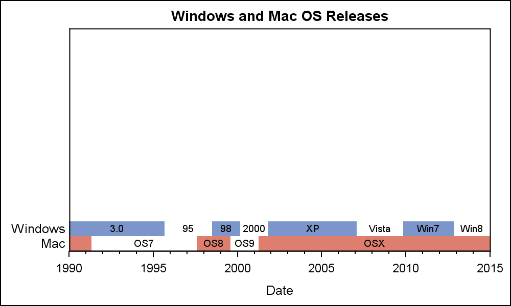 When placed in the inner margin, this plot occupies only the height needed to accommodate the value of the block, about the height of the font. So, each block plot occupies only a small part of the wall, and multiple block plots are STACKED and not overlaid. This allows you to see all the blocks as shown in the graph on the right. Here, we are displaying the release dates of the OS for both Windows and Mac. Note the class values displayed on the left. The GTL program for this graph is shown below.
SAS 9.3 GTL code for Block Plot in Inner Margin:
/*--Block plot with Inner Margin--*/ proc template; define statgraph BlockInner; begingraph; entrytitle 'Windows and Mac OS Releases'; layout overlay / xaxisopts=(timeopts=(minorticks=true)); innermargin; blockplot x=date block=windows / display=(fill values label) valuehalign=center valuevalign=top filltype=alternate altfillattrs=(color=_color) fillattrs=graphdata1 extendblockonmissing=true valueattrs=(size=7); blockplot x=date block=mac / display=(fill values label) valuehalign=center valuevalign=top filltype=alternate altfillattrs=(color=_color) fillattrs=graphdata2 extendblockonmissing=true valueattrs=(size=7); endinnermargin; endlayout; endgraph; end; run; |
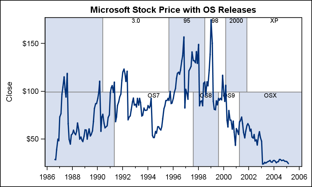 Finally, block plots also support the CLASS role. This is similar to the GROUP role, except in this case a separate strip of block plot is created for each class value and stacked on the previous, not overlaid. This behavior is both in the INNERMARGIN and in the layout itself.
In the graph on the right, we have changed the multi-variable data for Windows and Mac into a grouped data structure using the variable GROUP that has "Windows" or "Mac" and a REL variable that contains the release name, such as "WIN7" or "OSX". Then, we merged this data with the stock data as before, and created this graph using CLASS=GROUP.
SAS 9.3 GTL code for Block Plot with CLASS:
/*--Group data with series--*/ proc template; define statgraph BlockClassSeries; dynamic _color _trans; begingraph; entrytitle 'Microsoft Stock Price with OS Releases'; layout overlay / xaxisopts=(timeopts=(minorticks=true) display=(ticks tickvalues)); blockplot x=date block=rel / class=group display=(fill values outline) valuehalign=center valuevalign=top includemissingclass=false filltype=alternate altfillattrs=(color=_color) outlineattrs=(color=gray) extendblockonmissing=true valueattrs=(size=7); seriesplot x=date y=close / lineattrs=graphfit; endlayout; endgraph; end; run; |
Just as we did with the stock plot data, the block plot can be used to display the number of subjects at risk for a survival plot, or some other clinical graphs where it is important to display textual data that is axis aligned with the plot. While the ability to draw axis aligned text is now available using the new AXISTABLE (SAS 9.4), the Block Plot can be effectively used to display segments over a linear or time axis, such as severity of an adverse event or more. We look forward to seeing creative usage of this unique plot in your graphs.
Full SAS 9.3 code for all the examples: BlockPlot


5 Comments
What if one wants to present the value of Windows for each year instead of spanning across from 1990-1994? I am currently dealing with this situation where results for a given variable are shown at all planned time points. So data for a given subject might look like N N ' ' N P and blockplot would not present 2nd and 3rd N and also the ''. Is there a way to override this?
There is an option to show repeated values. Or, you can just use a SCATTER plot with MARKERCHAR.
That was most helpful. Although I have used REPEATEDVALUES=true/false before, it just didn't dawn on me to use in this context. Thank you! I do love these new SAS graphics procedures.
This is a terrific example of proc template and proc sgrender working together. Can bands be created in proc template that will be used in a series of panels in proc sgpanel?
You can create bands inside of PROC SGPANEL that are used in each cell of the panel. I can't give you a more specific answer without knowing your use case.