Often we need to plot multiple response variables on Y axes by a common variable on X axis. When the response variables are very different in magnitudes or format, we prefer to plot the variables on separate Y (Left) and Y2 (Right) axes.
Here is some sample data with three response columns "East", "West" and "Percent". Let us see how we can plot multiple variables by "Category".
Here is a bar chart of East by category overlaid with a line chart of West by Category. East is plotted on the Y axis and West on the Y2 axis. Click on the graph for a higher resolution image.
SAS 9.3 SGPLOT code:
proc sgplot data=synch; vbar cat / response=east dataskin=matte nostatlabel; vline cat / response=west y2axis lineattrs=(thickness=4) nostatlabel; run; |
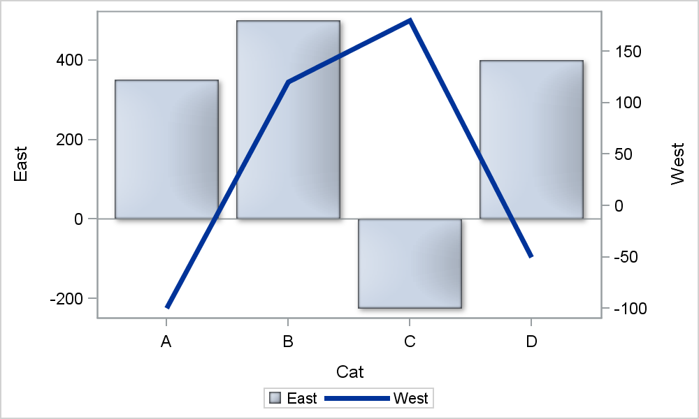
Note, the bar has a baseline at zero on the Y axis, but this does not match the zero value on the Y2 axis. How can we synchronize the zeros on both axes? If both Y and Y2 axis ranges were positive, we can just set the min=0 for both axes. But when one or both axes have negative values in the range, how do you do this?
Unfortunately, there is no magical option you can set on one or the other axis to make this happen. However, there is a simple way to do this. The axis offsets (the space reserved at both ends) are the same by default. Now, if you can set the Y and Y2 axis min and max values such that the proportion of the negative range to the positive range is same on both axes, then the zero values will line up. Here is how we synchronized the zero values for this case:
SAS 9.3 SGPLOT code:
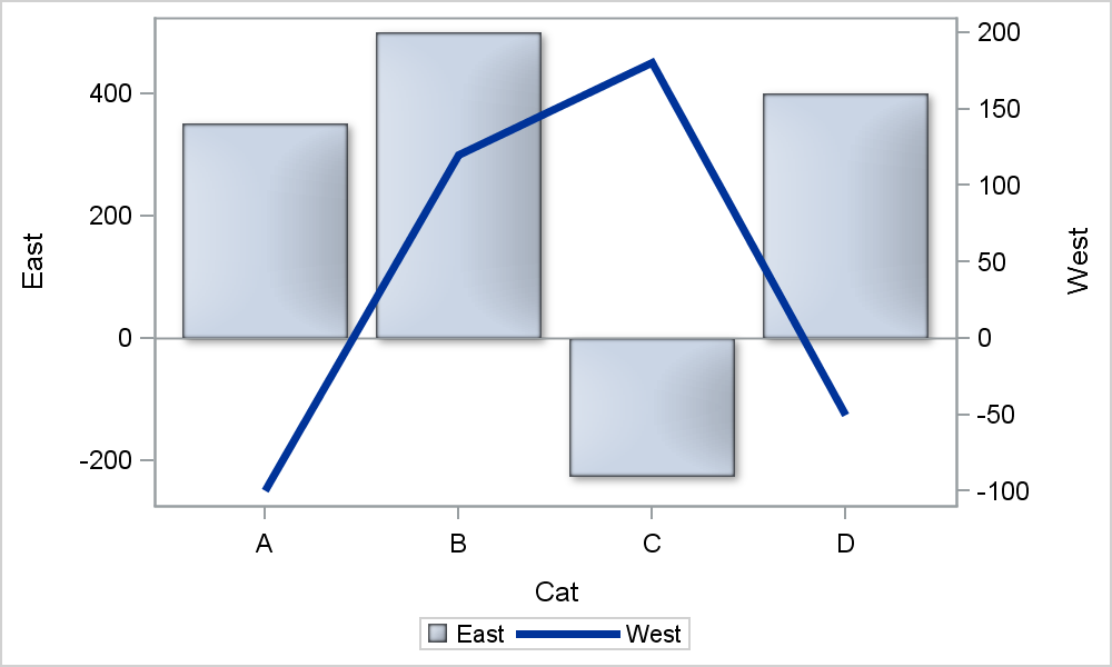
proc sgplot data=synch; vbar cat / response=east dataskin=matte nostatlabel; vline cat / response=west y2axis lineattrs=(thickness=4) nostatlabel; yaxis min=-250 max=500; y2axis min=-100 max=200; run; |
Note in the above program, we have set the Y axis range is from -250 to 500. So, the positive range is 2 times the negative range. We also make the Y2 axis ranges in the same proportion, -100 to +200. This makes the zeros of the two axes line up as seen in the graph above. The baseline at zero for the bar chart on the Y axis lines up exactly with the zero value on the Y2 axis for the line chart.
This same principle applies if the axis formats are different as long as the axis are linear. Actually, that is one reason you may want different axes anyway, when one of the values has a percent format, as shown in the graph below. Here we have a bar chart of East by category on the Y axis overlaid with a line chart of Percent by category on the Y2 axes:
Graph without axis synchronization. Note the zeros on Y and Y2 are not aligned:

Bar with axis synchronization. Note the zeros on Y and Y2 are aligned:
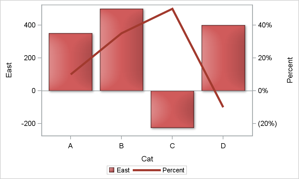
We have done the same in this case, just made sure the proportion of the negative to positive ranges on both axes are the same.
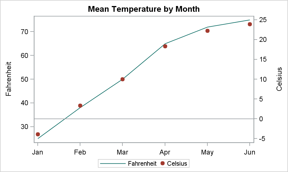
Now, what if you want to align a particular value on each axis, but also the axis ranges? In the graph below, I have plotted the Fahrenheit by Month overlaid with Celsius by Month. I want to align the 32 on Y with zero on Y2, and also get the exactly same ranges so the two graphs are exactly the same.
Fahrenheit and Celsius Graph without axis synchronization. Note the 32 on Y is not aligned with zero on Y2, and the scatter plot does not match with the series plot.
Fahrenheit and Celsius Graph with axis synchronization of 32 with zero.
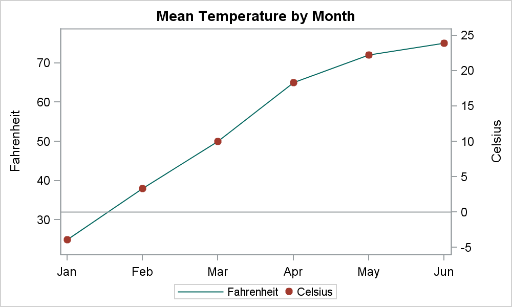
Here I have added a reference line on Y2 axis at zero, and it lines up exactly with 32 on the Y axis. Also note the Series plot of Fahrenheit on Y lines up exactly with the Scatter plot of Celsius on Y2. So, the mapping of the values on both axis is exact.
You can also do the same for the X and X2 axes. For an Adverse Events time line, we often we have a plot by Day on the X axis, with associated dates shown on the X2 axis. To synchronize these axis, you can use the same idea.
Now, we have given this issue some thought to see how we can automate this process. However, there has not been a pressing demand for this from the user community, nor have we come up with a simple solution. So, it is likely that many of you have already figured this out. If so, please feel free to contribute your ideas.
Full SAS 9.3 code: Synch_Axes


3 Comments
What do you mean "there has not been a pressing demand for this from the user community"? I posted this question just last week! Now I know where you get your blog post ideas 😉
You are right of course. You did ask this question on the SAS Communities page, and motivated this article. Yes, many of my articles are motivated by user questions as that is a good indicator that others may benefit form this topic. But, there has not been a deluge of questions on this topic. 🙂
Please see my poster "Aligning Parallel Axes in SAS® GTL" presented at MWSUG 2013. Here is a link: http://www.lexjansen.com/mwsug/2013/PT/MWSUG-2013-PT06.pdf
In it, I show how setting thresholdMin=0 and thresholdMax=0 in GTL will align synonym axes that use default settings. Axes in your first two graphs, though, are not synonyms of each other; you just want the zeroes aligned - interesting solution. I have another example of Fahrenheit to Celsius in the poster.
I am presenting the poster again at the PhilaSUG meeting on March 12th and will mention the "Graphically Speaking" post.