Classification panels are a very popular visual representation of the data, where the data is gridded by class variables all in one graph. This makes it easy to compare and contrast the data by these class variables. The SGPANEL procedure makes this easy, and most of the time it is all you need to create your class panel especially since SGPANEL supports computed plots like histograms, box plots and so on.
One long standing desire expressed by users was to be able to color the walls of each cell of the class panel by another variable, either as a group color or a color response. Recently, this was requested again by a user on the SAS User Communities board, leading me to take another look at this use case.
Since the requested graph was a scatter plot (and not a computed plot), it is easier to use the GTL DATALATTICE statement to create this graph. This opens up some possibilities. While there is no direct option to do this, we can leverage the plot layering capability to create such a graph. Click on the graph for a higher resolution image.
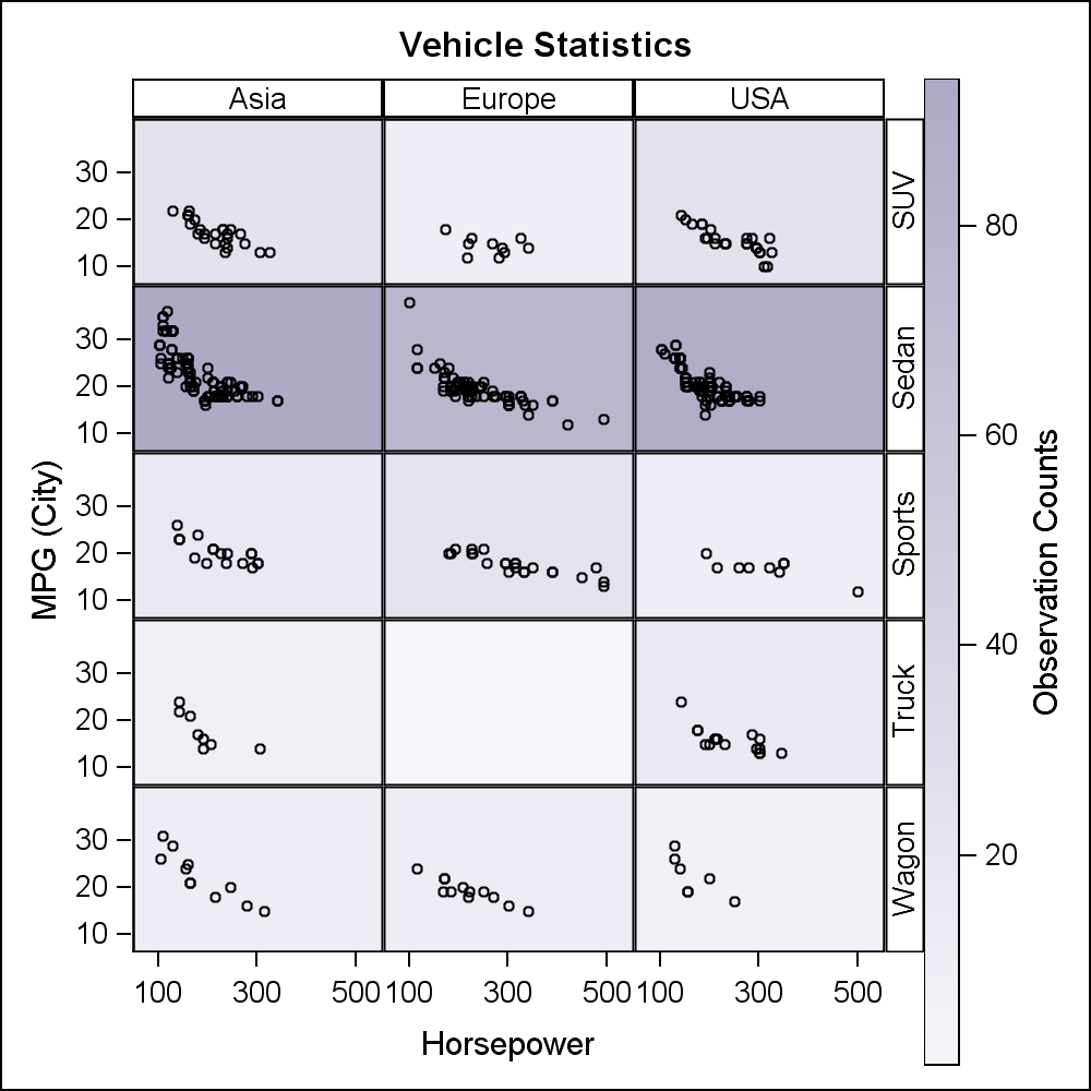
Here I have used the SASHELP.CARS data set. I run the MEANS procedure to compute the mean mpg, horsepower and frequency counts for each crossing of Origin and Type variables (excluding Hybrids). I have used the COMPLETETYPES option to retain crossings with zero counts. I merged the data back into the cars data set and plot the graph using this GTL code. SG procedures do not support ColorResponse (yet), so it is not possible to do this with SGPANEL. This is being addressed at SAS 9.4M2.
SAS 9.3 GTL code:
proc template; define statgraph GradientPanelWall; begingraph; entrytitle 'Vehicle Statistics'; layout gridded / columns=2; layout datalattice columnvar=origin rowvar=type / columns=3 headerlabeldisplay=value rowaxisopts=(offsetmin=0.1 offsetmax=0.1) columnaxisopts=(offsetmin=0.1 offsetmax=0.1); layout prototype; bubbleplot x=mean_hp y=mean_mpg size=size / colorresponse=n name='a' colormodel=twocolorramp datatransparency=0.5 bubbleradiusmin=300 bubbleradiusmax=400; scatterplot x=horsepower y=mpg_city / primary=true; endlayout; endlayout; continuouslegend 'a' / title='Observation Counts' halign=right orient=vertical; endlayout; endgraph; end; run; /*--Lattice with color background by count--*/ proc sgrender data=cars template=GradientPanelWall; run; |
The key features of this program are as follows:
- A GTL LAYOUT DATALATTICE is used to create the data lattice using Origin and Type.
- The prototype contains a SCATTERPLOT of mpg_city by horsepower. This is marked PRIMARY.
- The prototype also contains a BUBBLEPLOT using COLORRESPONSE=n. The (x,y) location of each bubble is the middle of the values for mpg and horsepower. The size of the bubble is fixed at 200, and the bubble radius min and max ranges are set to create large bubbles to cover the entire space of the cell. This is placed behind the scatter plot. The data has non-missing values for only one bubble per cell.
- A large bubble will enforce large axis offsets. This is overcome by setting axis offset min and max to a reasonable small value.
- The lattice is placed in the left cell of a LAYOUT GRIDDED with 2 columns. The right cell contains the gradient legend.
This code essentially creates the graph we want. Now, let use improve the visual a bit. Note, the height of the continuous legend is the full height of the Layout Gridded cell. It would be nicer if the height was reduced to match the height of the class lattice as shown below.
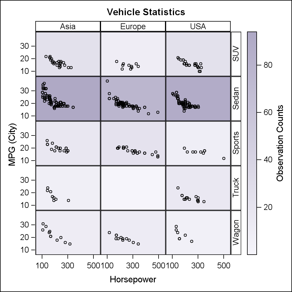
Now, this is much nicer. Note, there is no automatic way to do this. I have done this by specifying the PAD option for the legend, setting bottom, top and left pads appropriately for this case. The left pad creates a small separation between the lattice and the legend. We will take this up as an item to automate in future releases. See attached full program for this option in the second graph.
Another frequently requested item is the ability to place insets into the cell that provide information on the data in each cell. Using an ENTRY is not good enough as all the cells will have the same value. SAS 9.3 LAYOUT DATALATTICE provides an INSET option that allows you to display different values in each cell. The data has to be carefully merged into the data set and the additional columns should have only the number of observations as the number of cells, in the right order. These values are then displayed in each cell.
Note, this is not very user friendly, as the order is important. SAS 9.4 supports "match-merged" data, making this much easier. Here is the SAS 9.3 graph with color backgrounds and insets.
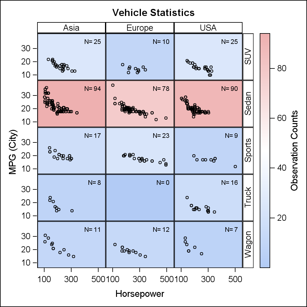
In this last example, we have used the default three color ramp. SAS 9.4 allows you to set your own color model by specifying a list of colors. Now, we have a graph that provides us some useful value-add over what the SGPANEL procedure can do. You can also do this with computed plots as long as you do the computing yourself. Only non computed plots can be placed in the prototype of the GTL lattice.
Full SAS 9.3 Code: DataLatticeGradientFill


2 Comments
Update: You can place the continuous legend in a SIDEBAR of the DATALATTICE itself. In this case, no extra LAYOUT GRIDDED is needed, and the size of the legend is closer to the width or height of the lattice.
This may or may not produce the beat results as the default side bar is inside the row headers. We may need a better solution.