Browsing graphs on the web, this graph caught my eye: The Arctic Sea Ice Volume Graph. My interest is not so much in the debate on Climate Change or Global Warming. To me, this graph has some interesting features that can help show the benefits of plot layering to build a graph. So, let us take a crack at it to see how far we can get. As usual, my preference is to use plot statements and options only, and not resort to annotation.
From our perspective, this graph has the following components:
- A display of the "Ice Remaining" amount in the middle.
- Rotated text displaying the values.
- A plot at the top to represent the Yearly Ice Minimum with a fit plot.
- A plot at the bottom to represent the Yearly Ice Loss with a fit plot.
- Y axis label has a superscript '3'.
Here is the data set I built by eyeballing the graph:
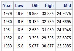
The column "Mid" in the above table represents the midpoint where I want to draw the value for the "Ice Remaining". Here is the first attempt at this graph, using SAS 9.3 features. Click on the graph for a high resolution version.
SAS 9.3 Graph:
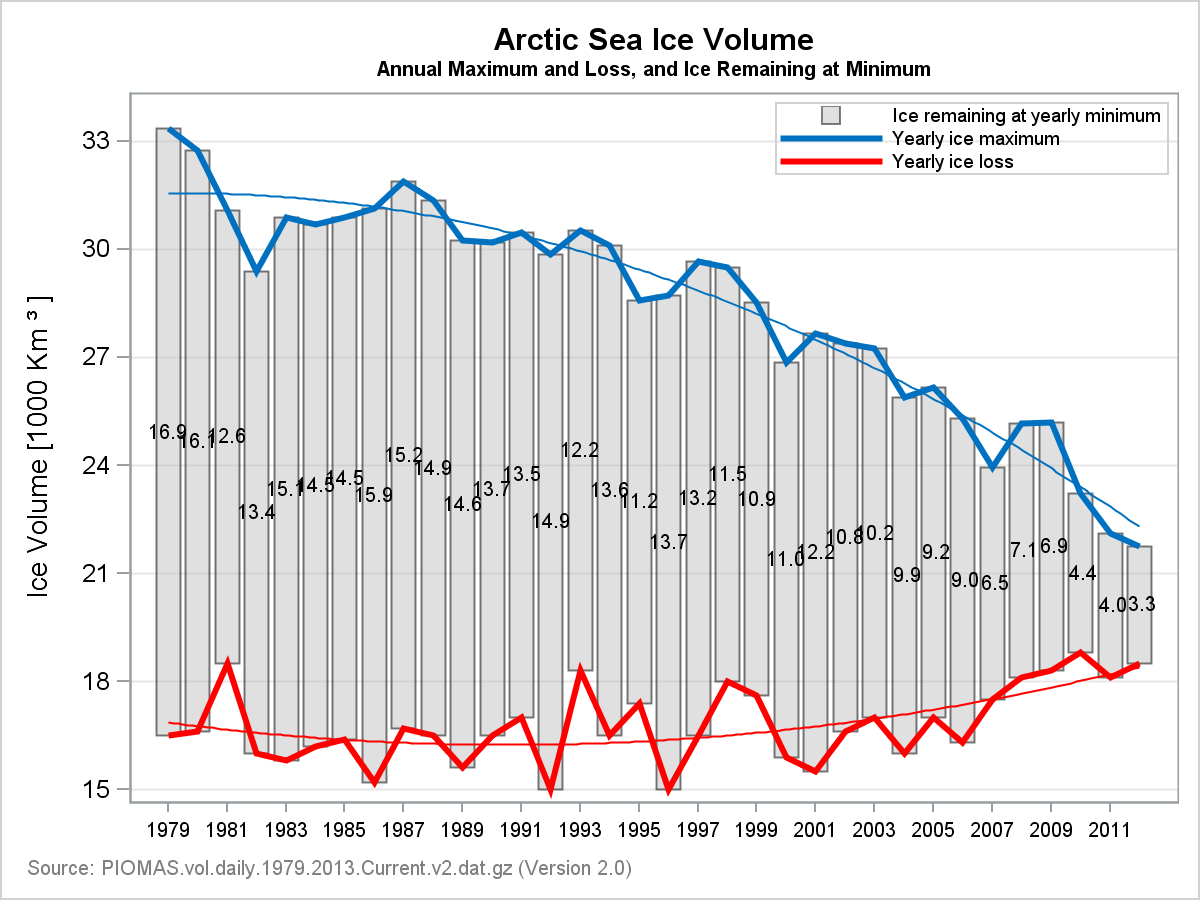
SAS 9.3 SGPLOT code:
proc sgplot data=ice noautolegend; format diff 4.1; title 'Arctic Sea Ice Volume'; title2 h=0.8 'Annual Maximum and Loss, and Ice Remaining at Minimum'; footnote j=l h=0.8 c=gray 'Source: PIOMAS.vol.daily.1979.2013.Current.v2.dat.gz (Version 2.0)'; highlow x=year low=low high=high / type=bar fillattrs=(color=silver) transparency=0.5 name='a' legendlabel='Ice remaining at yearly minimum'; series x=year y=high / lineattrs=(color=%rgbhex(0, 112, 192) thickness=3) name='b' legendlabel='Yearly ice maximum'; series x=year y=low / lineattrs=(color=red thickness=3) name='c' legendlabel='Yearly ice loss'; reg x=year y=high / degree=2 lineattrs=(color=%rgbhex(0, 112, 192) thickness=1) nomarkers; reg x=year y=low / degree=2 lineattrs=(color=red thickness=1) nomarkers; scatter x=year y=mid / markerchar=diff; xaxis display=(nolabel) values=(1979 to 2012 by 1) valueattrs=(size=7); yaxis label="Ice Volume [1000 Km ~{unicode '00b3'x} ]" values=(15 to 35 by 3) min=15 max=34 valueshint grid; keylegend 'a' 'b' 'c' / location=inside position=topright across=1 valueattrs=(size=7); run; |
Here are the relevant aspects of the code:
- We used the HIGHLOW plot with Type=Bar to draw the "Ice Remaining", using transparency. Skins are not available at SAS 9.3.
- We used two SERIES plots to display the curves at the top and bottom. SMOOTHCONNECT is not available at SAS 9.4
- We used REG plots with DEGREE=2 to draw the fit lines.
- We used a SCATTER plot with MARKERCHAR to display the ICE values in the middle.
- Note the usage of Unicode super script in the Y axis label.
While the graph above gets the job done, let us see if we an improve it further. Here is the same graph using some new features in SAS 9.4M1:
SAS 9.4M1 Graph:
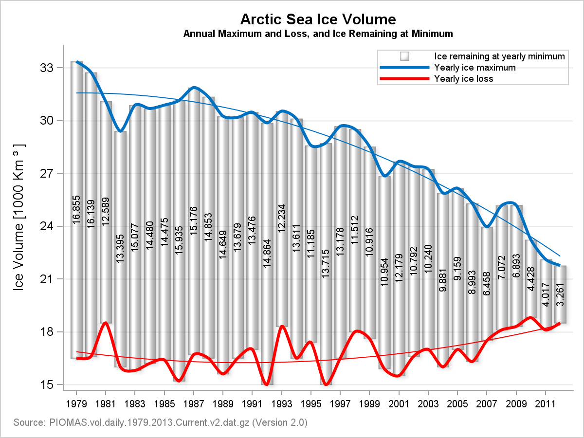
Note the following improvement in the graph:
- HighLow plot uses data skin, giving it the look of an ice core.
- Series plots use SmoothConnect, which creates a smooth connection at the vertices.
- The vertically oriented ice values are drawn using the new POLYGON plot which supports Rotate and RotateLabel. The plot data itself has only one obs. per ID, so the there is not enough data to draw the polygon itself, but associated label is still drawn at the location.
- Graph wall border is removed.
The above graph also demonstrates the power of using plot layers to create a graph, and the creative (non standard) usage of plot types to get our work done.
SAS 9.3 provides us the features necessary to present all the data as per the "intent" of the original graph. However, with SAS 9.4M1, we can create a graph that is practically identical to the one in the original link.
Full SAS 9.4M1 program: Ice_94

6 Comments
I like it this post because I often have to overlay features. I am looking forward to trying the POLYGON statement. Personally I would not use the SMOOTHCONNECT option, but I know that you are trying to duplicate a graph in which the original author used a snooth line. To see why I don't like it, see the lower series on the original graph, in which the line exits the graph area. Actually, there is no reason for the red or blue interpolating curves at all because the upper/lower edge of the bars already indicate those values. I'd just show the regression lines to indicate the trend.
put data set in.
Also put macro in. If not this will happen
series x=year y=high / lineattrs=(color=%rgbhex(0, 112, 192)
-
22
76
WARNING: Apparent invocation of macro RGBHEX not resolved.
I don't understand your comment. The log says it cannot find the macro definition.
When trying to duplicate the above I get the following error, what macro do I need to define and how. I am not an expert SAS programmer.
WARNING: Apparent invocation of macro RGBHEX not resolved.
24 series x=year y=high / lineattrs=(color=%rgbhex(0, 112, 192)
_
22
76
ERROR 22-322: Syntax error, expecting one of the following: a name, a quoted string.
ERROR 76-322: Syntax error, statement will be ignored.
Got my solution:
%macro RGBHex(rr,gg,bb);
%sysfunc(compress(CX%sysfunc(putn(&rr,hex2.))
%sysfunc(putn(&gg,hex2.))
%sysfunc(putn(&bb,hex2.))))
%mend RGBHex;
Pingback: On the SMOOTHCONNECT option in the SERIES statement - The DO Loop