Recently a user new to GTL and SG procedures asked how to create a Bland-Altman graph on the SAS Communities site. He included an image of the resulting graph to indicate what he wanted, I described to him how that graph can be created, but since he is new to the art of creating graphs with SG procedures, I decided to send him sample code.
On building the graph, it became apparent that this graph could be a good example of how to use the layering capabilities of the SGPLOT procedure (and GTL) to create a graph that is made up of multiple separate components. This also shows how to create the single data set needed to achieve this result.
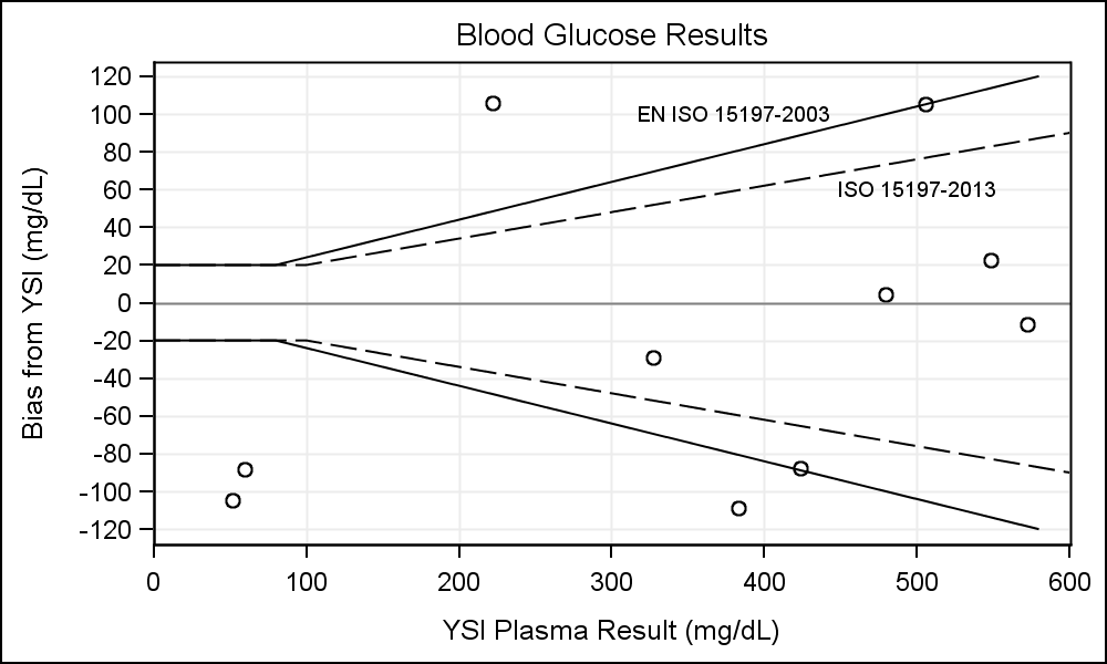
This graph is similar in construction to the Clarke Error Grid, where there are certain zones in the graph depicted by boundaries with labels along with actual data points.
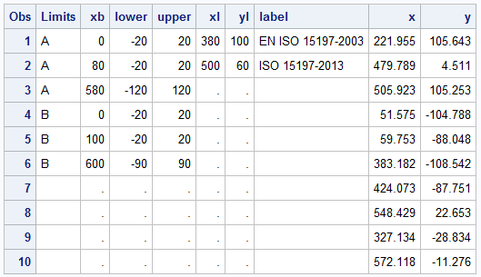
To make this graph, we start with the data and program needed to draw the different regions in the graph. Here is the data set needed to draw the bands, the graph and the code:
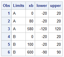
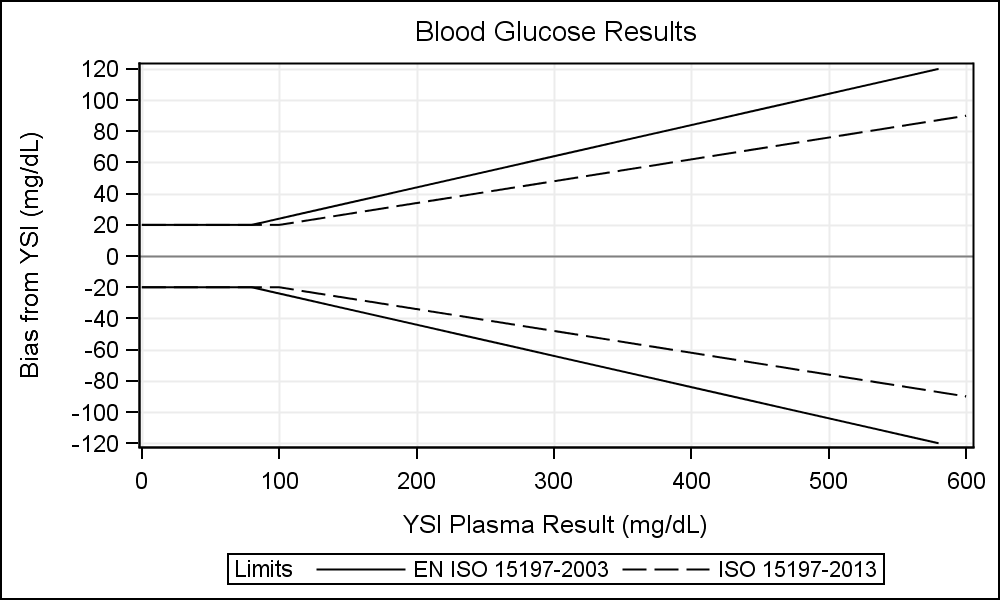
This 'Bands' dataset defines two bands with Ids of A and B. The bands are defined by a set of observations with three values (Xb, Lower, Upper). The bi-linear bands look like this. Click on the graph for a higher resolution image:
SGPLOT code :
proc sgplot data=bands; format Limits $name.; title 'Blood Glucose Results'; band x=xb lower=lower upper=upper / group=Limits outline nofill name='Band'; refline 0; xaxis grid label='YSI Plasma Result (mg/dL)'; yaxis grid values=(-120 to 120 by 20) label='Bias from YSI (mg/dL)'; run; |
Note the following features of the program:
- We have used a GROUPED BAND plot to draw the two bands.
- We need data columns for Band ID, X, Upper and Lower roles.
- We have used a format to name each band, and included the names in a legend.
- We added a reference line at Y=0.
- We set the extents and tick values for the Y axis, and enabled the grid lines.
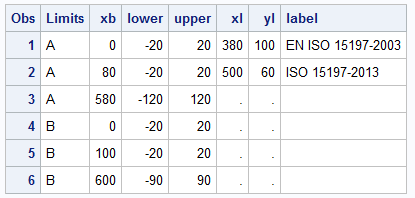
In the graph above, we have displayed the band names in the legend below the plot. However, in the example sent to me by user, each band was directly labeled and no legend was provided. To do this, we have to add a layer on top of the band plot to display the label for each band. To place the labels in the middle of the graph, we add two data points (xl, yl) and a label.
We create the data set 'Labels' with two observations and three columns, (xl, yl, Label) and merge it with the 'Bands' data set. Since there is no overlap with any column names, a simple merge works just fine.
Now, we layer a Scatter plot with MarkerChar option on top of the Band plot to display these two labels using the three new columns.
SGPLOT code:
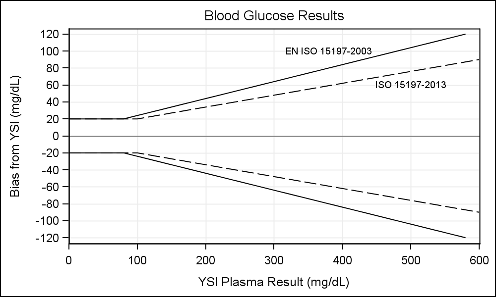
proc sgplot data=plot noautolegend; title 'Blood Glucose Results'; band x=xb lower=lower upper=upper / group=Limits outline nofill; scatter x=xl y=yl / markerchar=label; refline 0; xaxis grid offsetmin=0 offsetmax=0 label='YSI Plasma Result (mg/dL)'; yaxis grid values=(-120 to 120 by 20) label='Bias from YSI (mg/dL)'; run; |
Note the Scatter plot with the MarkerChar option added after the Band statement. This displays the band labels at the specified position. Also note the addition of the OffsetMin and OffsetMax options to the XAXIS statement.
Lastly, we layer the actual data points obtained from the study. For that, I have simulated a few random data points (x, y) in the expected data range in a data set called 'Points'. Then, we merged this data set with the Bands and Labels data set:
Here is the final graph:
SGPLOT code:
proc sgplot data=plot noautolegend; title 'Blood Glucose Results'; band x=xb lower=lower upper=upper / group=Limits outline nofill; scatter x=x y=y; scatter x=xl y=yl / markerchar=label; refline 0; xaxis grid offsetmin=0 offsetmax=0 label='YSI Plasma Result (mg/dL)'; yaxis grid values=(-120 to 120 by 20) label='Bias from YSI (mg/dL)'; run; |
Full SAS 9.3 Code: Bland_Altman

2 Comments
Sanjay, this is a good post on working around the limits of the sgplot procedure to make the graph you need. It reminded me of the 9.2 days when sgplot lacked a lineparm statement, so that if you wanted to add a 45 degree (i.e., x=y) reference line to your figure, you had to add two new columns to your dataset and and create two new records with the minimum and maximum range values so that sgplot's reg statement could then draw the line. These days, 'Lineparm x = 0 y = 0 slope = 1'; can handle that.
Now, it's time to expand features like that so that kludges of adding a few extra columns and data points to an extant data set are no longer necessary. An experienced SAS user will know to do this, but a beginner won't - leading to frustration; besides, conceptually the annotation elements should be separate from the raw data.
Refline and Lineparm should include options to allow for an end-point (and start-point): e.g., for the blog post example, I'd image 'refline y = 20 end=100;' to tell the statement to stop drawing the upper straight line segment when x =100; and a lineparm statement like 'lineparm x = 100 y = 20 slope = .14' could add start=(x=20 y =100) to let lineparm know not to start the line before that point.
The CURVELABELPOS option would also benefit from the ability to directly specify the x and y position of the label.
I'd also like sgplot to have a marker statement, e.g., 'Markerparm x = 380 y = 100 ' to add a marker or a label independent of the main data.
I'm aware that SGANNO could accomplish some of what I've suggested (and am a little surprised that wasn't the approach you advocated in your blog post),but I still think the changes I suggest would be very helpful. I find it much less opaque to order things done in the sgplot procedure, than to contort the dataset behind the scenes or to build a separate instruction set.
Thanks for your suggestions, James. We will certainly look into incorporating some into a future release. Providing a (x,y) for curve labels certainly has merit. Limits for lineparm is an interesting idea, but is likely easier to manage with one dimension limit only, like XMAX (or YMAX) and XMIN (or YMIN) but not both. Needs some thought. Yes, SGANNO was indeed added to provide a way to do stuff that cannot be done with one of the plot statements. Support for SGANNO is added at SAS 9.4 to GTL and we have added the DROPLINE stmt to SGPLOT at SAS 9.4M1.
In my opinion, having all data in the plot dataset (instead of hard coded in the program, or separately provided in sganno data) makes the program more extensible and usable with other data. The DRAW statements in GTL are equivalent to some of your suggestions. These are easy to use for a specific use case, but harder to use in a extensible way with macro variables for each value. If you have lots of such objects (say for drawing the Clarke Error Grid), it is easier to set that up in the plot data set or as a separate sganno data set.
I use annotation only when all else fails. One still has to set up a separate dataset and (sometimes) create space for the annotations, so I prefer to set that up in the plot data itself, when possible. The annotations are all drawn on top of or below everything else and cannot work with legend or the attr maps. Drawing the grid using plot statements (including new Polygon plot) allows you to interleave this into the rest of your graph and work with legend and attrmaps. The first graphs shows the band names in the legend.
Stay tuned for more articles on SAS 9.4M1 features.