Often we have situations where the category values on the graph have long character strings. This is often the case when graphing survey responses to questions. The questions may be sentences, sometimes moderately long.
With SAS 9.4, GTL and SG now support the ability to display tick values split over multiple lines. Here is an example of a simple survey dataset.
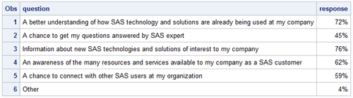
The bar chart made with this data using SAS 9.4 looks like this. Click on the graph for a higher resolution image.
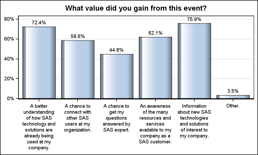
SAS 9.4 SGPLOT code
proc sgplot data=survey; title 'What value did you gain from this event?'; vbar question / response=response nostatlabel dataskin=gloss datalabel; xaxis display=(nolabel) valueattrs=(size=7); yaxis display=(nolabel) valueattrs=(size=7) grid; run |
For SAS 9.4 SGPLOT, we have changed the default tick fit policy for the x axis. Now the new fit policy is SPLITROTATE. The x axis will try to split the long tick values. If they cannot fit in the available spacing, then the tick values will be drawn rotated like before. This creates a much nicer graph that is readable. Personally, I do not like the diagonal rotated tick values.
While this works by default for the x axis, for the y axis, there is based on the default width available to draw the tick values on the Y axis. With GTL, splitting has to be specifically requested. Then, GTL uses 40% of the graph width to split the tick values. Here is the graph and the GTL code.
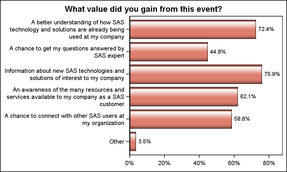
SAS 9.4 GTL Code:
proc template; define statgraph Survey_GTL; begingraph; entrytitle 'What value did you gain from this event?'; layout overlay / xaxisopts=(display=(ticks tickvalues)) yaxisopts=(reverse=true display=(ticks tickvalues) discreteopts=(tickvaluefitpolicy=split)); barchart category=question response=response / orient=horizontal fillattrs=graphdata2 dataskin=gloss barlabel=true; endlayout; endgraph; end; run |
Note, we have to specify the TickValueFitPolicy=fit when using GTL. The y axis ticks are wrapped in 40% of the width of the graph.
Now, you may want to have the tick values wrap in a tighter zone, leaving more width for the data area. In this case, you can provide the split characters explicitly in the strings. Here we have used the '^' as the split character, inserted into the string where we want the split.

Now, we can use an explicit directive to the y axis to split the tick values on the provided split character. Here is the graph and the GTL code. Click on the graph for a high resolution image.

proc template; define statgraph Survey_GTL_2; begingraph; entrytitle 'What value did you gain from this event?'; layout overlay / xaxisopts=(display=(ticks tickvalues)) yaxisopts=(reverse=true display=(ticks tickvalues) discreteopts=(tickvaluefitpolicy=splitalways tickvaluesplitchar='^')); barchart category=question response=response / orient=horizontal fillattrs=graphdata3 dataskin=gloss barlabel=true; endlayout; endgraph; end; run; |
Note the use of the TickValueSplitPolicy of SPLITALWAYS, and TickValueSplitChar='^'. With these new policies and options, you can control the splitting of the categorical tick values. Split characters are normally dropped where the string is split. However, if needed, you can cause the split character to be retained in the displayed string.
Full SAS 9.4 program: Survey


3 Comments
A very helpful post Sanjay. Flipping the emphasis, though, I think it would be very useful to have direct over the proportion of the graph allocated to the axis spines, i.e., instead of the spine length being set by the string length of the longest question, I'd like to be able to specify directly that the spine width (x-axis) should be, say, 80%, of the plots total width. By the same token, I'd like direct correct of the y-axis spine height, i.e., I don't necessarily want the presence of absence of a title and/or x-axis label do determine the proportion of the vertical space covered by the y-axis.
This is a feature I will find very useful as my data have very long descriptions of factor levels. Will labels be split in some sensible automatic way in the output of statistical procedures such as PROC MIXED and PROC PLM?
Splitting of labels is appearing in many procedures with subtly different syntax and semantics. Maybe some system-wide options would be a good way to bring some consistency and efficiency to this feature?
Another option for dealing with this is to use GTL's AXISLEGEND statement in order to replace the tick mark values with integers and to build a legend mapping these integers to the question numbers. There is an example of this in the documentation for the AXISLEGEND statement.
I like this approach as it allows a lot of space for the graph itself, even if the viewer has to do a little more work to interpret the tick mark values.