Creating a Bar Chart with a table of statistical data aligned with the bars is a popular topic. With SAS 9.4, creating such graphs gets easier with the new AXISTABLE statement in GTL and SG procedures. But some use cases can flummox the latest gizmos. Such is the case I ran into recently.
Here is a bar chart of mileage by origin for some cars in the sashelp.cars dataset. Trucks and Hybrids are removed. Creating a bar chart with a statistics table of the mean mileage below each bar is very easy. Click on the graph for a higher resolution image.

Note the mean MPG statistics displayed under each bar. The code needed for this using the new SAS 9.4 Axis table is as follows:
SAS 9.4 SGPLOT code:
proc sgplot data=sashelp.cars(where=(type not in ('Hybrid' 'Truck'))); title 'Mileage by Origin'; format mpg_city 4.1; vbar origin / response=mpg_city dataskin=gloss stat=mean; xaxistable mpg_city / label labelpos=left stat=mean location=inside; xaxis display=(nolabel); run; |
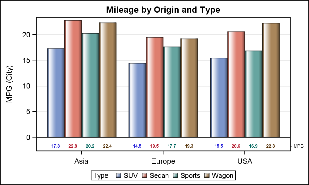
However, if the bar chart is grouped by TYPE, then we can create a cluster grouped bar chart, and include the mileage statistics by type as shown below.
SAS 9.4 SGPLOT code:
proc sgplot data=carmeans; title 'Mileage by Origin and Type'; vbarparm category=origin response=mpg / group=type dataskin=gloss; xaxistable mpg / class=type label labelpos=left location=inside; xaxis display=(nolabel); keylegend / location=inside position=topright; yaxis offsetmax=0.1; run; |
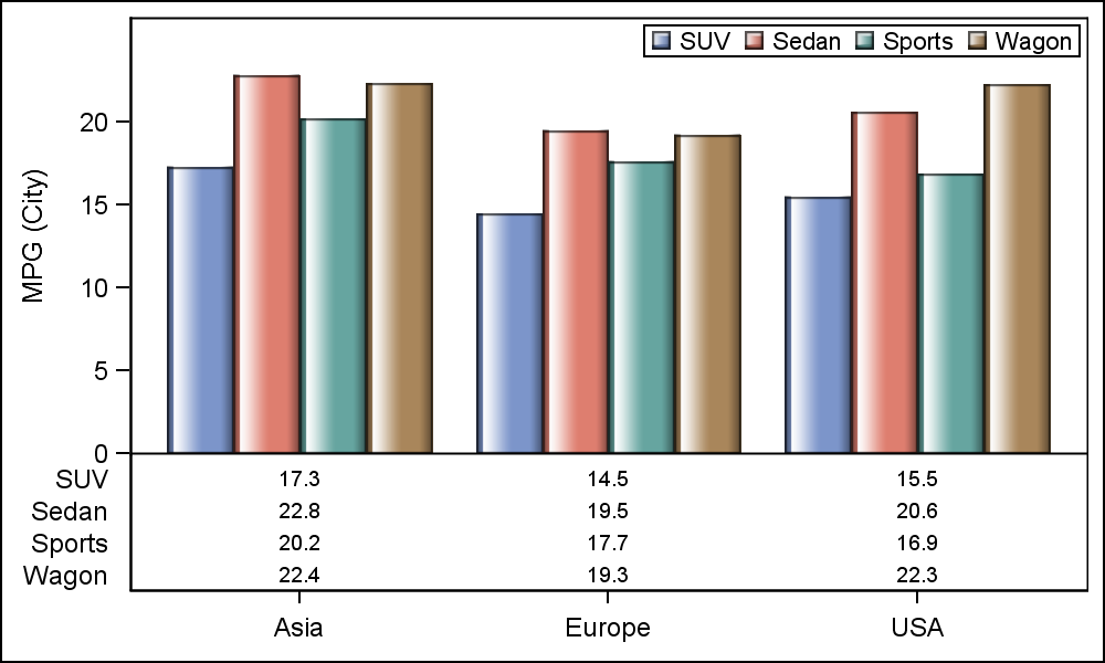
In this case, the statistics values are displayed for each value of TYPE in a multi-row table. This is how the CLASS variable is handled in the AXISTABLE statement. But, what if I really want each statistics to be displayed by TYPE under each bar for the same type value. So, I want a statistics table of one row, with all the values shown under the associated group value. Here is what I want:
This, unfortunately, cannot be done using the AxisTable, which does not support the GROUP option. Clearly, we have found a hole that we need to fill, and we will do that in an upcoming SAS release. But, how did I make the above graph? Well, the old fashioned way.
In the days before the arrival of AxisTable, we created such tables using the Scatter plot with the MarkerChar option. Well, I have to go back to that method to do this graph, using the Y and Y2 axis along with the "axis-splitting" technique I spoke of earlier. Here is the code to create this graph using SAS 9.3 code.
SAS 9.3 Code:
proc sgplot data=carmeans; title 'Mileage by Origin and Type'; vbarparm category=origin response=mpg / dataskin=gloss group=type; scatter x=origin y=lb_mpg / markerchar=mpg group=type groupdisplay=cluster markercharattrs=(size=6 weight=bold) y2axis; xaxis display=(nolabel); yaxis grid offsetmin=0.1; y2axis offsetmax=0.95 display=(nolabel) valueattrs=(size=6); run; |
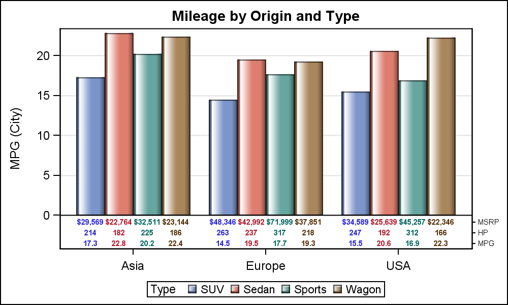
In the program above, first we computed the mean statistics using the MEANS procedure. Then, we have used a VBARPARM associated with the Y axis to plot the bar chart. We used a scatter plot with cluster group on the Y2 axis, and adjusted the Y and Y2 axis settings to get this graph. See attached program at bottom for the full code. Note, the statistics are aligned with the bars, and are also colored by the group values.
We can extend this technique to add more rows for Horsepower, MSRP and any other statistics we want to display in the table as shown below.
SAS 9.3 Code:
proc sgplot data=carmeans; title 'Mileage by Origin and Type'; vbarparm category=origin response=mpg / dataskin=gloss group=type; scatter x=origin y=lb_mpg / markerchar=mpg group=type groupdisplay=cluster markercharattrs=(size=6 weight=bold) y2axis; scatter x=origin y=lb_hp / markerchar=horsepower group=type groupdisplay=cluster markercharattrs=(size=6 weight=bold) y2axis; scatter x=origin y=lb_msrp / markerchar=msrp group=type groupdisplay=cluster markercharattrs=(size=6 weight=bold) y2axis; xaxis display=(nolabel); yaxis grid offsetmin=0.15; y2axis offsetmax=0.88 display=(nolabel) valueattrs=(size=6); run; |
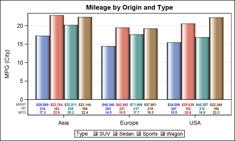
Note we have used a scatter plot statement for each statistic, one each for MPG, HP and MSRP. We have used columns that contain the appropriate character labels for each row. This gets us to the basic plot, but note the table row labels are to the right. These are really the Y2 axis tick values. How can we move them to the left?
We can use a trick to do that using the REFLINE statement. This statement draws reference lines for each value specified (or from data). But, each reference line can also have a label, either on left or right. So, we can draw reference lines for the same values, suppress the line itself, and draw the labels to the left and suppress the Y2 axis tick values. Here is the graph and the code:
SAS 9.3 Code:
proc sgplot data=carmeans; title 'Mileage by Origin and Type'; vbarparm category=origin response=mpg / dataskin=gloss group=type; scatter x=origin y=lb_mpg / markerchar=mpg group=type groupdisplay=cluster markercharattrs=(size=6 weight=bold) y2axis; scatter x=origin y=lb_hp / markerchar=horsepower group=type groupdisplay=cluster markercharattrs=(size=6 weight=bold) y2axis; scatter x=origin y=lb_msrp / markerchar=msrp group=type groupdisplay=cluster markercharattrs=(size=6 weight=bold) y2axis; refline 'MPG' 'HP' 'MSRP' / axis=y2 lineattrs=(thickness=0) label labelpos=min labelattrs=(size=6); xaxis display=(nolabel); yaxis grid offsetmin=0.15; y2axis offsetmax=0.9 display=none valueattrs=(size=6); run; |
Note the REFLINE statement, with line thickness of zero, and label position of MIN. One last item is to see if we can reduce the required eye movement between the legend at the bottom and each color. This part is optional. I remove the legend, and draw the name of the car type directly on the bar itself as shown below:

SAS 9.3 Code:
proc sgplot data=carmeans noautolegend; title 'Mileage by Origin and Type'; vbarparm category=origin response=mpg / dataskin=gloss group=type; scatter x=origin y=lb_y / markerchar=type group=type groupdisplay=cluster markercharattrs=(size=6 color=black); scatter x=origin y=lb_mpg / markerchar=mpg group=type groupdisplay=cluster markercharattrs=(size=6 weight=bold) y2axis; scatter x=origin y=lb_hp / markerchar=horsepower group=type groupdisplay=cluster markercharattrs=(size=6 weight=bold) y2axis; scatter x=origin y=lb_msrp / markerchar=msrp group=type groupdisplay=cluster markercharattrs=(size=6 weight=bold) y2axis; refline 'MPG' 'HP' 'MSRP' / axis=y2 lineattrs=(thickness=0) label labelpos=min labelattrs=(size=6); xaxis display=(nolabel noticks); yaxis grid offsetmin=0.15; y2axis offsetmax=0.9 display=none valueattrs=(size=6); run; |
Now, the legend is in the graph itself, and no need for a separate legend, requiring eye movement to decode the colors and recover space used up by the legend. Clearly, this last part is an interesting exercise, and may or may not be suitable for all users.
Moral of the story is that often important missing features are discovered later in the game when new features are released. Luckily, SG and GTL syntax is well structured and robust, so we can rectify the situation in the next release.
Full SAS program: BarTable


4 Comments
Hello All, I am using JMP 10.0.2, I have a bar chart with specific groups of treatment that I am trying to cluster in pairs for the past one week. Unfortunately I have not been successful at this endeavor irrespective of my team effort to help we are still stuck. This s SOS please any assistance will be highly appreciated. I was also trying to use pattern instead of colors on my bar chat this has not been possible as well.
You may get a more useful response if you post your question on the JMP communities page: https://communities.sas.com/community/support-communities/jmp_software
In the second example above, is there a way to have the y-axis report a percentage but then have the xaxistable show a frequency value that drives the percentage reported in the bars?
As long as you can build a data set with the information you want to display, it is possible. Also note, this article was written long ago in 2013. Newer features such as AxisTables are available to make things easier. You can search the blog for these.