I decided this year to get serious about my running. I started recording my distance for every run. I made a SAS data set and generated simple reports. After a few weeks, I set a goal of averaging one marathon a week (3.8 miles per day, 26.2 miles per week, and 1367 miles per year), and I made a graph to chart my progress. When it became clear that I was well beyond the 1367-mile pace (I am currently at 1339 miles), I modified my goal to 1500 miles for the year and I decided to train for a marathon. This graph shows my runs from January 1 – November 9, 2013 and illustrates a few of the many features of the Base SAS ODS Graphics procedure SGPLOT.
Click on graph to see full resolution image.
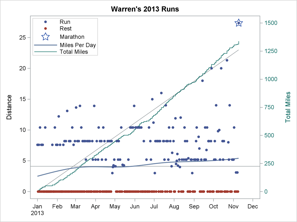
The blue dots show runs, and the distance in miles is displayed on the left Y axis. The red dots show days that I rested, biked, or lifted weights, but did not run. Most of my runs are 5.2, 8.2, or 10.4 mile runs in Umstead State park near the SAS campus with some longer runs on the weekends. In May and August you can see clusters of shorter treadmill runs when I was at SAS Global Forum, PharmaSUG, and the Joint Statistical Meetings.
The horizontal reference line is at approximately 4.1 miles—the number of miles I need to average per day to reach 1500 miles for the year. The blue curve is a penalized B-spline function fit to the distances (all running and resting days). It shows a smooth function of distance run per day. When the curve is above the reference line, I am exceeding my goal. Notice that the reference line and the penalized B-spline function would be misleading if the resting days had been excluded from the graph.
I wanted to display my total distance for the year along with the daily runs. I needed two Y axes so that I could see daily runs on a 0 to over 25 mile scale and total distance on a 0 to 1500 mile scale. With one axis, the daily runs would be too compressed to provide information. Total distance is displayed in the green step function with the right Y axis. The diagonal reference line is a regression line fitting total miles as a function of time. During some periods, the green step function is increasing faster than the average slope, and in some periods it is increasing at a slower rate.
There is one additional component to the plot. On November 9, I ran 27.36 miles fulfilling my goal of running a marathon. That point is indicated with a star. The final push to the marathon included 18, 20, 20, and 21.3 mile runs. These were followed by a taper period ending with two 3.1 mile runs in the week preceding the marathon. The short 3 mile days occurred when I dropped my car at the shop and ran into work.
I created the graph by using PROC SGPLOT:
proc sgplot data=r2; title "Warren's 2013 Runs"; refline %sysevalf(1500 / 365); series y=pred x=date / y2axis lineattrs=graphreference; step y=totalmiles x=date / y2axis lineattrs=graphdata3 name='t' legendlabel='Total Miles'; pbspline y=distance x=date / nomarkers name='p' legendlabel='Miles Per Day'; scatter y=distance x=date / group=g name='r' markerattrs=(size=5px symbol=circlefilled); scatter y=star x=date / markerattrs=(size=15px symbol=star) legendlabel='Marathon' name='s'; format date mmddyy8.; xaxis display=(nolabel); y2axis max=1500 labelattrs=graphdata3 valueattrs=graphdata3 label='Total Miles'; keylegend 'r' 's' 'p' 't' / location=inside position=topleft across=1; run; |
The data set contains the variables Date, Distance (per day), TotalMiles (running sum of Distance), Pred (linear prediction of total miles from the date minus the starting date fit with a no intercept model), and Star (one nonmissing value equal to Distance when Distance is greater than or equal to 26.2 and the rest missing). The graph is constructed as follows:
- The horizontal reference line is drawn at 1500 miles divided by 365 days and uses the Y1 axis.
- The SERIES statement displays the diagonal reference line and uses the Y2 axis.
- The STEP statement displays total miles and uses the Y2 axis.
- The PBSPLINE statement displays a smooth function of distance per day as a function of time and uses the Y1 axis.
- The first SCATTER statement displays distances as 5 pixel filled circles and uses the Y1 axis. The Group variable G differentiates resting days from running days.
- The second SCATTER statement displays a 15-pixel star on the marathon day.
- The format statement declares Date as a date variable.
- The XAXIS statement suppresses the X axis label.
- The Y2AXIS statement displays the total miles in the right Y axis in the same style as the step plot.
- The KEYLEGEND statement displays a legend identifying the points in the plot, the smooth function of average miles per day, and the total miles.
- Fittingly, the step ends with a RUN statement.
The GraphReference style element is used implicitly and explicitly for the two reference lines. The PBSPLINE fit function uses the GraphFit style element. Running days (the first group) are displayed by using the GraphData1 style element (blue), resting days by using GraphData2 (red), and total miles by using GraphData3 (green). Reference lines are drawn first so that they never obscure any other graph elements. The total miles function is drawn next so that it never obscures distances per day. The PBSPLINE function is fit to all distances (ignoring groups), whereas the scatter plot of distances displays the running and resting days as separate groups. The PBSPLINE and first SCATTER statements display the same data: PBSPLINE without a group variable and SCATTER with a group variable. In contrast, PBSPLINE with a group variable produces two fit functions. I needed to display one curve that fit all the data while at the same time distinguishing the two types of observations. You will find that using the same data in multiple ways in one graph is a useful tool.
Training for a marathon requires a great deal of hard work and motivation. Graphing my runs each day was a huge motivating factor for me, and it was fun too. I never wanted to see the step function stay flat for long, nor did I want to see the penalized B-spline function turn down after a period of less activity. When it did start slipping down, I had extra motivation to get some longer runs in to get it pointing up again. ODS Graphics enabled me to easily see my progress and helped me stay motivated after every run.
Full Code: The_RUN_Statement


1 Comment
Thanks for sharing some of your journey, Warren, and helping so many "see" what their data's saying. All the best to you as you begin this next chapter!