Working at SAS, I consider myself fortunate to have the best employee benefits in the industry. That is one of the factors placing SAS as one of the best companies to work for worldwide, and often THE best company to work for in USA.
Given that, I was curious to know the kind of health care plans offered under the much maligned "Affordable Health Care" act. Also, the reports of the malfunctioning website led me to try experiencing for myself the tribulations of obtaining health care insurance.
 My first attempt was almost 3 weeks ago, and not surprisingly, I was not able to make much headway. About a week later I was able to create an account, but that was about it. So, I decided to let the wizards from Google, Oracle and others work their magic, and see how things are progressing. Tonight, I tried again (with very low expectation), and viola, I got in.
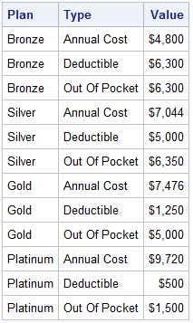
I was able to view a bunch of plans, in all four categories, Bronze, Silver, Gold and Platinum. I selected some plans at random for side by side comparison. I was expecting the site to freeze up on me at any time, but it worked all the way through, and I got some numbers and actually selected a plan. It even took me to the page to sign up, where I finally exited. But I did get some numbers, and here is the raw data.
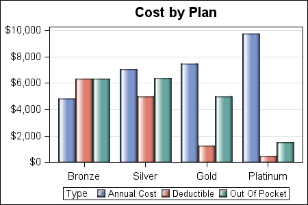
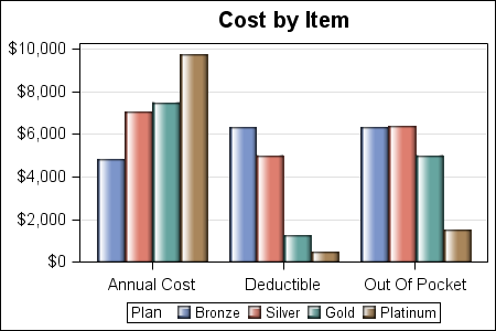
We here are all about graphics, so let us compare these plans and see how they stack up. Here are some views of the data.
Annual Cost by Plan:
Annual Cost by Item:
Total Cost by Plan:
![]()
Maybe I should only stack actual annual cost and out-of-pocket maximum, but not deductible. In that case, the costs are:
![]()
Does this make sense? Based on this simplistic first look, the Bronze plan is coming out ahead. Of course, there are many other differences between the plans such as co-pay, etc, so this is very simplistic.
SAS 9.3 SGPLOT Code: HealthCare


7 Comments
Your analysis seems more of the "worst case" kind, in which case you'd use up your deductibles as well, so Total Cost is the best metric.
If you want to get a sense of "typical cost", I think you have to multiply each of the costs by the likelihood of incurring it. I routinely use up most of my deductibles, but it's a rare year that I hit the OOP max.
I agree competely. I would not even grace it with the term "analysis". Just getting some numbers out of the Healthcar.gov site was a surprise. There were actually many plans, with lots more info on co-pay for regular and specialist visits, etc. With more effort, one can accumulate more data. For the information I gathered, using graphs to view the data provided a better understading of the numbers.
If all of the Out-of-pocket is not used (as for most young people), the Bronze plan may be even better (if all else is equal, which may not be the case).
Do you know of anyone/any company that is putting together a full analysis? I would be interested to see their analysis, research and conclusions.
Thanks for posting this. I'm surprised there is not more graphical data coming out since Healthcare.gov's launch. This was very useful to me, a 27 year old, healthy male. I mentioned and linked to this blog from a post I did about Healthcare.gov from a big data QA'ers perspective. Thanks and make some more!
The data I collected was very small and the graphs are simple. The idea is that even with small amount of data, graphs can help in their understanding.
And help they did! Thank you for putting this together! 🙂