The graphs produced by the SG procedures (and GTL) have a default look and feel designed for the common use cases. However, everyone has a preference for some special features that make the graphs unique. Fortunately, extensive customizations can be made to graphs produced by these tools using statement and axis options, and sometimes by using some creative coding.
Recently, a question was posed on how we can create a timeseries graph with a different look from the default. In this case, the y axis line is suppressed, the axis label is on top of the axis and the "year" part of the X axis tick values is displayed inside the graph. Let us see how far we can get using the SGPLOT procedure.
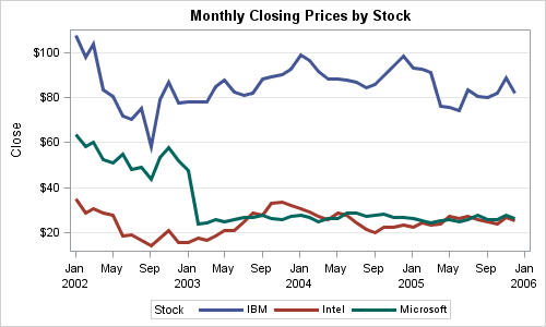
Using the SASHELP.STOCKS data set, here is the default look of a time series graph of Close by Date by Stock from 2002 to 2005:
SAS 9.3 SGPLOT code:
proc sgplot data=stocks; title 'Monthly Closing Prices by Stock'; series x=date y=close / group=stock lineattrs=(thickness=3); xaxis display=(nolabel); yaxis grid label='Close'; run; |
Note the following features:
- The time axis tick values are thinned using a nice derived date format.
- The repeating value of 'year' is printed separately only when needed.
The user wanted the repeating display of "Year" moved inside the plot area. SGPLOT does not have any such option to move the "Year" part inside the plot area. What to do?
One way is to create a column in the data that contains the year value for each observation. For every subsequent observation with the same value of year, I set it to missing. This new column "year" only contains unique values for year. Now, we can use the scatter plot with markerchar option to place these as labels at the bottom of the plot area. Here is the graph:
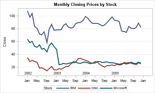
SAS 9.3 SGPLOT code:
proc sgplot data=stocks; title 'Monthly Closing Prices by Stock'; series x=date y=close / group=stock lineattrs=(thickness=3); scatter x=date y=ymin / markerchar=year markercharattrs=(size=9); xaxis display=(nolabel) tickvalueformat=monname3.; yaxis grid label='Close'; run; |
Here are some details:
- A column for Year is created in the data step. See the full code in attached file below.
- A scatter plot with MARKERCHAR options is used to display the year.
- An axis format of MONNAME3. is used on the x axis.
- YMIN is a data column in the data that contains the minimum Y value.
- Note: There is no value for 2006 in the data, so there is no label for 2006. By default, the x axis does extend the data to the next whole interval.
Finally, we used SAS 9.4 SGPLOT features to suppress the graph border and the Y axis line and move the Y axis label to the top of the axis. We also use the QTR. format on the x axis.:
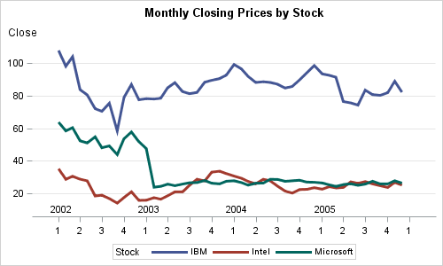
SAS 9.4 SGPLOT code:
proc sgplot data=stocks noborder; title 'Monthly Closing Prices by Stock'; series x=date y=close / group=stock lineattrs=(thickness=3); scatter x=date y=ymin / markerchar=year markercharattrs=(size=9); xaxis display=(nolabel) tickvalueformat=qtr. interval=quarter; yaxis display=(noline) grid label='Close' labelpos=top; run; |
With SG procedures, it is possible to change the appearance of the graph by using statement and axis options that are provided. However, often some unique feature cannot be done using the built-in features of options. In such cases, you can use the "Building-block" nature of the syntax to use plot statements increative ways to acheive results that may not seem possible just by looking a plot options.
Full SAS code: Time_Axis


