As promised, here is a better combined AE-CM graph, using some of the UI improvements suggested by our UI expert, Riley. His suggestions helped to reduce the clutter in the graph, while still keeping all the features preferred by our users. Click on the graphs for a higher resolution image.
SAS 9.3 AE-CM Graph:
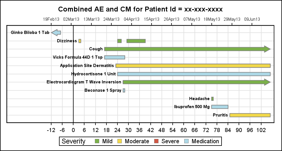
Key improvements are:
- The events are ordered from top to bottom, for better readability.
- The AE and CM labels use camel case text, instead of all caps. This is easier on the eyes.
- The intensity of outline for the event bars is reduced.
- The font for the X2 axis (top) is reduced to reduce clutter.
SAS 9.4 AE-CM Graph:
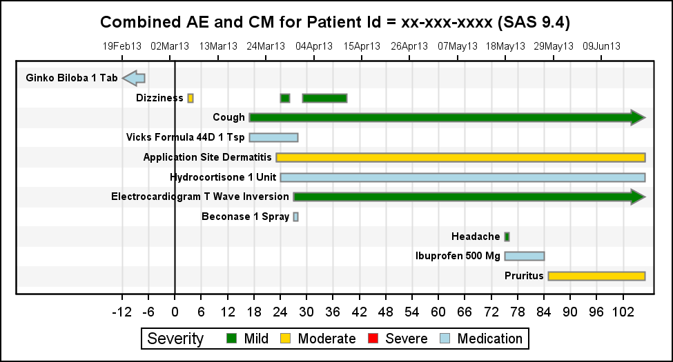
In the SAS 9.4 version, the main addition is the use of the alternating gray bands on Y axis instead of the grids. These help align the items horizontally. This could be done with some extra work in the SAS 9.3 graph, but is easier with SAS 9.4.
Code for AE-CM graph:
title "Combined AE and CM for Patient Id = &pid (SAS 9.4)"; proc sgplot data=AE_CM_sort dattrmap=attrmap; refline 0 / axis=x lineattrs=(color=black); highlow y=name low=stdy high=endy / type=bar group=sev lineattrs=(color=gray pattern=solid) barwidth=0.8 lowlabel=label lowcap=locap highcap=hicap attrid=Severity nomissinggroup labelattrs=(size=7 weight=bold); scatter y=name x=stdate / x2axis markerattrs=(size=0); xaxis grid display=(nolabel) offsetmax=0.02 values=(&minday2 to &maxday by 2); x2axis display=(nolabel) offsetmax=0.02 values=(&mindate2 to &maxdate); yaxis grid reverse display=(noticks novalues nolabel); /*-- SAS 9.3--*/ /*--yaxis reverse display=(noticks novalues nolabel) colorbands=odd colorbandsattrs=(color=cxf5f5f5);--*/ /*--SAS 9.4--*/ run; |
Full SAS code: Combined_AE_CM
I am hoping to hear feedback from users in the field on the pros and cons of this configuration.


4 Comments
Maybe if you have to ask then this plot isn't for you, but personally I have no idea what AE, CM, or UI are short for. Could the blog posts be a little less jargony?
You are absolutely correct, I should provide more context. The AE stands for Adverse Event, and CM for conmonitant Medications. This is a useful graph to track the progress of an individual subject in a study, or just while they are in a medical facility. Knowing the occurrance of adverse events such as those listed along with the medications the subject is taking on the same timeline can provide the care giver or the study investigator better information on possible interactions between the medication and the illness.
Similar combined graphs can be created for tracking VS (Vital statistics) like blood pressure, pulse, etc and also LB (Lab results) for cholesterol, and other liver functions.
The main proposal here is to plot these together so the temporal associations will be more evident. The issue is of avoiding too much information in one graph, causing clutter and noise that can lead to distractions.
Pingback: Graphs at WUSS – Part 2 - Graphically Speaking
This plot is not created correct for the following situation:
When a AE start day is same as the max of any AE last day for that subject but AE end day is missing, the plot is not shown with the filled arrow due to the space problem. One should consider bigger value than 0.5 to show the filledarrow.