At the SAS Global Forum 2013 in San Francisco, I presented a paper on making Patient Profile Graphs using SAS. You can follow the link to see the graphs presented in this paper.
In that paper, I presented ways to create AE, CM, VS and Lab graphs. I discussed aligning the x-axes of the two independent AE and CM graphs, and also carrying reference lines for each AE start event into the CM graph. Here are the AE and CM graphs from the paper. Click on the graph for a high resolution view.

Note these features:
- These are two separate graphs.
- The zero values on the x-axis of both graphs are correctly aligned.
- Reference lines for each AE start event are carried into the CM graphs.
After the presentation, and also recently at the Minnesota SAS users' group meeting, users stopped by to discuss these graphs, and ways to further improve the graph to help the PI clearly view each AE event and associate it with the CM prescriptions exactly.
This discussion led to the idea of plotting both AE and CM events together in one graph. Here is the first installment of this graph. Click on the graph for high resolution view.
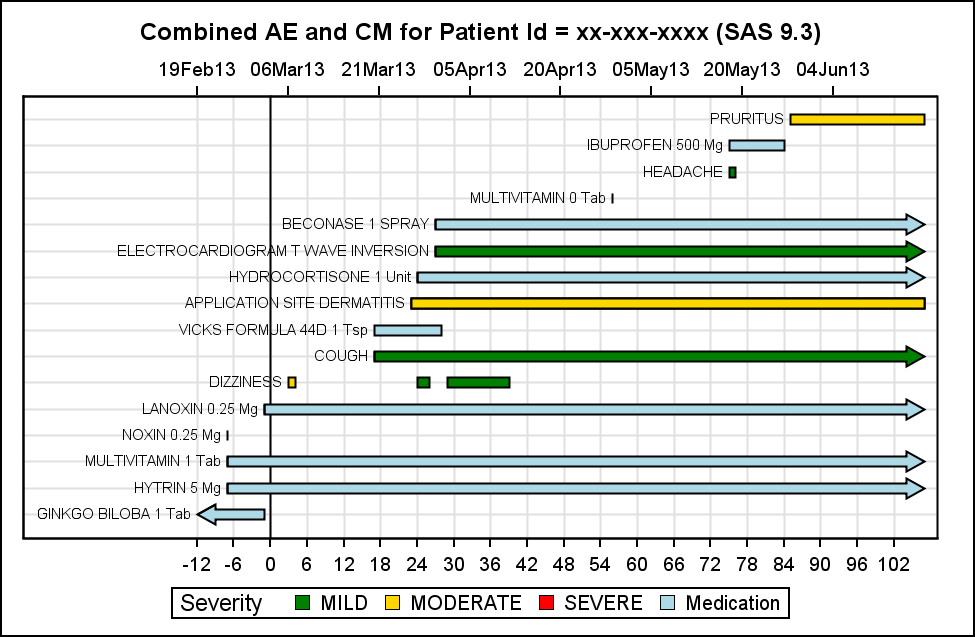
Note the following features of this graph:
- Both the AE and the CM events are plotted in the same graph.
- The events are sorted by start date, with earliest event on the left.
- Each subsequent event (by date) is plotted in ascending fashion.
- AE's are classified by severity, using a distinct color for the each.
- CMs are colored in light blue to distinguish these from the AE.
- No need for any reference lines.
In my opinion, this graph is clearly superior to the previous version. It follows the principles of effective graphics, were related information is presented together. I would like to reduce clutter, and highlight the appropriate items.
Do you work with such graphs in your work? Would you find this useful? Your suggestions would be very valuable.
Similar combined graphs for VS and LAB would also be useful.
I have not included the code yet, but this graph is created using SAS 9.3. I would like to include the suggestions from readers into this graph.


8 Comments
Hi Sanjay,
I work with AE graphs a lot in my industry, and I find your example really interesting. I will show the Statisticians your graphs and get some feedback on whether this should be implemented in our department too. Thank you for the example.
Many thanks,
Kriss
Thanks, Kriss. Any and all suggestions are welcome. I have received some suggestions from one of our UI experts that should help improve the graph. I will post an updated graph shortly.
Hi Sanjay,
the patient's profile is vital in the safety and efficacy of a clinical trial ,could you pls send me the example datasets and codes of in the paper " Patient Profile Graphs using SAS" . thanks.
Yes, I am in the process of adding these to the SAS Support Focus page for graphics. Should be there shortly.
Hi Sanjay,
Like Jim I am really interested in the code for the graph at the top ie different graphs with aligned axis. Are you able to please post? I'm using 9.3.
A really, really good improvement to SGPANEL would be the option to NOT print every combination of Y if missing.
To illustrate I am trying to timeline client demographics by type (address, contact details and bank accounts) using HIGHLOW. I'd like to have just addresses turn up in the address panel, contacts in the contacts panel etc and have the same axis but SAS insists on printing all in each panel - very frustrating!
cheers
Steve
I posted the code in a subsequent article "A Better AE + CM Graph".
For SGPANEL, it is not clear exactly what you are doing, but you can set the UNISCALE option on the PANELBY statement to ROW or COLUMN to get only the category values in the row or column.
Hi Sanjay
This example of 2 charts on a page is great --- comparing events on a concomitant medication against AE's. Would it be possible to do the following in 9.3 (I say 9.3 because it will be a very long time before pharma companies go to 9.4):
Give us the capability of having may graphs stacked on a scrolling page. Give us the ability to turn their appearance "on and off" at the viewer level. This would give the investigator the easy capability of comparing exposure against anything, exposure against efficacy against adverse events, etc. Essentially this page could be folded and unfolded by selecting the areas of interest.
I am not sure what the printing capabilities would be.
Keep up the good work.
Pingback: CandleStick Chart with SAS 9.2 - Graphically Speaking