SG procedures and GTL use a collision avoidance algorithm to position data labels for a scatter or series plot. This is enabled by default. The label is preferably placed at the top right corner of the marker. The label is moved to one of the eight locations around the marker to avoid collision with other markers or labels. If a collision is still detected, then the label is moved a bit away from the marker.
While this works for sparsely populated graphs, it does not work very well for dense plots, as the markers start drifting away from the data point, and soon it becomes hard to associate the label with the marker.
This gets worse when used with a series plot, as the data labels try to avoid other labels and the series plot itself. Also, for a busy series (real data), the data points are close to each other anyway, even if there is a lot of space elsewhere in the graph. The full code is in the attached file.
Here is a graph of a sparse series plot with data labels. Here we have only plotted 18 observations (every 5th one) from the original series plot that has 91 observations.
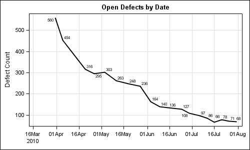
This case works well. Every vertex in the series plot is labeled. Some labels are moved to avoid collisions.
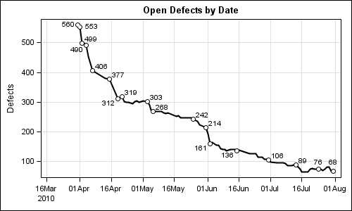
Here is the graph for the original series plot with all 91 data points:
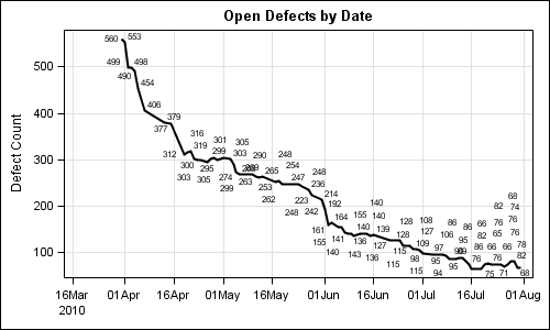
title 'Open Defects by Date'; proc sgplot data=series; series x=date y=count / datalabel=count lineattrs=(thickness=2); xaxis grid display=(nolabel); yaxis grid; run; |
As we can see here, this series plot has too many data labels to position without collisions. The markers are moved away from the data point, and soon it becomes pretty useless.
Disable Label Collisions: There is a way to disable the label collision entirely by using the LABELMAX option on the ODS Graphics statement. The option name is a little misleading. This option does not set the maximum number of labels to be displayed, but rather the point at which collision avoidance is switched off.
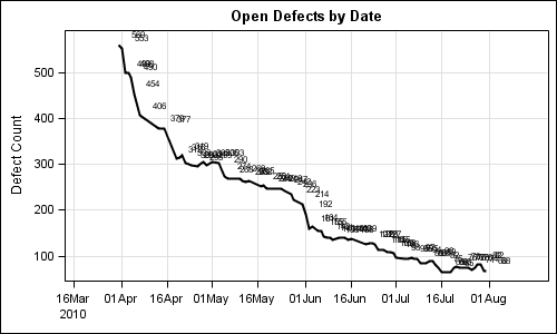
ods graphics / reset labelmax=0; title 'Open Defects by Date'; proc sgplot data=series; series x=date y=count / datalabel=count lineattrs=(thickness=2); xaxis grid display=(nolabel); yaxis grid; run; |
In the graph above, the label collision is completely disabled by setting LABELMAX=0. But the resulting graph is not very useful as the labels overwrite, creating a mess.
In my use cases with such data, what I need is really a way to label the local extreme points on the curve, and not necessarily all the points. One could use a simplistic approach and only label every 5th point, but that would be less than satisfactory.
So, what I do is use a LOESS fit behind the scene to compute a fit line and a confidence band. Then, if the distance of the data point from the predicted fit value is larger than a tunable factor of the band width, I label that point. Else I skip is (set to missing). I used a factor of 0.4, but you can adjust that. The full code is included in the attached file. Here is the graph with reduced labels.
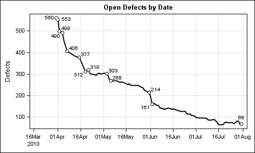
Here, only some of the extreme points are labels. I also draw a scatter marker at each labeled point, we know which one is labeled.
In the graph above, there are regions where the curve is less jaggy, and so no points are labeled. Same would be the case if we have a smooth sine curve. To ensure at least some points are labeled, I added code to label a point if the previous 10 points did not get a label. Here is the graph:
title 'Open Defects by Date'; proc sgplot data=loessLabels noautolegend; series x=date y=depvar / datalabel=loessPluslabel lineattrs=(thickness=2) datalabelattrs=(size=8); scatter x=date y=loessPluslabel / markerattrs=(symbol=circlefilled size=9); scatter x=date y=loessPluslabel / markerattrs=(symbol=circlefilled size=5 color=white); xaxis grid display=(nolabel); yaxis grid label='Defects'; run; |
Now, this looks pretty good to me. All extreme points are labeled, and some points along the smooth curve are also labeled. Label collision avoidance is enabled, so if the points get close, like 312 and 319, they are moved. I also increased the size of the data labels. I am sure you can macrofy the code for more efficient usage.
Note: An improvement to the collision avoidance algorithm will be released with SAS 9.4. A new "Simulated Annealing" based alternative algorithm is also in the works.
Full SAS 9.2 Program: Vertex_Labels
Excel Data File: Series


1 Comment
Your code is misleading as you named your data set "series" but in the third line of code "series" is a "key word".
Your code:
title 'Open Defects by Date';
proc sgplot data=series;
series x=date y=count / datalabel=count lineattrs=(thickness=2);
xaxis grid display=(nolabel);
yaxis grid;
run;
Clarification:
title 'Open Defects by Date';
proc sgplot data=yourdatasetname;
series x=date y=count / datalabel=count lineattrs=(thickness=2);
xaxis grid display=(nolabel);
yaxis grid;
run;