A common request we have been often hearing is for display of the distribution of data as a box plot, along with some detailed information overlaid. For example, one may have ratings data of all the hospitals in a region by different specialty, and you want to view this distribution by specialty, and also overlay on top of this the actual data point for some specific hospitals of interest.
Here, I have simulated such data for multiple hospitals (by ID) for six specialties such as Pediatrics, Nephrology, etc., with a rating from 0.0 - 1.0. Two of the hospitals (ID=1 and 2) are of interest to us, and I have named them "County" and "Memorial".
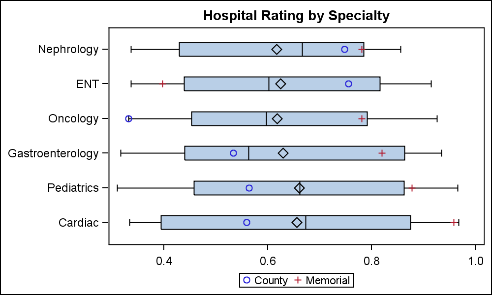
Here is the graph, showing the box plots of Rating by Specialty, overlaid with the specific values for the two hospitals. A horizontal box plot is used due to the long category value names. Click on the graph for a larger view:
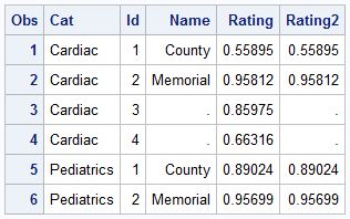
Here is the data snippet. A format is defined that sets the hospital names for id=1 & 2 and missing for other ids. The actual data has 20 different hospitals. Rating2 is same as Rating for id=1 & 2.
Users of the SGPLOT procedure will know that you cannot overlay a basic plot like SCATTER on a HBOX. So, to do this, we have to use GTL. The code is quite straight forward, and SGPLOT users will recognize the similarities:
/*--Distribution of Hospital Ratings with Specfic Overlay--*/ proc template; define statgraph Rating_Overlay; begingraph; entrytitle 'Hospital Rating by Specialty'; layout overlay / xaxisopts=(display=(ticks tickvalues)) yaxisopts=(display=(ticks tickvalues)) ; boxplot x=cat y=rating / orient=horizontal; scatterplot y=cat x=rating2 / group=name name='a' includemissinggroup=false; discretelegend 'a'; endlayout; endgraph; end; run /*--Create graph--*/ proc sgrender data=rating template=Rating_Overlay; run; |
The GTL code is verbose, but it is well structured. We always need the PROC TEMPLATE step, with a DEFINE STATGRAPH statement to create the named template. The template has a LAYOUT OVERLAY container that contains the BOXPLOT and the SCATTERPLOT statements with the usual options. Then, we need the PROC SGRENDER step to bind the data with the template to create the graph.
Another way would be to actually label the hospital names on the graph itself, and avoid the legend. The DATALABEL option for the scatter plot is used to place the labels. The labels are automatically moved a bit to avoid collision. The code is included in the attached program file.
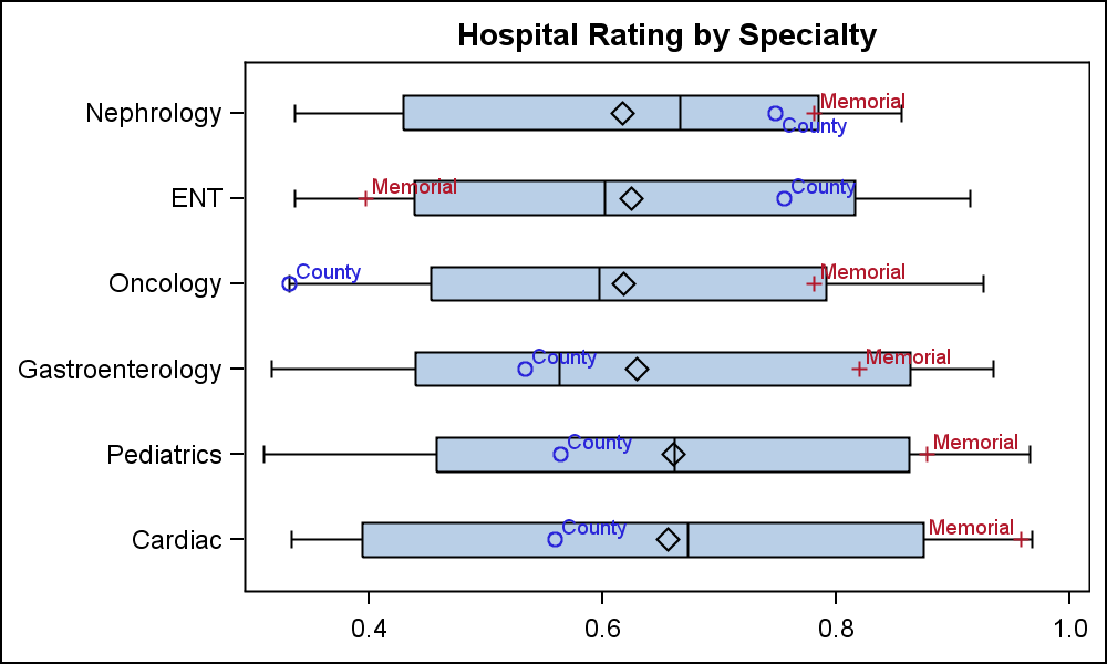
Finally, here is a sneak preview of the same graph using SAS 9.4 (to be released soon).

Note the long category value "Gastro-Enterology" has been split on two lines using a split character. This is a new features included with the SAS 9.4 release, allowing us to use a vertical box plot instead. Also, we have used optional "Skins" to render the boxes and also the scatter markers. The label positions have been fixed to "Top". Click on the graph for full resolution view. I will show you the SAS9.4 code as soon as it is released.
SAS 9.4 also includes a nifty new "Jitter" feature to place a large number of coincident markers. More on this soon.
Full SAS 9.3 Code: Rating


4 Comments
Nice, I will probably use this sometime. But the thing I'm most excited about is the ability to split category names in 9.4!
Side note - I think the boxplot looks great and I love the dataskin feature myself but less so ever since a client referred to it as my '50 shades of grey' plot.
In general, for clinical or other analytical graphs, "Chart Junk" like skins etc. should be avoided. However, we often have users looking for some pizzazz, as shown here.
Nice topic Sanjay! Do you know when SAS 9.4 will be released please?
It is hard to say with certainty, but my guess is sometime this summer. Don't hold me to it...