Recently a reader chimed in with a question on the Do Loop article by Rick Wicklin on how to create a bar chart with percent statistics. Rick used SAS 9.3 and the reader wanted to do the same with SAS 9.2.
For the basic (non-grouped) bar chart, the process is the same as described by Rick. The VBAR only supports the FREQ, SUM and MEAN statistics. So, to plot the percentages, you have to compute the statistics using proc FREQ., and then plot the percent column as the RESPONSE role in the SGPLOT procedure.
Since we want to use the "PERCENT." format , we normalize the percent values in the column between 0.0 - 1.0. Here is the SAS 9.2 graph and code.

proc freq data=sashelp.cars noprint; tables Type / out=FreqOut; run; data freqout; set freqout; label pct='Percent'; format pct percent.; pct=percent/100; run; title 'Distribution by Type'; proc sgplot data=FreqOut; vbar type / response=pct datalabel; yaxis grid display=(nolabel); xaxis display=(nolabel); run; |
For the second graph shown in Rick's article, things are a bit different with SAS 9.2. SAS 9.3 SGPLOT procedure supports the GROUPDISPLAY=CLUSTER option that displays the group values side-by-side. This feature did not exist at SAS 9.2.
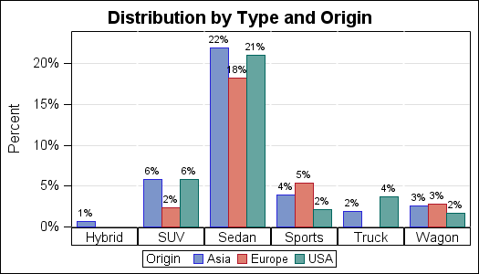
However, one can get a functionally similar graph using SAS 9.2, you just have to use the SGPANEL procedure. Here is the graph created using the SAS 9.2 SGPANEL procedure, and the code.
SAS 9.2 SGPANEL code:
proc freq data=sashelp.cars; tables Origin*Type / out=FreqOut2; run; data freqout2; set freqout2; label pct='Percent'; format pct percent.; pct=percent/100; run; title 'Distribution by Type and Origin'; proc sgpanel data=FreqOut2; panelby type / layout=columnlattice onepanel colheaderpos=bottom noborder novarname; vbar origin / response=pct datalabel group=origin barwidth=1; rowaxis grid; colaxis display=none; run; |
Note, we have used "Type" as the panel variable that creates a panel with 6 cells. Each cell is then populated with a VBAR by "Origin". We have moved the cell header to the bottom so it looks sort of like an axis.


3 Comments
how did you increase the size of the percentages on top of the bar?
With SAS 9.3, you can use DATALABELATTRS=(size=10pt) to set the size of the font in pt.
Is there a way to make the bar height equal the freq and the label be the percent?