In this final post for 2012, I would like to finish up the panel sorting topic with a discussion on sorting the panel cells by statistic. With this sort, the response or dependent data in each cell is calculated down to a single statistic value (mean or median, for example). These values are used to sort the cells in ascending or descending order. There are two primary benefits of this type of sort:
- The person reading the graph can quickly determine the highest and lowest classfication values.
- When used in conjunction with axis sorting, abnormalities in the data are easier to spot
T0 demonstrate both of these points, I am going to create a panelled dot plot using a classic data set involving barley yields in Minnesota (http://stat.ethz.ch/R-manual/R-devel/library/lattice/html/barley.html). In the example below, I subsetted the data set to the year 1931 for clarity. Notice that the cells are displayed in descending mean order and that the response values are sorted in descending order to add further clarity (this option is available in SAS 9.3 and greater). Also notice that the "Trebi" variety of barley at the "Morris" site seems to stand out as an odd data point, warranting further investigation. Without this sorting, that anomaly could have easily been missed.
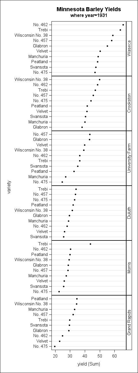
The first step to create this example is to determine the correct order for the class values. The SUMMARY procedure is used to do the actual mean calculations. Then, the RANK procedure is used to create a rank column based on the mean values. If you want the cells in descending order (as in this example), be sure to use the DESCENDING option on PROC RANK to rank the values from high to low.
proc summary data=t.barley nway; where year=1931; class site; var yield; output out=cellstats mean=cell_means; run; proc rank data=cellstats descending out=rankings; var cell_means; ranks order; run; |
The next step requires that you create a format that associates the rank value back to the class value (similar to what we did in part 1).
proc format; value mean_order 2 = "Crookston" 4 = "Duluth" 6 = "Grand Rapids" 5 = "Morris" 3 = "University Farm" 1 = "Waseca" ; |
Next, you match-merge the rank dataset with the original data to create a merged data set that we will use with PROC SGPANEL.
proc sort data=rankings; by site; run; proc sort data=t.barley (where=(year=1931)) out=barley; by site; run; data merged; merge barley rankings; by site; run; proc sort data=merged; by order; run; |
Finally, the SGPANEL procedures renders the graph. Notice that the rank column "order" is used on the PANELBY statement. The user-defined format associated with that column turns the rank values back into the original class values.
ods graphics / height=1300px width=480px; title "Minnesota Barley Yields"; title2 "where year=1931"; proc sgpanel data=merged; format order mean_order.; panelby order / layout=rowlattice uniscale=column onepanel novarname; dot variety / response=yield categoryorder=respdesc; run; |
As mentioned in the previous post, the new SORT option on the PANELBY statement in PROC SGPANEL for SAS 9.4 will make this example much easier to create. In fact, all that will be needed for this example in SAS 9.4 will be to run PROC SGPANEL.
Happy new year, everyone!


1 Comment
Pingback: GTL Layouts - Graphically Speaking