“So, you work for SAS?” asked my co-passenger. I was on the plane to Baltimore to attend my first NESUG conference and the tag on my laptop bag was the clue. I happened to be seated next to a SAS user who was familiar with ODS Graphics. I ended up giving a demo of the ODS Graphics Designer. Talk of a ‘captive audience’! Thus began a journey where I learned some things and, I hope, helped some users transition to and learn more about ODS Graphics.
At NESUG, I reprised the presentation for my SAS Global Forum 2012 paper, ‘Off the Beaten Path: Create Unusual Graphs with GTL’ and also presented Sanjay’s “Clinical Graphs using SG Procedures”. I gave super demos on “What’s New for GTL in SAS 9.3” and “ODS Graphics Designer”. The latter drew a standing-room only crowd the second time around. (Of course, the ‘room’ here was the smaller solutions theater, but it was still a larger crowd, relatively speaking -- thanks to recommendations by Cynthia Zender.) I sensed that many users now appreciate the benefit of the ‘Designer as a quick and easy graph tool. Some had misgivings about the application being light on programming, but were won over when I pointed out the code window that shows you the code behind the scenes, which also makes it a great learning tool for GTL.
I also realized that many of our users are not aware of our “ODS Graphics Editor” application. To reiterate here, if you have a need for post-processing your ODS Graphics generated graphs for minor changes such as editing or inserting/deleting titles and footnotes, or adjusting the color of some graphical element, the 'Editor is what you need! It also allows some basic annotations, all via a point-n-click GUI operating on .sge output files. It does not allow any data-related changes in order to preserve the data integrity of your output. Here is a screen shot of the tool in action:
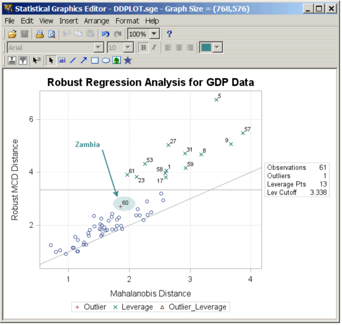
The ODS Graphics Editor has been available since SAS 9.2. The stand-alone version of this tool (no other SAS install required) can be installed from the SAS Support website. The ODS Graphics Editor: User’s Guide (SAS 9.3) has all the information you need to download and use this free application.
Perusing the dozen or so posters, I learnt a new trick from Perry Watts & Nate Derby’s entry titled ‘Using SAS® GTL with 9.3 Updates to Visualize Data When There is Too Much of it to Visualize’. Here is the of the plot of interest:
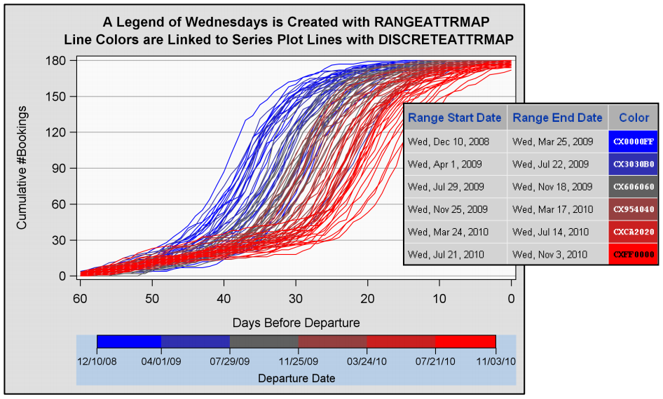
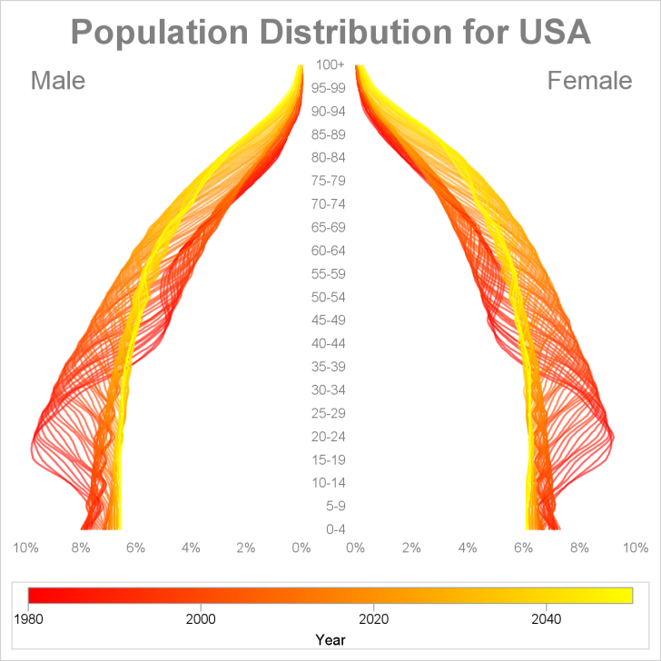
In my GTL paper, it would have been nice if the population pyramid example had a continuous legend instead of the discrete legend for just the end-point values. The above poster shows how you can do this by using a SCATTERPLOT statement that uses MARKERCOLORGRADIENT= set to a RANGEATTRVAR which is then referenced in a continuous legend! I reworked my graph, now with a continuous legend using this trick, as shown below.
Here is another interesting graph from a paper “Using Axes Options to Stretch the Limits of SAS® Graph Template Language” also authored by Perry Watts:

While we have added support for minor ticks on linear axes in SAS 9.4, the above graph displays an x-axis with minor ticks restricted to a part of the axis to indicate a higher data precision! You will have to read the paper for the details on which SAS 9.3 feature was exploited to achieve this.
All in all, it was a very productive conference for me. Not bad for a newbie, eh?


1 Comment
I really like the samples you provide and have adapted many of them to fit my needs. However I do have a graphic that I would really appreciate your help with. I have a dataset that I want to show a site average and compare that to the entire study average on a color coded bar. I have an example of what I would like that I can email you. I would like to program this with a template and sgrender, but this has me stumped.