ODS Graphics system was initially motivated by the need for high quality graphs for SAS Base, STAT, and other analytical procedures. Use of SG Procedures, ODS Graphics Designer and GTL by users too has initially focused on analytical graphs. But just like wheels on carryon bags that started for the specific needs of flight staff, are now available on all luggage, GTL has found many uses in the business graphics domain.
So, with SAS 9.3, GTL has taken the first steps towards supporting business graphs, with addition of data skins for Bar Charts and inclusion of Pie Charts and Water Fall charts in the framework. Here is an example of a Bar Chart and Pie Chart side by side in a Lattice:
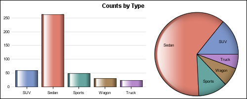
The graph above is done using GTL, by placing a Bar Chart and a Pie Chart in two adjacent cells of a Layout Lattice.:
proc template; define statgraph BarPie; dynamic _skin; begingraph; entrytitle 'Mileage by Type'; layout lattice / columns=2 columnweights=(0.6 0.4) columngutter=10; layout overlay / walldisplay=none xaxisopts=(display=(ticks tickvalues)) yaxisopts=(display=(tickvalues) griddisplay=on); barchart x=type / dataskin=_skin barlabel=false group=type name='a'; endlayout; layout region; piechart category=type / dataskin=_skin datalabelcontent=(category); endlayout; endlayout; endgraph; end; run; |
Note a new LAYOUT REGION statement is used with the PIECHART statement. The REGION container is used for components that do not have axes such as a Pie Chart. Other components that will be included in the future are Tile Chart (Tree Map) and node-link diagrams. A REGION container also supports other components like Entries, Legends, etc.
In the graph above we have turned off the display of the "wall" for the Bar Chart, and kept only the tick values and grid lines for the Y axis. This results in a "light weight" look that better matches the Pie Chart. Also, both the Pie Chart and the Bar Chart use the GLOSS skin.
The Pie Chart is not often used in the analytical community as it does not lend itself to accurate comparisons of magnitude among the categories. As per the principles of visual perception, comparisons of magnitude are difficult when they are represented as an angular measure. This gets worse when these are not from a common baseline. In many cases, a good bar chart can be as good or better than a pie chart to visualize the data.
In this example, the comparison of the number of vehicle between types are harder to make in the Pie Chart. For example, it is harder to determine just by looking at the pie chart whether the number of Wagons is greater or smaller than number of Trucks. Such comparisons between categories is easier with the Bar Chart.
On the other hand, the Pie Chart is a useful tool for visualizing a "part-to-whole" relationship. In above graph, it is easier to see in the Pie Chart that more than 50% of the vehicles are Sedans.
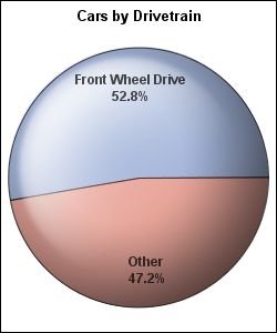
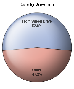
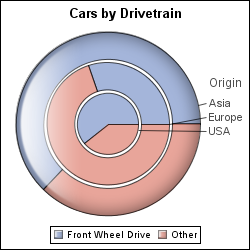
Here is another example of a good usage of a Pie Chart to view part-to-whole comparisons, where it is clear that more than half of all cars in the data set are Front-Wheel drive. GTL supports many options on Pie Chart, such as Groups, Other Slice, Start and so on. Here are some examples:
Pie Chart with Start Angle:
Grouped Pie Chart with gaps:
If you must have a pie chart in your GTL program, with SAS 9.3 you can.
SAS 9.3 program: PieCharts


2 Comments
Hi Sanjay! Can the same concept be applied if I want a script to subset just specific causes on a pareto? Thanks!
I am not fully clear on your question, but you can surely add a line plot with cumulative frequencies on top of the bar chart to create a Pareto chart.