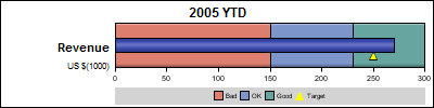
In this blog we have been discussing graphs useful for analysis of data for many domains such as clinical research, forecasting and more. SG Procedures and GTL are particularly suited for these use cases. So, when I came upon a dashboard image from Steven Few's Visual Business Intelligence blog, showing the use of bullet graphs with targets, I was intrigued to see how much mileage I could get out of GTL to create this graph:
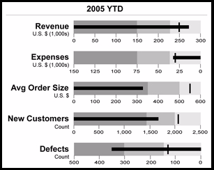
As we are all familiar by now, GTL uses a building block approach to create a graph. Often you can build unique visuals by combining together plot statements in creative ways . Let us analyze this graph and see if we can break it down into component parts that can be handled by GTL. We will start with the first bullet graph for Revenue. Here is what I see, and the equivalent GTL feature:
- A needle showing the current performance on a linear axis - GTL horizontal bar chart.
- A banded background behind the needle represents qualitative data ranges - GTL horizontal stacked bar chart or band plot.
- A symbol to show a comparative measure or a target - GTL Scatter plot.
- A label on the left to describe the measure - GTL Entry.
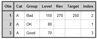
I put together a simple data set for just one indicator by eyeballing the data in the graph. Here is the data for Revenues:
Step 1: Draw the background range bands using a stacked horizontal bar chart. This could likely be done using a band plot. With bar chart we can use the skin feature to make it look better (business users prefer a little glitz). We will use a two-column Lattice, with the text in the left cell, and the graph in the right cell. The cell sizes are set to provide more space for the plot.
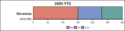
- The stacked horizontal grouped bar chart has only one bar (category).
- I used index to pick specific style elements for each group value.
- I have hidden the Y axis and set offsets to zero.
- I made the BarWidth=1.0 so now the bar fills the whole cell.
- I added the legend so show the range levels.
- I used a right aligned Entry in the left cell for the description.
Code snippet:
proc template; define statgraph KPI_Revenue_1; begingraph; entrytitle '2005 YTD' / textattrs=(weight=bold); layout lattice / rows=1 columns=2 columnweights=(0.25 0.75); layout gridded; entry halign=right "Revenue" / textattrs=graphtitletext; entry halign=right "US $(1000)"; endlayout; layout overlay / yaxisopts=(display=none offsetmin=0.0 offsetmax=0.0) xaxisopts=(display=(ticks tickvalues) offsetmin=0.0 offsetmax=0.0 tickvalueattrs=(size=8)); barchart x=cat y=level / group=group name='a' orient=horizontal barwidth=1.0 outlineattrs=(color=black) skin=satin index=index; endlayout; columnheaders; entry ' '; discretelegend 'a' / border=false valueattrs=(size=8); endcolumnheaders; endlayout; endgraph; end; run; ods graphics / reset width=4in height=1in imagename="KPI_Revenue_92_1"; proc sgrender data=YTD_2005_Revenue template=KPI_Revenue_1; run; |
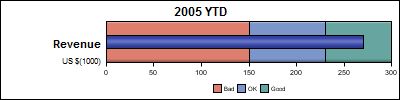
Step 2: Overlay a second bar chart showing just the revenue:
Step 3: Overlay a ScatterPlot with filled triangle marker at a small discrete offset.
- Markers are not outlined, so I used two scatter plots, one with black marker and one with smaller yellow marker.
- Markers in the legend are not overlaid, so I put a grey background color.
- I used DiscreteOffset to move the marker down a bit.
- Now, we essentially have the bullet KPI for one measure.
Step 4: Extend this concept to multiple cells, each cell using a separate set of columns for the data. Here is what the data looks like for 2 cells (Revenues and Expenses): 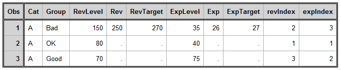
Here is the graph for all three measures:
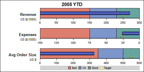
- Note the 2nd KPI has reverse axis.
- I used index to color the group values. The indexes are reversed for the 2nd kpi.
- I added a gutter to separate the rows a bit.
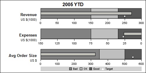
This works well with style=journal too, as long as we are careful with the custom colors we used for the indicator bar and the target symbol.
Looks like we may have covered almost every detail from the original graph. Everything is data driven, no custom hard coded features except the labels. If one of the axis was not reversed, we could have used a DataLattice with data organized by class variable for even more flexibility.
Not bad for a framework designed to create analytical graphs! With SAS 9.3, you have more options with built-in Target option on the Bar Chart.
A suggestion was made by Prashant that if the data was classified by the type of metric (Revenue, Expense, etc.), one could use the ifc() function to extract just the values for one metric for each cell. This seemed to work, until I ran into a glitch. I will post a follow up once I figure that out. Stay tuned.
Full SAS 9.2 program : Full SAS 92 Code


1 Comment
Pingback: Dashboard graphs revisited - Graphically Speaking