Recently we discussed the features of the Shiller Graph, showing long term housing values in the USA. To understand the features necesary in the SGPLOT procedure to create such graph easily, it was useful to see how far we can go using GTL as released with SAS 9.2(M3).
I got the data Shiller Housing index data over the web as a spread sheet, and read it into SAS and added some "forecast" observations at the end. I created a data set of the historical events, and merged this with the housing data. You can see all this in the full program code attached.
GTL supports the BLOCKPLOT statement that is designed for such a use case. The graph and GTL code are shown below. Click on the graph to see it in full size.
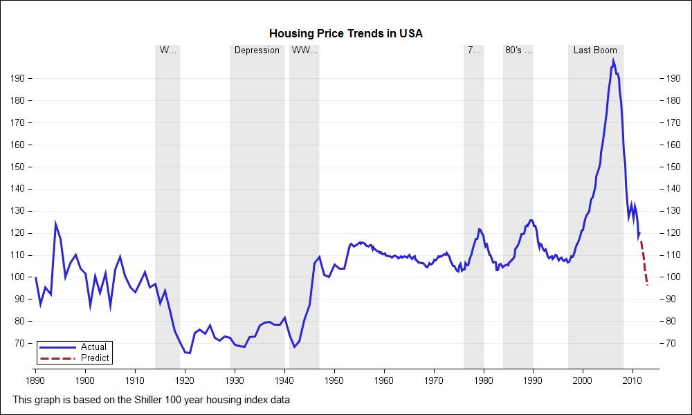
proc template; define statgraph housing1; begingraph; entrytitle "Housing Price Trends in USA"; layout overlay / walldisplay=(fill) pad=(top=20) xaxisopts=(display=(ticks tickvalues line) griddisplay=off offsetmax=0.02 linearopts=(tickvaluesequence=(start=1890 end=2010 increment=10))) y2axisopts=(display=(ticks tickvalues) displaysecondary=(ticks tickvalues) griddisplay=on offsetmin=0.05 offsetmax=0.05 linearopts=(tickvaluesequence=(start=60 end=200 increment=10) thresholdmax=1)); blockplot x=date2 block=event / fillattrs=(color=lightgray) datatransparency=0.5 fillattrs=(color=white) altfillattrs=(color=lightgray) filltype=alternate display=(fill values) valuehalign=center valuevalign=top; seriesplot x=date y=index / yaxis=y2 group=group lineattrs=(thickness=3) name='p' includemissinggroup=false; discretelegend 'p' / location=inside halign=left valign=bottom across=1; endlayout; endgraph; end; run; ods listing; ods graphics / reset width=10in height=6in imagename='Housing_1' antialiasmax=1000; proc sgrender data=merged template=housing1; run; |
The BLOCKPLOT statement does most of what we want. The statement has the following syntax:
BLOCKPLOT X=var BLOCK=var / <options>; |
In our usage, "X" should be assigned the date variable (sorted), and "BLOCK" should be assigned the Event variable. A "block" is formed from consecutive values of the event variable. Each block is drawn with the applicable display attributes, including values. This statement used with the SERIESPLOT statement is essentially what is needed to create this basic graph. Note, the Date variable may be the same for both timeseries and event data, or separate variables, with similar data.
Now for the details. The block value is displayed in each block, as requested above. If the value text fits, all is well. If not, it is truncated, as can be seen for some values in the graph. There is no option available to control this behavior. We will get back to this issue later.
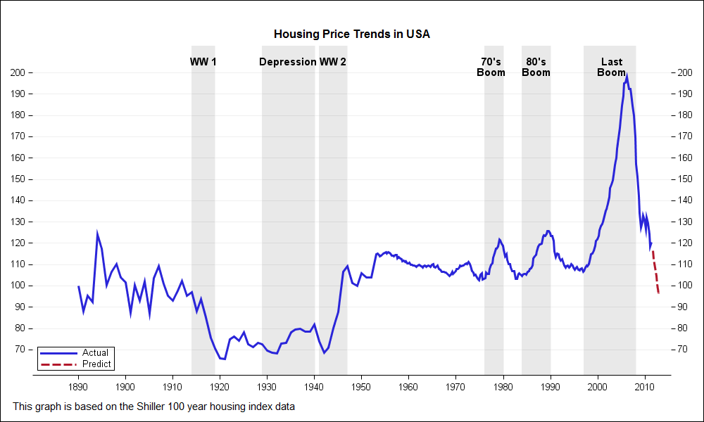
To overcome this shortcoming, we have to resort to other means to draw the block labels. We use the SCATTERPLOT statement with the MarkerCharacter option using a separate column added to the Historical Data called Label. Now, we turned off the BLOCKPLOT labels, and added the SCATTERPLOT. Graph and code are shown below.

proc template; define statgraph housing2; begingraph; entrytitle "Housing Price Trends in USA"; layout overlay / walldisplay=(fill) pad=(top=20) xaxisopts=(display=(ticks tickvalues line) griddisplay=off offsetmax=0.02 linearopts=(tickvaluesequence=(start=1890 end=2010 increment=10))) y2axisopts=(display=(ticks tickvalues) displaysecondary=(ticks tickvalues) griddisplay=on offsetmin=0.05 offsetmax=0.05 linearopts=(tickvaluesequence=(start=60 end=200 increment=10) thresholdmax=1)); blockplot x=date2 block=event / fillattrs=(color=lightgray) datatransparency=0.5 fillattrs=(color=white) altfillattrs=(color=lightgray) filltype=alternate display=(fill) valuehalign=center valuevalign=top; scatterplot x=date2 y=ylabel / markercharacter=label yaxis=y2; seriesplot x=date y=index / yaxis=y2 group=group lineattrs=(thickness=3) name='p' includemissinggroup=false; discretelegend 'p' / location=inside halign=left valign=bottom across=1; endlayout; endgraph; end; run; ods listing; ods graphics / reset width=10in height=6in imagename='Housing_2' antialiasmax=1000; proc sgrender data=merged template=housing2; run; |
Click on the graph to see that now the labels for each regime is shown in its entirety, and the label text flows beyond the block if necessary.
To make the event labels more readable, we use the MarkerCharacterAttrs option, setting size=10 and weight=bold. Now the labels are bigger, and easier to read, but they run into each other, especially the 70's Boom and 80's Boom. To fix this, we can split the labels, and use two scatter plots to create this graph. Graph and code included below.
proc template; define statgraph housing3; begingraph; entrytitle "Housing Price Trends in USA"; layout overlay / walldisplay=(fill) pad=(top=20) xaxisopts=(display=(ticks tickvalues line) griddisplay=off offsetmax=0.02 linearopts=(tickvaluesequence=(start=1890 end=2010 increment=10))) y2axisopts=(display=(ticks tickvalues) displaysecondary=(ticks tickvalues) griddisplay=on offsetmin=0.05 offsetmax=0.05 linearopts=(tickvaluesequence=(start=60 end=200 increment=10) thresholdmax=1)); blockplot x=date2 block=event / fillattrs=(color=lightgray) datatransparency=0.5 fillattrs=(color=white) altfillattrs=(color=lightgray) filltype=alternate display=(fill) valuehalign=center valuevalign=top; scatterplot x=date2 y=ylabel / markercharacter=label1 markercharacterattrs=(size=10 weight=bold) yaxis=y2; scatterplot x=date2 y=eval(ylabel-5) / markercharacter=label2 markercharacterattrs=(size=10 weight=bold) yaxis=y2; seriesplot x=date y=index / yaxis=y2 group=group lineattrs=(thickness=3) name='p' includemissinggroup=false; discretelegend 'p' / location=inside halign=left valign=bottom across=1; endlayout; endgraph; end; run; ods listing; ods graphics / reset width=10in height=6in imagename='Housing_3' antialiasmax=1000; proc sgrender data=merged2 template=housing3; run; |
This exercise showed us that while a graph like this can be created using some custom coding, the program does not scale well to all situations. To make this easy to use, we need some enhancements to the BLOCKPLOT statement.
One feature we need is a BlockValueFitPolicy=(None | Split | ...). The "none" option will allow the block value text to flow across boundaries, and the "Split" feature will split the label into mulitple lines within the block width on split characters. These features are planned for the V9.4 release. Also, a BLOCK statement is planned for the SGPLOT procedure, so we can look forward to be able to create this graph with code like this (future):
proc sgplot data=merged; block x=date2 block=event / display=(fill value) valuefitpolicy=none; series x=date y=index / group=group; keylegend / location=inside position=bottomleft across=1; run; |
If this seems of interest to you, please feel free to provide your comments.
Full program code: Full SAS 92 Code
Housing Data: housing_csv


1 Comment
Pingback: How to show recessions on your SGplot line graph - Graphically Speaking