Often it is useful to view multiple responses by a common independent variable all in the same plot. SGPLOT procedure and GTL support the ability to view two responses, one each on the Y and Y2 axes by one independent variable (X) in one graph. Yes, you can also have X and X2, but for now, let us go with one independent variable (X) and multiple response variables.
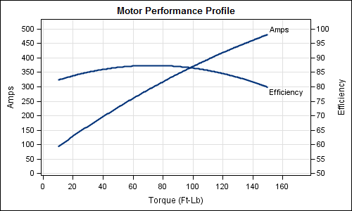
Let us use the example of the data for an electric motor that I eyeballed off of a web page listing the observations for RPM, Amps, Efficiency and Torque. The data is included in the attached code file. Here is the graph and the code for the Amps and Efficiency by Torque:
proc template; define statgraph torque_gtl_2_Axis; begingraph; entrytitle 'Motor Performance Profile'; layout overlay / xaxisopts=(linearopts=(tickvaluesequence=(start=0 end=160 increment=20) tickvaluepriority=true) griddisplay=on label='Torque (Ft-Lb)') yaxisopts=(linearopts=(tickvaluelist=(0 10 20 30 40 50 60 70 80 90 100) tickdisplaylist=('0' '50' '100' '150' '200' '250' '300' '350' '400' '450' '500') tickvaluepriority=true) griddisplay=on) y2axisopts=(linearopts=(tickvaluesequence=(start=50 end=100 increment=5) tickvaluepriority=true) label='Efficiency'); regressionplot x=torque y=amps / degree=2 curvelabel='Amps'; regressionplot x=torque y=Eff / degree=2 yaxis=y2 curvelabel='Efficiency'; endlayout; endgraph; end; run; /*--Two Axis Plot--*/ proc sgrender data=torque template=torque_gtl_2_Axis; run; |
Here are some of the key aspects of this graph:
- We want to have common grid lines to make it easy to read the graph, especially as we add more responses. To facilitate that, the number of tick values on each axis must be the same, with the same offsets.
- To acheive this, we have normalized the data to 0-100 range, and set ticks 10 tick intervals.
- We plotted "Amps" on Y and "Efficiency" on Y2.
- We have mapped the correct values of the responses to each tick value.
- We have used direct labeling of the curves to reduce eye-movement caused if using a legend.
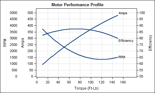
Now, we want to add a third response, RPM, display all the curves in the same graph, along with an external axis for RPM. The graph and code are shown below.
proc template; define statgraph Torque_gtl_3_Axis; begingraph; entrytitle 'Motor Performance Profile'; layout lattice / rows=1 order=columnmajor columnweights=(0.12 0.88); layout overlay / walldisplay=none xaxisopts=(display=none linearopts=(tickvaluesequence=(start=0 end=160 increment=20) tickvaluepriority=true)) yaxisopts=(linearopts=(tickvaluelist=(0 10 20 30 40 50 60 70 80 90 100) tickdisplaylist=('0' '500' '1000' '1500' '2000' '2500' '3000' '3500' '4000' '4500' '5000') tickvaluepriority=true) display=(tickvalues label)); seriesplot x=torque y=rpm / lineattrs=(thickness=0); endlayout; layout overlay / xaxisopts=(linearopts=(tickvaluesequence=(start=0 end=160 increment=20) tickvaluepriority=true) griddisplay=on label='Torque (Ft-Lb)') yaxisopts=(linearopts=(tickvaluelist=(0 10 20 30 40 50 60 70 80 90 100) tickdisplaylist=('0' '50' '100' '150' '200' '250' '300' '350' '400' '450' '500') tickvaluepriority=true) griddisplay=on display=(ticks tickvalues label) label='Amps') y2axisopts=(linearopts=(tickvaluesequence=(start=50 end=100 increment=5) tickvaluepriority=true) display=(tickvalues ticks label) label='Efficiency'); regressionplot x=torque y=rpm / degree=2 curvelabel='RPM'; regressionplot x=torque y=amps / degree=2 curvelabel='Amps'; regressionplot x=torque y=Eff / degree=2 yaxis=y2 curvelabel='Efficiency'; endlayout; endlayout; endgraph; end; run; |
/*--Three Axis Plot--*/ proc sgrender data=torque template=Torque_gtl_3_Axis; run; |
Some key aspects of the graph are as follows:
- We have used a LAYOUT LATTICE to create a 2 cell graph, the first cell is 12% of the graph width and second 88%.
- We plotted all three responses in the 2nd cell, RPM and AMPS to Y and Eff to Y2.
- We plotted RPM by Torque in the 1st cell, but made the graph invisible by setting line thickness to zero, and set the wall display to none.
- The Y axis of the 1st cell also has 10 tick intervals, mapped to the correct values of RPM.
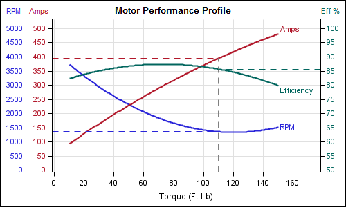
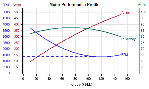
Now, we make some cosmetic improvements to enhance the readability of this graph We have color coded the curves and the corresponding axis values to make it make the graph easier to decode. The graph and the code are shown below:
proc template; define statgraph Torque_gtl_3_Axis_OuterLabel; begingraph; entrytitle halign=left textattrs=graphdata1(size=9pt weight=normal) 'RPM' halign=left textattrs=graphdata2(size=9pt weight=normal) ' Amps' halign=center textattrs=(size=11pt) 'Motor Performance Profile' halign=right textattrs=graphdata3(size=9pt weight=normal) 'Eff %'; layout lattice / rows=1 order=columnmajor columnweights=(0.08 0.92); layout overlay / walldisplay=none xaxisopts=(display=none linearopts=(tickvaluesequence=(start=0 end=160 increment=20) tickvaluepriority=true)) yaxisopts=(linearopts=(tickvaluelist=(0 10 20 30 40 50 60 70 80 90 100) tickdisplaylist=('0' '500' '1000' '1500' '2000' '2500' '3000' '3500' '4000' '4500' '5000') tickvaluepriority=true) display=(tickvalues) tickvalueattrs=graphdata1); seriesplot x=torque y=rpm / lineattrs=(thickness=0); endlayout; layout overlay / xaxisopts=(linearopts=(tickvaluesequence=(start=0 end=160 increment=20) tickvaluepriority=true) griddisplay=on label='Torque (Ft-Lb)') yaxisopts=(linearopts=(tickvaluelist=(0 10 20 30 40 50 60 70 80 90 100) tickdisplaylist=('0' '50' '100' '150' '200' '250' '300' '350' '400' '450' '500') tickvaluepriority=true) griddisplay=on display=(ticks tickvalues) tickvalueattrs=graphdata2) y2axisopts=(linearopts=(tickvaluesequence=(start=50 end=100 increment=5) tickvaluepriority=true) display=(ticks tickvalues) tickvalueattrs=graphdata3); regressionplot x=torque y=rpm / degree=2 curvelabel='RPM' curvelabelattrs=graphdata1 lineattrs=graphdata1(pattern=solid); regressionplot x=torque y=amps / degree=2 curvelabel='Amps' curvelabelattrs=graphdata2 lineattrs=graphdata2(pattern=solid); regressionplot x=torque y=Eff / degree=2 yaxis=y2 curvelabel='Efficiency' curvelabelattrs=graphdata3 lineattrs=graphdata3(pattern=solid); dropline y=79 x=110 / dropto=y lineattrs=graphdata2(pattern=dash thickness=1); dropline y=79 x=110 / dropto=x lineattrs=(pattern=dash thickness=1); dropline y=85.5 x=110 / dropto=y yaxis=y2 lineattrs=graphdata3(pattern=dash thickness=1); dropline y=27.5 x=110 / dropto=y lineattrs=graphdata1(pattern=dash thickness=1); endlayout; endlayout; endgraph; end; run; /*--Three Axis Plot with color--*/ proc sgrender data=torque template=Torque_gtl_3_Axis_OuterLabel; run; |
Some key aspects of the graph are as follows:
- We color coded the curves and the corresponding axes tickvalues.
- We turned off the axis labels for all Y and Y2 axes, and used the three part ENTRYTITLE to put the associated axis label above each axis. This part is a bit kludgy, as you have to line things up. The text attributes for each portion of the title can be customized.
- We added some drop lines to see how one would read off the data from this graph. Starting with Torque=110, we can work up to each curve, and read off the appropriate response values.
- We also color coded the drop lines.
Full code for these examples is included here: Full SAS 92 Code
There is really no limit to the number of response axes you could create in this way. Add additional cell with Y axis on the left, or with a Y2 axis on the right to create a graph with multiple Y and / or Y2 axes. This exercise is left to the reader: Add another response column to the data, say Horsepower, and plot it in the graph, and create a 2nd Y2 axis for Horsepower.


4 Comments
Thanks for your sharing.
Great stuff. One advantage here is that it obviates the need for formatting the y-axis values, which is I would have done. Why? Becuase no where in my, online SAS help that comes with my PCSAS do I see documentation for tickdisplaylist. Maybe I'm missing it, somewhere. Anyway, something like this is really great when you're graphing morethan 2 analytes vs time in a drug trial. Thanks for this posting.
Pingback: Bar-Line graph - Graphically Speaking
This is great Sanjay! Thank you for sharing this.