A new book from SAS Press, "Statistical Graphics Procedures by Example" co-authored by Dan Heath and I has now been published (phew!). For both Dan and I, this was our first foray into writing a book, so it was highly educational to say the least.
The key idea behind the presentation of the contents is that you should be able to create the graph you need in a few minutes, having never seen the procedures before. The book includes many graphs commonly used for data analysis with the code alongside. You are very likely to find a graph you want, and can get going in minutes.
Furthemore, SG procedures use a building-block concept to create complex graphs. So, if you know the code for a scatter plot and a reg plot, you can likely combine the two to create more sophisticated graphs.
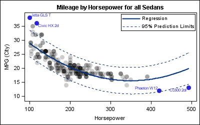
That said, let us get to some interesting examples. Here we want to see a distribution of Mileage by Horsepower, along with a quadratic regression fit with confidence bands. We want to label the observations having high mileage or high horsepower. Here is the graph for all Sedans in the sashelp.cars data set:
The procedure code is shown below. The full SAS code is shown here: Scatter_Label
title 'Mileage by Horsepower for all Sedans'; proc sgplot data=sedans nocycleattrs; scatter x=horsepower y=mpg_city / markerattrs=(symbol=circlefilled size=12) transparency=0.8; scatter x=horsepower y=mpg_city / datalabel=name group=group nomissinggroup markerattrs=(symbol=circlefilled size=12); reg x=horsepower y=mpg_city / degree=2 cli name='a' nomarkers; discretelegend 'a' / location=inside position=topright across=1; run; |
The above graph uses a combination of statements from three different samples in the book, simply combining the plot statements from each:
- Figure 4.4.1 using a scatter plot to just display the observations.
- Figure 4.5.4 using the DATALABEL option to display some data labels.
- Figure 5.3.3 using the REG statement to show a linear fit of the data.
Statements can be combined as shown in Section 2.4 of the book. Combining separate statements allows us to achieve specific results. In this graph, we have done the following:
- Make scatter markers transparent to see where the dense data lies.
- Label only the outliers without transparency. So we used another scatter plot without transparency. Also, this scatter plot uses group to color the outliers.
- Add a regression fit and confidence bands.
Names of most plot statements in the SG procedures are intuitive and self documenting. When you use a SCATTER, SERIES, HISTOGRAM, VBOX, VBAR, etc you know what to expect. However, many statements can be used creatively to build graphs that may not be obvious at first glance. Here are some examples:
Figure 4.5.6 - Use a SCATTER statement to create a table of statistics:
Figure 13.3 - Use a BAND plot to draw a series plot with fill under:
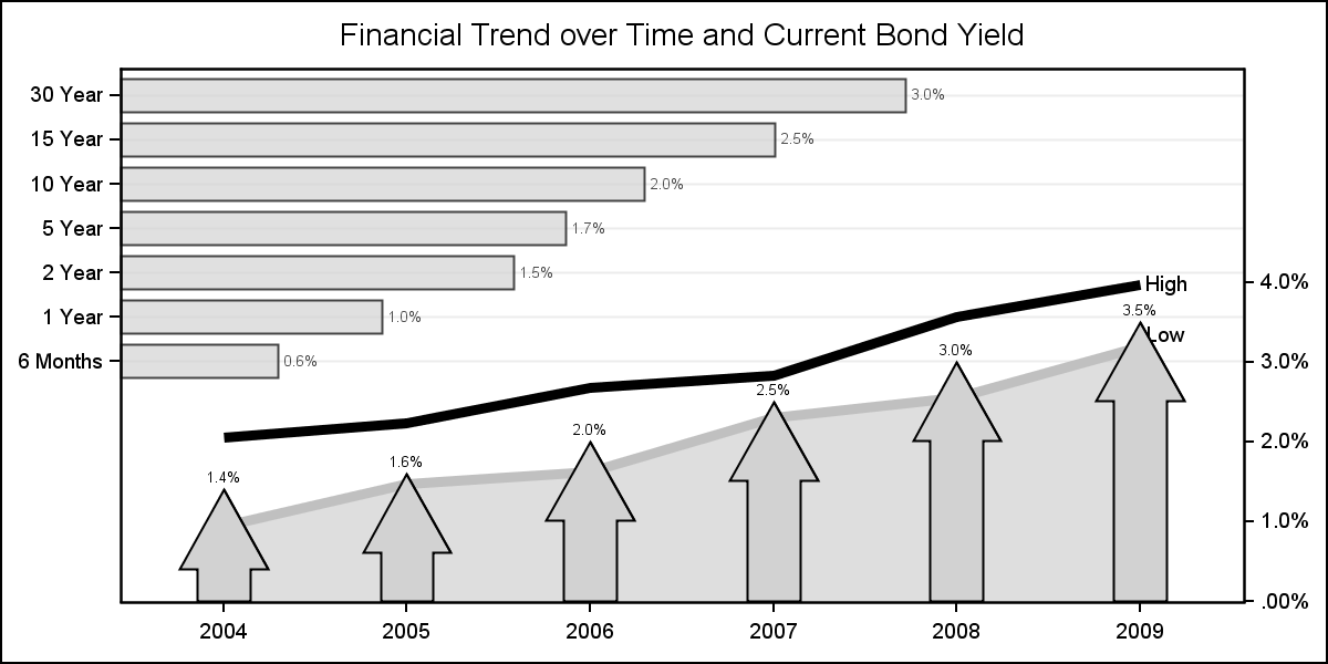
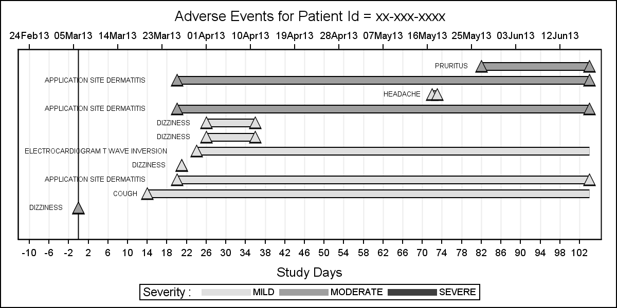
Figure 12.5- Use a VECTOR plot to draw a adverse event timeline:
The above graphs represens only a few of the many real world examples in the book. Also included are creative ways you can make paneled graphs using the SGPANEL and the SGSCATTER procedures.


4 Comments
I got the book, and have started reading it, and it is excellent so far.
Peter
Hi Peter, I hope can find a graph close to what you need, and get going right away. We would like to hear of your experience. The Samples link here, has the data sets used in the book.
nomissinggroup option works in proc sgplot but gives error in GTL scattelerplot statement in 9.3. What is corresponding key word for GTL? I could not find it in the documentation. Thanks
INCLUDEMISSINGGROUP=false.