Calendar Heatmaps are an interesting alternative view of time-series data. The measured value is displayed as color mapped cells in a calendar. Calendar Heatmaps can be easily created with SAS 9.3 using just the HEATMAPPARM, SERIESPLOT and BLOCKPLOT statements in GTL and some simple data manipulation.
The example below shows the number of traffic fatalities in the US[1] during 2008. The effects of weekends and holidays can be clearly seen in this graph.

proc template; define statgraph cal_heatmap; begingraph / designheight=210 designwidth=1200; entrytitle 'Traffic Fatalities in the US during 2008'; rangeattrmap name="rmap"; range 0 - max / rangecolormodel=(white cxeeeeaa red); endrangeattrmap; rangeattrvar attrmap="rmap" attrvar=cvar var=fatalities; layout overlay / walldisplay=none xaxisopts=(display=none) yaxisopts=(display=(tickvalues) reverse=true linearopts=(tickvaluelist=(1 2 3 4 5 6 7)) ); heatmapparm x=week y=weekday colorresponse=cvar / name="heatmap" xgap=1 ygap=1; seriesplot x=wk y=wd / connectorder=xvalues break=true lineattrs=(color=black) primary=true; innermargin / align=bottom; blockplot x=prevwk block=month / valuehalign=center display=(values); endinnermargin; continuouslegend "heatmap" ; endlayout; endgraph; end; run; proc sgrender data=combined template=cal_heatmap; run; |
The example above was created by generating a day of the week and week of the year value from the date value and using those columns as the X and Y values on the HEATMAPPARM. The month boundaries are computed from the input date variable and rendered using the SERIESPLOT statement and the month labels are drawn using a BLOCKPLOT statement.
When working with financial data, weekly trends as well as the values at the end of month, quarter or year can also be more easily observed on a Calendar Heatmap. The example below shows the % daily change in the Dow Jones composite index during 1988.
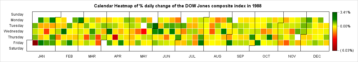
proc template; define statgraph cal_heatmap; begingraph / designheight=210 designwidth=1200; entrytitle 'Calendar Heatmap of % daily change of the DOW Jones composite index in 1988'; rangeattrmap name="rmap"; range min - 0 / rangecolormodel=(darkred red yellow); range 0 - max / rangecolormodel=(yellow green darkgreen); endrangeattrmap; rangeattrvar attrmap="rmap" attrvar=cvar var=percent; layout overlay / walldisplay=none xaxisopts=(display=none) yaxisopts=(display=(tickvalues) reverse=true linearopts=(tickvaluelist=(1 2 3 4 5 6 7)) ); heatmapparm x=week y=weekday colorresponse=cvar / name="heatmap" xgap=1 ygap=1; seriesplot x=wk y=wd / connectorder=xvalues break=true lineattrs=(color=black) primary=true; innermargin / align=bottom; blockplot x=prevwk block=month / valuehalign=center display=(values); endinnermargin; continuouslegend "heatmap" / valuecounthint=3; endlayout; endgraph; end; run; proc sgrender data=combined template=cal_heatmap; run; |
As in the first example, the day of the week and the week of the year were computed and used for the X & Y values on the HEATMAPPARM. A RANGEATTRMAP is used with the COLORRESPONSE option to clearly represent the positive and negative changes in the Dow Jones composite index. The empty cells correspond to days where the Stock Exchange was closed.


11 Comments
Will these heatmaps run in 9.2?
The HEATMAPPARM statement was added to GTL at SAS 9.3 so this code would not run at 9.2. Prior to 9.3, users have created Heatmaps using the SCATTERPLOT statement. This example illustrates how this could be done: http://support.sas.com/kb/35/156.html
For another 9.2 example, complete with a SAS program, see
http://blogs.sas.com/content/iml/2011/01/14/two-letter-initials-which-are-the-most-common/
For more on using calendar charts to visualize time series, see
http://support.sas.com/rnd/app/papers/airlinedelays.pdf
and
http://pubs.amstat.org/doi/abs/10.1198/jcgs.2011.2de (Click "Hi-res for printing")
Pingback: Beer, daipers and heat map - Graphically Speaking
You can also look at "Stretching the Bounds of SAS/GRAPH® Software" ... http://www2.sas.com/proceedings/sugi30/137-30.pdf.
There are also examples at http://www.albany.edu/~msz03/temps.html together with a link to daily temperature data for US and world cities (nice for practice with heat maps)
Pratik, can you please share the structure of the data file which you used to create a calendar heatmap in SAS? (Eg. variable names and types in the Fatalities file and perhaps how you prepared the file for graphing.)
The full program for each example is attached in a link under the graph.
Thank you, Sanjay!
Dear Sanjay, how would we modify the code so I can get an annual plot (multiple years with multiple plots)? thanks!
I am having trouble running this in 9.4 - can you please help?
WARNING: The heatmapparm statement named 'heatmap' will not be drawn because one or more of the
required arguments were not supplied.
WARNING: The seriesplot statement will not be drawn because one or more of the required arguments
were not supplied.
WARNING: The blockplot statement will not be drawn because one or more of the required arguments
were not supplied.
WARNING: A blank graph is produced. For possible causes, see the graphics template language
documentation.
Hi Ida,
It would be best if you open a track with SAS Technical Support so we can get more information on this issue.