Rafael Nadal is nothing less than a freak of nature on the tennis court. One oft-cited stat among tennis aficionados: Nadal routinely hits the ball at 5,000 revolutions per minute. By way of contrast, Roger Federer's strokes come in at 3,200 RPM. Put differently, "Rafa" hits the ball with 50 percent more topspin than the man who has won more major tennis tournaments than anyone.
Wow.
When you win as many matches as Rafa, it doesn't take a data scientist to determine that he wins more points than he loses. But go deeper for a moment. How do his points break down? In other words, when the score is 15-all in a game, does he tend to surge ahead or fall behind? Exactly how often? (For those of you unfamiliar with the rules of tennis, click here.)
That's precisely the type of question that an effective data visualization can address. Even better, what if that dataviz were interactive? That is, you could break down Rafa's performance while service by individual tournament? Well, it turns out that you can do just that on GameSetMap:
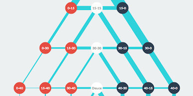
Click on the image above to break down how Rafa does on his serve. It's particularly instructive in light of the fact that he changed his strategy after returning from injury. Nadal's coach and uncle Toni decided to play more aggressively, theoretically shortening points. Nadal is legendary for his ability to play defense, something that has arguably caused his knee ailments – especially on hard courts. (While we're at it, there's been no shortage of interesting tennis data visualizations. Here's one.)
Simon says
We can create informative and interactive data visualizations to understand how a tennis player's service game breaks down. Given that, there's no reason for an organization not to build and use a similar tool to understand sales, its supply chain, customer churn and employee movement.
A great deal can be gleaned from a static dataviz but, as I write in The Visual Organization, there's so much more to learn from interactive ones. The latter promote data discovery and exploration, ultimately finding needles in haystacks.
Feedback
What say you?
To watch the trailer for The Visual Organization, click here.