INTERNATIONAL BUSINESS COMMUNICATION STANDARDS is an organisation defining international standards in business communication and presenting proposals relating to designing easy-to-understand business reports and presentations. With this post, we are starting a series of articles relating to these recommendations, while incorporating them into the context of a tool for visual exploration of data – SAS Visual Analytics.
Visual exploration of data is defined as a technique of transforming data into information. It aims at helping in making decisions on all levels of an organisation, especially the management level.
We present one of the main principles proposed by IBCS – the principle of selecting the correct visualisation.
- Correct visualisation should take into account only such objects (diagrams, tables) that contain the desired message, while enabling quick association with facts. Selection of the proper type of objects is of key importance in terms of understanding the content of the visualisation. For example, diagrams with horizontal axis of categories are proper for presentation of data, while diagrams with vertical axis of categories are useful for presenting structural associations and relations.
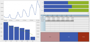
Figure 1 – sample SAS Visual Analytics visualisations
- Bad choice of a visualisation will make it more difficult to understand the message. Replacing the improper types of objects (e.g. round diagram, “speedometer” indicator, radar diagram) is of key importance for how the content is received and interpreted. Proper selection of the visualisation to the data type and using unified notation principles are equally as important.
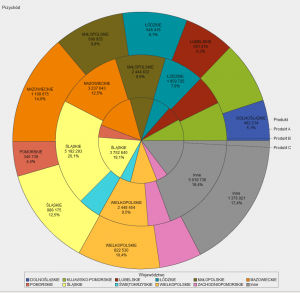
Figure 2 – an example of choosing improper visualisation type – too many segments and using grouping makes it more difficult to perceive proportions and interpret results
- Our sight perception is strongly focused on seeing one object with reference to another one. Taking into account the principles of justified comparisons will help in completing a faster analysis and make it easier to draw conclusions. Business scenarios are a typical example of comparisons that represent various layers (e.g. previous year, plan, budget, forecast) of a business model.
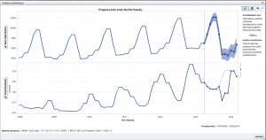
Figure 3 – Sample scenario in SAS Visual Analytics – “what - if” analysis
- The ability to take into account the entire context including in particular the extreme values and differing data as well as correlations, enables to increase reliability of a presentation and also to better understand the message and discover new relations, that were not disclosed before.
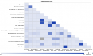
Figure 4 – samples of a correlation matrix in SAS Visual Analytics
- A visualisation should be based on simplicity of a message. It should describe facts, explain causes and include recommendations.
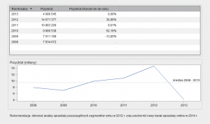
Figure 5 – sample SAS Visual Analytics visualisation with recommendation
Using the above standards of visual data exploration currently becomes an increasingly more important challenge for organisations. When preparing implementation projects for customers, SAS Institute applies recommendations of IBCS, taking into account the specific requirements of end users.