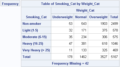
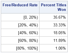
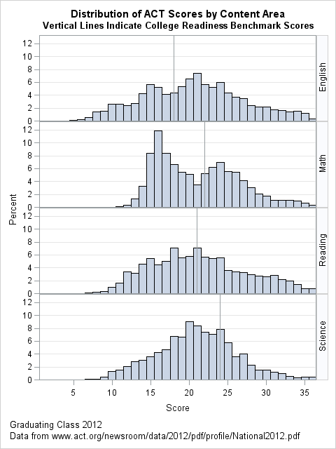
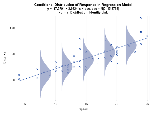
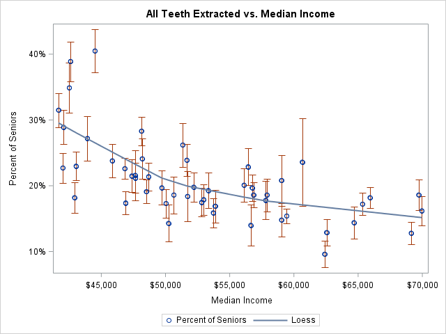
Last week I discussed ordinary least squares (OLS) regression models and showed how to illustrate the assumptions about the conditional distribution of the response variable. For a single continuous explanatory variable, the illustration is a scatter plot with a regression line and several normal probability distributions along the line. The
Author
I've previously written about how to generate a sequence of evenly spaced points in an interval. Evenly spaced data is useful for scoring a regression model on an interval. In the previous articles the endpoints of the interval were hard-coded. However, it is common to want to evaluate a function
A friend who teaches courses about statistical regression asked me how to create a graph in SAS that illustrates an important concept: the conditional distribution of the response variable. The basic idea is to draw a scatter plot with a regression line, then overlay several probability distributions along the line,
Statistical programmers often have to use the results from one SAS procedure as the input to another SAS procedure. Because ODS enables you to you to create a SAS data set from any ODS table or graph, it is easy to obtain a data set that contains the value of
In my previous blog post, I showed how you can use SAS to program a "weaving" algorithm that takes an image, cuts it into strips, and weaves the strips together to create mathematical art. I used matrices and heat maps for the computations and visualization. At the end of the
An artist friend of mine recently created a beautiful abstract image and described the process on her blog. She says that "after painting my initial square, I cut it into strips and split them down the middle, then wove them together.... I had no idea when I started piecing these
The title of this blog post might seem strange, but I occasionally need to compute the number of digits in a number, usually because I am trying to stuff an integer value into a string. Each time, I have to derive the formula from scratch, so I am writing this
Ugh! Your favorite regression procedure just printed a warning to the SAS log. Something is wrong, and your attempt to fit a model to the data has not succeeded. A typical message is "WARNING: The validity of the model fit is questionable," perhaps followed by some additional diagnostic messages about
One of my presentations at SAS Global Forum 2015 was titled "Ten Tips for Simulating Data with SAS". The paper was published in the conference proceedings several months ago, but I recently recorded a short video that gives an overview of the 10 tips: If your browser does not support
I wanna be an airborne ranger, Live the life of guts and danger.* If you are an 80's movie buff, you might remember the scene in The Breakfast Club where Bender, the juvenile delinquent played by Judd Nelson, distracts the principal by running through the school singing this song. Recently,
Typically a correlation analysis reports the correlations between all pairs of variables, including the variables with themselves. The resulting correlation matrix is square, symmetric, and has 1s on the main diagonal. But suppose you are interested in only specific combinations of variables. Perhaps you want the pairwise correlations between one
When SAS 9.4m3 was released last month (including SAS/STAT and SAS/IML 14.1), I was happy to see that a HEATMAP statement had been added to the SGPLOT procedure. Although heat maps in the SAS/IML language have been available for several releases, you previously had to use the Graph Template Language
Last month I wrote about how to simulate a drunkard's walk in SAS for a drunkard who can move only left or right in one direction. A reader asked whether the problem could be generalized to two dimensions. Yes! This article shows how to simulate a 2-D drunkard's walk, also
When using SAS to format a number as a percentage, there is a little trick that you need to remember: the width of the formatted value must include room for the decimal point, the percent sign, and the possibility of two parentheses that indicate negative values. The field width must
Last week's post about odds ratio plots in SAS made me think about a similar plot that visualizes the parameter estimates for a regression analysis. The so-called regression coefficient plot is a scatter plot of the estimates for each effect in the model, with lines that indicate the width of
Imagine the following scenario. You have many data sets from various sources, such as individual stores or hospitals. You use the SAS DATA step to concatenate the many data sets into a single large data set. You give the big data set to a colleague who will analyze it. Later
Last week, SAS released the 14.1 version of its analytics products, which are shipped as part of the third maintenance release of 9.4. If you run SAS/IML programs from a 64-bit Windows PC, you might be interested to know that you can now create matrices with about 231 ≈ 2
I recently read an argument by Andrew Wheeler for using a logarithmic axis for plotting odds ratios. I found his argument convincing. Accordingly, this blog post shows how to create an odds ratio plot in SAS where the ratio axis is displayed on a log scale. Thanks to Bob Derr
Base SAS contains many functions for processing strings, and you can call these functions from within a SAS/IML program. However, sometimes a SAS/IML programmer needs to process a vector of strings. No problem! You can call most Base SAS functions with a vector of parameters. I have previously written about
The Raleigh News & Observer published a front-page article about the effect of wealth and poverty on high school athletics in North Carolina. In particular, the article concluded that "high schools with a high percentage of poor students rarely win titles in the so-called country club sports—tennis, golf and swimming—and
My colleague Robert Allison finds the most interesting data sets to visualize! Yesterday he posted a visualization of toothless seniors in the US. More precisely, he created graphs that show the estimated prevalence of adults (65 years or older) who have had all their natural teeth extracted. The dental profession
The triangular distribution has applications in risk analysis and reliability analysis. It is also a useful theoretical tool because of its simplicity. Its density function is piecewise linear. The standardized distribution is defined on [0,1] and has one parameter, 0 ≤ c ≤ 1, which determines the peak of the
A SAS programmer wanted to plot the normal distribution and highlight the area under curve that corresponds to the tails of the distribution. For example, the following plot shows the lower decile shaded in blue and the upper decile shaded in red. An easy way to do this in SAS
My son is in high school and plans to take the ACT, a standardized test to assess college aptitude and readiness. My wife asked, "What is a good score for the ACT?" I didn't know, but I did a quick internet search and discovered a tabulation of scores for the
Recently a SAS customer asked how to Winsorize data in SAS. Winsorization is best known as a way to construct robust univariate statistics. The Winsorized mean is a robust estimate of location. The Winsorized mean is similar to the trimmed mean, and both are described in the documentation for PROC
As my colleague Margaret Crevar recently wrote, it is useful to know how long SAS programs take to run. Margaret and others have written about how to use the SAS FULLSTIMER option to monitor the performance of the SAS system. In fact, SAS distributes a macro that enables you to
You've probably heard of a random walk, but have you heard about the drunkard's walk? I've previously written about how to simulate a one-dimensional random walk in SAS. In the random walk, you imagine a person who takes a series of steps where the step size and direction is a
SAS/IML software is used by many SAS programmers, primarily for creating custom algorithms and macros that implement statistical analyses that are not built into any SAS procedure. I know that PROC IML is used regularly by pharmaceutical companies, by the financial and insurance industries, and by researchers in medical colleges
When you count the outcomes of an experiment, you do not always observe all of the possible outcomes. For example, if you roll a six-sided die 10 times, it might be that the "1" face does not appear in those 10 rolls. Obviously, this situation occurs more frequently with small
When I am computing with SAS/IML matrices and vectors, I often want to label the columns or rows so that I can better understand the data. The labels are called headers, and the COLNAME= and ROWNAME= options in the SAS/IML PRINT statement enable you to add headers for columns and